

 Rapid Ext JS (beta)
 ReExt
ReExt


Making a New GXT Theme Has Never Been Easier
March 20, 2014
106 Views
A few weeks ago we shipped GXT 3.1.0 beta. This release includes our new Theme Builder tool, which generates Appearance based themes for GXT. It includes CSS3 features like gradients and rounded corners, and the Theme Builder can also generate images to enable older browsers to use these properties.
Getting Ready
The GXT 3.1 beta download includes both the Theme Builder tool itself as well as a handful of examples. It shows you not only how to build a new theme, how variables and functions work, what properties can be set and what they mean, but also how to integrate building a theme into your build system. You can also check out the docs for more information.
With the GXT 3.1 beta downloaded, you already have all you need to build a theme for both Mac and Windows. On Linux, you’ll also need to download the appropriate version of PhantomJS for your platform, and modify the themer.sh file to point to the binary.
On Windows, you’ll run the themer.bat file:
> themebuilderbinthemer.bat
On Mac or Linux, you’ll run the themer.sh file:
$ themebuilder/bin/themer.sh
On any platform, you’ll get this output, describing how to run the themer:
| usage: ThemeBuilder [options] [config …] | |
| -gen <path> | directory to generate code to |
| -generateConfig <outputFile> | Generate sample configuration |
| -h,–help | print this message |
| -imageFile <path> | captured image used for slicing images |
| -manifestFile <manifestFile> | json manifest file of the captured image |
| -out <jar> | path to jar file to generate. Default is a jar named <theme.name>.jar in the current directory |
| -warDir <warDir> | directory to compile the css3-based theme to before images are sliced from it |
The only argument that is required is the name of the config file you wish to generate, the rest are all optional.
Config Files
The theme config file structure is a set of namespaces key/value pairs. Namespaces are used to group related properties and to keep key names short, consistent and easy to remember.
Property values can be strings or numbers, simple expressions (arithmetic, string concatenation), as well as references to other properties or built-in function calls to be run when the theme is generated.
When creating a theme config, there are two properties required: the name of the theme, and the package to generate the theme in. The name is used both to name the resulting jar file and as a value for a GWT property to enable an application to have more than one theme compiled.
Sample Configurations
The quick-start example provides a simple way to get started with the themer. You only have to change a few properties, and you can quickly get a completely different theme. It can be found in the themebuilder/examples/quick-start directory.
The first 20 lines of this file set the name and package for the theme, and define a few global variables that the rest of the theme is based off of:
/* First, create a name for your theme, and define a package to place it in */
name = “quickstart”
basePackage = “com.example”
/* Next, configure these basic defaults, to be used throughout the file */
text = util.fontStyle(“Tahoma, Arial, Verdana”, “13px”, “#000000”, “normal”)
headerText = util.extend(text, {
size = “15px”
color = “#eeffff”
weight = “bold”
})
borderRadius = 6
headerBgColor = “#2299cc”
iconColor = “#ddeeff”
spacing = 10
First, you need to specify a package and name for the theme:
name = “myfirsttheme”
basePackage = “com.example.myfirsttheme”
Throughout the rest of the file, these remaining variables are used to provide the actual values to style each widget. For example, later in quick-start.theme, the Info widget uses this configuration:
backgroundColor=”#000000″
borderRadius=theme.borderRadius
border=util.border(‘none’)
opacity=0.8
margin=util.margin(4,0,0,0)
padding=util.padding(0)
headerPadding=util.padding(theme.spacing)
headerText=util.extend(theme.headerText, {
color = “#ffffff”
})
messagePadding=util.padding(0, theme.spacing, theme.spacing, theme.spacing)
messageText=util.fontStyle(text.family,text.size,’#ffffff’,text.weight)
radiusMinusBorderWidth = util.radiusMinusBorderWidth(border, borderRadius)
}
Note that sometimes we refer to a variable with its full name like theme.headerText and other times refer to it without the ‘theme.’ prefix. The prefix isn’t always required, but the theme config language will try to resolve the closest variable that matches (either in the current namespace or the parent’s namespace and so on). Referencing ‘theme.headerText’ ensures that we don’t reference ‘theme.details.info.headerText’ — this is important because even though it matches ‘headerText’ on its own, it can’t match the more specific ‘theme.headerText’.
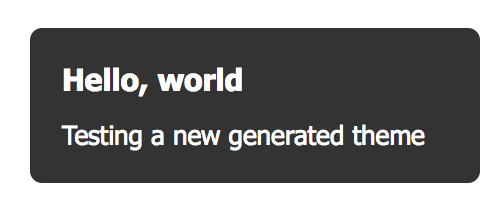
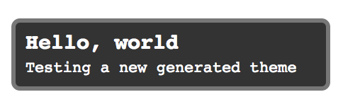
There are a few hardcoded values in here that are specific to the Info widget. They are not easily shared across other widgets in a meaningful way. This set of values is set just once. The default values here result in an info popup that looks like this:
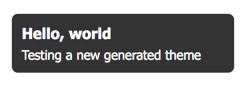
If you change theme.spacing to 4, instead you see:
If you changed to theme.text to util.fontStyle(“monospace”, “11px”, “#000000”, “normal”), you get:
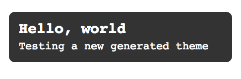
For better or worse, you’ve also changed the spacing, font family and size everywhere else in the theme. What if instead you just wanted to change the Info popup? You could leave theme.text as is, and just tweak the info block. While you’re at it, you can also add a border, and change the background:
backgroundColor=”#000000″
borderRadius=theme.borderRadius
border=util.border(‘solid’, ‘#555555’, 3)
opacity=0.8
margin=util.margin(4,0,0,0)
padding=util.padding(0)
headerPadding=util.padding(4)
headerText=util.fontStyle(“monospace”, “15px”, “#ffffff”, “bold”)
messagePadding=util.padding(0, 4, 4, 4)
messageText=util.fontStyle(“monospace”, “11px”, “#ffffff”, “normal”)
radiusMinusBorderWidth = util.radiusMinusBorderWidth(border, borderRadius)
}
Now, you have the same text and spacing as before, but with an added border style, and you haven’t affected other parts of the theme:
How It Works
The Theme Builder takes one or more theme config files, which describe the font, color, border, padding, and background styles of each widget supported. As it generates each appearance, it looks for those variables in the config files and integrates their values into the finished jar file.
One of the main goals of the Theme Builder was to target CSS3 features like rounded corners and gradients, and to support browsers which don’t fully support those features. The Theme Builder achieves that by taking screenshots of the generated theme in a modern browser, and saving image files to be used when compiling for a legacy browser.
Conclusion
Creating visually compelling apps is hard work for developers. With the inclusion of the Theme Builder in GXT 3.1, along with the new Neptune theme, it becomes much easier. The Theme Builder provides a great opportunity for creating newer and better UX. We are very excited about this feature and would like to hear about your experience with it. Remember to give us your feedback in the the Sencha GXT 3.1 Beta forum, so we can keep improving it for you.
What's your reaction?
 0
0

 0
0

Latest Content

Discover the Top 07 Architecture Patterns used in Modern Enterprise Software Development
Developing software without an architecture pattern may have been an option back then. However, that’s…
April 11, 2024

JavaScript Design Patterns: A Hands-On Guide with Real-world Examples
As a web developer, you know how popular JavaScript is in the web app development…
March 26, 2024

Virtual JS Days 2024のハイライト
2024年2月20日~22日、第3回目となる「Virtual JavaScript Days」が開催されました。JavaScript の幅広いトピックを採り上げた数多くのセッションを実施。その内容は、Senchaの最新製品、ReExt、Rapid Ext JSまで多岐にわたり、JavaScriptの最新のサンプルも含まれます。 このカンファレンスでは多くのトピックをカバーしています。Senchaでセールスエンジニアを務めるMarc Gusmano氏は、注目すべきセッションを主催しました。Marc は Sencha の最新製品「ReExt」について、詳細なプレゼンテーションを実施。その機能とメリットを、参加者に理解してもらうべく詳細に説明しました。 カンファレンスは、Senchaのジェネラルマネージャを務めるStephen Strake氏によるキーノートでスタートしました。キーノートでは、会社の将来のビジョンについての洞察を共有しています。世界中から JavaScript 開発者、エンジニア、愛好家が集まるとてもエキサイティングなイベントとなりました。これは、JavaScript…
March 25, 2024


