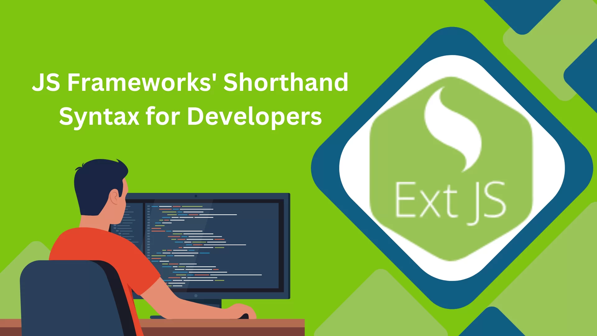
…or… A pixel is not a pixel.
In my last article about the benefits of SASS and CSS3, I briefly touched on a technique we use in Sencha Touch to make our interfaces resolution independent. Today I will be expanding on that technique, so you can start to make your own scalable UI elements for WebKit.
A Brief Introduction
This is not an article on adaptive layouts or responsive web design. This article is specifically about pixel “density”, a relatively new concern to digital designers. In the mobile environment, screen resolution has been quickly advancing, resulting in larger and larger “pixels per inch” (ppi).
Take, for example, the image above. This is the same page, rendered by the same browser, on the iPad and iPhone 4. Note how the button looks smaller on the iPhone. This is because the iPad has a pixel density of 132ppi, while the iPhone 4, with its Retina Display, has a ppi of 326. The iPhone 4, however, automatically scales pages 2×, so we are effectively working with a ppi of 163. This is still about 15% denser than the iPad display, which means the physical display of the button button is about 15% smaller.
This pixel density must be taken into account when designing cross-platform mobile applications, for two primary reasons:
If you design a button for a 132ppi (like the iPad), it will come out much smaller for higher ppis, which could result in it becoming harder to tap and possibly render it unusable.
Images and UI elements must be scaled intelligently, to avoid pixellation and blurriness.
The General Concept
The overriding concept behind this technique is to use ems — a typographically relative measurement unit — to size your elements. Wikipedia describes an Em as such:
This unit defines the proportion of the letter width and height with respect to the point size of the current font… This unit is not defined in terms of any specific typeface, and thus is the same for all fonts at a given point size. So, 1 em in a 16 point typeface is 16 points.
Because font-size is an inherited property in CSS, we are able to change the scale of any em-based elements by simply changing the parent’s font-size.
Starting Simple: A Button
To put this concept into practice, let’s take a look at a simple button.
As you can see, we’ve added rounded corners, an inner glow (using inset with -webkit-box-shadow), a drop shadow, text shadow, and padding to our element — all using em as our sizing unit. The only sizing which is not accomplished with ems is the background-gradient, which must be defined in percentage-based color-stops. As these color-stops are still relative to the size of the button itself, these values are inherently relative as well.
To show off some different sizes for our button, we can easily just add a few classes like:
The only troublesome part of this method is that you will occasionally want to change the actual font-size of an element, without affecting its overall scale. For this, we can use a wrapper div/span inside of our element, like so:
The technique can also be used on images. For traditional images, it’s as easy as setting either the width or the height (the other will be automatically applied to remain proportional) in ems or percentages. We must embed a higher resolution photo, to be scaled down to meet the different sizes (we want to make sure we’re scaling down, as scaling up will result in pixellation).
Similarly, we can be apply sizing to background images and masks:
li {
background: url(resources/duckbullet.png) 0 .3em no-repeat;
background-size: 1em auto; // sets width to 1em, then height automatically
}
The benefit of this technique is that your images will be the same physical size across different devices, but will have more resolution on the devices that support it.
It should be noted, though, that these images are not truly “resolution independent.” The very concept of resolution independence is impossible to apply to bitmap-based graphics. As mentioned, we created our image at a large size, anticipating that it would be scaled down. If the image were to be scaled up instead, it would become pixellated. The other unfortunate side-effect is wasted bandwidth — by always including a larger version of your image, you’re ensuring unnecessary kilobytes are being transferred.
Preview this step in a WebKit-based browser.
SVG to the Rescue
SVG is a W3C specification for vector images which is already implemented in WebKit (though not all versions*). Because SVG is vector-based, it can be infinitely scaled without detriment to quality. This is the best option available for icons, logos, and non-bitmap UI elements.
Jordan Dobson has implemented this technique to great effect by creating a CSS3-based loading spinner. Check out his demo page, which has buttons to make the spinner bigger and smaller (again, by changing the parent’s font-size).
Changing Size Per Devices
Once you have your entire UI and layout measured in ems and percentages, you can apply the font-size to the body to adjust the overall scale (previously, we were setting the font-size on a parent element of our target). Currently, in Sencha Touch, we use Javascript user-agent sniffing to detect the device, and then add corresponding classes to the body. Once those are added, we adjust the UI resolution like so:
body {
font-size: 100%; // This accommodates the lowest density, the iPad, at 132ppi.
}
body.x-iphone-os.x-phone {
font-size: 114%; // This accommodates the iPhone, at 163ppi
}
body.x-android-os.x-phone {
font-size: 120%; // This accommodates most Android phones, at 180ppi.
}
The future: @media queries
Ideally, we should be able to detect and change style using CSS3 media queries. There is a specific addition to the CSS3 recommendation that would help here, though it has yet to be implemented on iOS or Android — the resolution attribute:
@media screen and (min-resolution: 132dpi) {
body {
font-size: 100%; // This accommodates the lowest density, the iPad, at 132ppi.
}
}
@media screen and (min-resolution: 160dpi) {
body {
font-size: 114%;
}
}
@media screen and (min-resolution: 180dpi) {
body {
font-size: 120%;
}
}
// Not possible yet :(
There is one media query attribute of note which iOS recently added, called device-pixel-ratio. As mentioned at the start of this article, the iPhone 4 (with Retina Display) automatically scales pixels 2× on web pages. Developers can check for the Retina Display with a query like this:
@media screen and (-webkit-min-device-pixel-ratio: 2) {
// CSS specific to Retina Displays
}
As device displays become denser and denser (did someone say Retina Display iPad?), finding the right method for creating resolution independent UI elements will become more and more important. Using ems and percentages is one such method, that we currently think is the strongest, but I’m curious: Do you know of others? Is there a change to the CSS3 spec that you think would improve this process?
Thanks for all the great comments guys — let me know if you have any extra questions/thoughts, I’ll be posting a followup to my blog at some point soon.
There are still an awful lot of px’s in the Sencha Touch CSS, though. Just yesterday, I was working through the .x-tabbar.x-docked-top rules, because I needed smaller than standard tabs for a certain tab panel, and they’re full of px’s. That’s presumably because they’re a lot about background image management. Do you really plan to make the Sencha Touch CSS px-free?
P.S.: I realize the lack of support for SVG in the Android browser is a problem. So I should have asked, do you really plan to make the Sencha Touch CSS px-free, assuming the Android browser eventually supports SVG?
Like it. We’ve been working on something like this for our apps, but you added a couple pieces to the puzzle we hadn’t got to yet. A big internet-thanks to you sir.
* I do use the occasional px measurement in Sencha Touch, but only for borders/highlights. These could/may become ems, but ultimately, it’s not the worst thing, as they’re all ‘1px’ and just trying to say “the smallest unit possible,” in a sense (ie. A 1px highlight at the top of a tab). Other places where you see px are likely just in the process of being refactored.
* Using ems and SVG are somewhat different, so the fact that Sencha Touch will not _rely_ on SVG in the near future doesn’t affect that we’ll continue using ems for sizing.
David, thanks. I agree 1px borders, highlights, and shadows are little or no problem. As for SVG, I had in mind it can be used to make background images such as Sencha Touch’s tab image resolution-independent, as at
Great article. It was so interesting in fact, that I kept reading it whilst I spilled (accidentally) my morning cereal breakfast milk down my shirt…. LOL.
Your comment is awaiting moderation.
September 11, 2010 at 10:46 pm
That button looks cool.
Though for the technical advice, I can’t completely agree.
Citing Wikipedia for Ems is fine for amateurs but for a technical publication such as this one, any CSS specification should do (CSS 2.1 – lengths).
Using ems is right, but the rest is no good.
“Currently, in Sencha Touch, we use Javascript user-agent sniffing to detect the device”
Such technique is limited to today’s devices. Where it works, it cannot be expected to be forwards-compatible.
I’m not convinced that the iPhone is scaling undesirably. Sure, it’s inconsistent with iPad, but iPhone users are used to it being smaller on the smaller iPhone.
Thanks Garrett — all good feedback. As web buffs (née standards buffs) we could argue all day about semantics, but ultimately, that doesn’t sound like a fun afternoon. The classnames are terrible of course, but were used purely for clarity in the demos. I definitely don’t recommend using names like that in production. As for the UA sniffing, I mentioned it’s not the best method, but until we have support for resolution in @media queries (or the ability to detect ppi via Javascript) I still think it’s the best can do right now. Thanks again-
“The classnames are terrible of course, but were used purely for clarity in the demos. I definitely don’t recommend using names like that in production.”
A few years ago somebody wrote a great research paper, Design Fragments Make Using Frameworks Easier, that studied 36 code samples found on the Internet, used in open source projects, and showed they all were traceable back to code samples on Sun’s developer website, and that some of the demo code contained sub-par coding practices. The number of users affected by these sub-par coding practices cannot even be counted.
Bottom line: You should always provide code with your name on it that you would drop-in to production. Hope this comment changes your practices going forward, and that you will always post production-ready samples.
I agree with Garrett, using proportional measures is good advice but messing with the device resolution at the web UI design level is a bad idea. There are already a huge variety of screen resolutions being used just in desktop devices, why the sudden focus on mobile devices just because iPhone changed their dot pitch and provided a method to detect it?
Web developers need to concentrate on clear and effective communication. By all means present attractive pages that are viewable and useable for a wide variety of host environments but let users deal with device related issues such as different sized screens, number of pixels, aspect rations, dot densities and so on themselves.
For example, my eyesight isn’t what it used to be so zooming is very important when using Mobile Safari. Therefore it is extremely annoying when a site is configured to prevent zooming. A designer can’t know every visitor’s circumstance and can’t accommodate them all specifically, so instead they should try to allow as much freedom as possible when the site is viewed. Taking control of resolutions, orientation, font sizes, whatever is obstructive and thoughtless. Just don’t do it.
Some of you rightly point out the flaws in doing this, but there may be times when someone wants to do this sort of thing. Very informative AND easy to understand. Excellent article!
Great article. Just the answers I was looking for. If bandwidth is a worry, would you recommend that we base-64 encode our images directly into the stylesheets?
At easi phone we specialise in big button phones for the elderly, we provide big button mobile phones and big button telephones suitable for senior citizens, partially sighted and disabled.
Comments are Gravatar enabled. Your email address will not be shown.
Commenting is not available in this channel entry.
There are 36 responses. Add yours.
Jay Garcia
2 years agoReally awesome to see this.
Joe McCann
2 years agoBrilliant and thank you.
Damon Oehlman
2 years agoThanks for the post David. Nice to see some practical examples for dealing with varying pixel densities on devices.
Willem de Slimme
2 years agoFlash has been scalable since 1985, and without the need for a single line of code…
Awesomee Bob
2 years agoWillem de Slimme, if you haven’t noticed yet, the most popular mobile device on the planet doesn’t support flash.
James Noble
2 years agoBrilliant. Perfect timing, working on a related project at the moment.
B
2 years agoVery timely indeed. Thanks David.
Lim Chee Aun
2 years agoNice write, David! I’m just thinking if a better solution would be using CSS absolute units like mm or inch instead of percentage and em’s?
Felix
2 years agoHere’s another resolution independent loading spinner that uses SVG/VML and works in IE6, too: http://neteye.github.com/activity-indicator.html (jQuery plugin)
Josh
2 years agoThank you for such a clear and well written post on a confusing subject. This will be on my “book shelf” for reference.
David Kaneda
2 years agoThanks for all the great comments guys — let me know if you have any extra questions/thoughts, I’ll be posting a followup to my blog at some point soon.
Ralph Haygood
2 years agoThere are still an awful lot of px’s in the Sencha Touch CSS, though. Just yesterday, I was working through the .x-tabbar.x-docked-top rules, because I needed smaller than standard tabs for a certain tab panel, and they’re full of px’s. That’s presumably because they’re a lot about background image management. Do you really plan to make the Sencha Touch CSS px-free?
Ralph Haygood
2 years agoP.S.: I realize the lack of support for SVG in the Android browser is a problem. So I should have asked, do you really plan to make the Sencha Touch CSS px-free, assuming the Android browser eventually supports SVG?
Joe
2 years agoLike it. We’ve been working on something like this for our apps, but you added a couple pieces to the puzzle we hadn’t got to yet. A big internet-thanks to you sir.
Auré
2 years agoWaho… a very clear explaination of a great technique !
Thanks
Siki?
2 years agoReally awesome to see this.
David Kaneda
2 years agoRalph, two things:
* I do use the occasional px measurement in Sencha Touch, but only for borders/highlights. These could/may become ems, but ultimately, it’s not the worst thing, as they’re all ‘1px’ and just trying to say “the smallest unit possible,” in a sense (ie. A 1px highlight at the top of a tab). Other places where you see px are likely just in the process of being refactored.
* Using ems and SVG are somewhat different, so the fact that Sencha Touch will not _rely_ on SVG in the near future doesn’t affect that we’ll continue using ems for sizing.
Hope that helps answer your questions-
Ralph Haygood
2 years agoDavid, thanks. I agree 1px borders, highlights, and shadows are little or no problem. As for SVG, I had in mind it can be used to make background images such as Sencha Touch’s tab image resolution-independent, as at
http://www.helephant.com/wp-content/uploads/2009/08/svg1.html
for example. But if you’re going to deal with background images in some non-SVG way, even better.
Alex Penny
2 years agoIs Willem really trying to advocate flash? Hah!
Anyway pretty interesting idea.
Rod Homor
2 years agoGreat article. It was so interesting in fact, that I kept reading it whilst I spilled (accidentally) my morning cereal breakfast milk down my shirt…. LOL.
Thanks, and… really, thanks!
=)
Garrett
2 years agoYour comment is awaiting moderation.
September 11, 2010 at 10:46 pm
That button looks cool.
Though for the technical advice, I can’t completely agree.
Citing Wikipedia for Ems is fine for amateurs but for a technical publication such as this one, any CSS specification should do (CSS 2.1 – lengths).
Using ems is right, but the rest is no good.
“Currently, in Sencha Touch, we use Javascript user-agent sniffing to detect the device”
Such technique is limited to today’s devices. Where it works, it cannot be expected to be forwards-compatible.
I’m not convinced that the iPhone is scaling undesirably. Sure, it’s inconsistent with iPad, but iPhone users are used to it being smaller on the smaller iPhone.
Use class with semantics in mind. textsize_2x is not a semantic class.
David Kaneda
2 years agoThanks Garrett — all good feedback. As web buffs (née standards buffs) we could argue all day about semantics, but ultimately, that doesn’t sound like a fun afternoon. The classnames are terrible of course, but were used purely for clarity in the demos. I definitely don’t recommend using names like that in production. As for the UA sniffing, I mentioned it’s not the best method, but until we have support for resolution in @media queries (or the ability to detect ppi via Javascript) I still think it’s the best can do right now. Thanks again-
John "Z-Bo" Zabroski
2 years agoDavid,
“The classnames are terrible of course, but were used purely for clarity in the demos. I definitely don’t recommend using names like that in production.”
A few years ago somebody wrote a great research paper, Design Fragments Make Using Frameworks Easier, that studied 36 code samples found on the Internet, used in open source projects, and showed they all were traceable back to code samples on Sun’s developer website, and that some of the demo code contained sub-par coding practices. The number of users affected by these sub-par coding practices cannot even be counted.
Bottom line: You should always provide code with your name on it that you would drop-in to production. Hope this comment changes your practices going forward, and that you will always post production-ready samples.
Robert Green
2 years agoI agree with Garrett, using proportional measures is good advice but messing with the device resolution at the web UI design level is a bad idea. There are already a huge variety of screen resolutions being used just in desktop devices, why the sudden focus on mobile devices just because iPhone changed their dot pitch and provided a method to detect it?
Web developers need to concentrate on clear and effective communication. By all means present attractive pages that are viewable and useable for a wide variety of host environments but let users deal with device related issues such as different sized screens, number of pixels, aspect rations, dot densities and so on themselves.
For example, my eyesight isn’t what it used to be so zooming is very important when using Mobile Safari. Therefore it is extremely annoying when a site is configured to prevent zooming. A designer can’t know every visitor’s circumstance and can’t accommodate them all specifically, so instead they should try to allow as much freedom as possible when the site is viewed. Taking control of resolutions, orientation, font sizes, whatever is obstructive and thoughtless. Just don’t do it.
Jack
2 years agoSome of you rightly point out the flaws in doing this, but there may be times when someone wants to do this sort of thing. Very informative AND easy to understand. Excellent article!
Kaushik
2 years agoGreat
Bart
2 years agoGreat article! Some awesome tips in there for the tool kit.
Tameshwar
1 year agoThanks
Nice tutorial,
Trung
1 year agoDoes this work for ie6? Thanks.
Sahadan,Sahada,Spor Haberleri
1 year agoReally awesome to see this.
siki?
1 year agoWaho… a very clear explaination of a great technique !
Thanks
vertipper
1 year agoThanks for this explanation. I think that we use it on our app…
Gregory
1 year agoLinks to examples doesn’t work after your site redesign. Can you fix it up? Or probably somebody have those examples?
Matt Fairbrass
12 months agoGreat article. Just the answers I was looking for. If bandwidth is a worry, would you recommend that we base-64 encode our images directly into the stylesheets?
Krisalyn
11 months agoKnocekd my socks off with knowledge!
easiphone
10 months agoAt easi phone we specialise in big button phones for the elderly, we provide big button mobile phones and big button telephones suitable for senior citizens, partially sighted and disabled.
Comments are Gravatar enabled. Your email address will not be shown.
Commenting is not available in this channel entry.