

 Rapid Ext JS (beta)
 ReExt
ReExt


Building Sencha Touch Custom Components, Part 2
November 14, 2012
126 Views
 We’re back with part two of our Sencha Touch 2.1 component creation tutorial. In part one of this tutorial, we introduced the concept of Sencha Touch components, our Ext.tux.AudioCover idea and began defining the functionalities needed for our Ext.tux.AudioCover to be a success. Today, we’ll be continuing with detailing those definitions, starting with the configuration parameters.
The configurations params
Every good component should provide a set of configuration parameters that can be set by developers according to their application needs. Below we’ll walk through our component’s main configuration definitions:
* @class Ext.tux.AudioCover
* @extend Ext.Audio
* @author Andrea Cammarata
*/
Ext.define(‘Ext.tux.AudioCover’,{
extend: ‘Ext.Audio’,
xtype: ‘audiocover’,
config: {
/**
* @cfg coverUrl
* The url of the picture used as the cover
* of the audio file.
* @accessor
*/
coverUrl: null,
/**
* @cfg {Object} stopButton
* The configuration for the stop button.
*/
stopButton: {
iconMask: true,
iconCls: ‘stop’,
ui: ‘white’
}
},
cachedConfig: {
/**
* @cfg baseCls
* The base CSS class used to render the component.
* @accessor
*/
baseCls: ‘x-tux-audiocover’,
/**
* @cfg enableControls
* Hide the default browser controls because we are going
* to provide a custom UI to control the audio file.
* @accessor
*/
enableControls: false
},
…
We have defined two different types of configurations: “config” and “cachedConfig”.
The first one allows developers to provide different configurations that can be changed in order to customize the component look and behavior. The second one will allow us to supply a set of default configurations that will not be publicly exposed.
Starting with the public configurations, we have defined the property “coverUrl” that will allow us to specify the image to be used as a cover of the audio track that the component is bound to. The second property, “stopButton”, will be used to create the audio stop button. Regarding the latter, you can see that we have defined a set of default configurations for this button, such as the UI and the icon, but you can change these according to your preference.
You’re probably asking yourself: if these are the only two configurations publicly exposed, where can we specify the URL of the audio track to play? You always need to keep in mind that we are extending the Ext.Audio component. As a result, in addition to the defined configurations params, we also have available all the ones defined by the parent component. Therefore, the URL of the audio file to play should be defined in the “url” config, a property already exposed by the Ext.Audio superclass.
Regarding the “baseCls” property defined inside the “cachedConfig”, there’s only one thing you need to know: we are going to use the “x-tux-audiocover” CSS class as the default root class of all the children elements used by our custom UI.
Lastly, you’ll notice the last property inside the “cachedConfig” named “enableControls” is set to false. This is required because browsers automatically render a default user interface for media elements in order to allow users to control the audio or video file. Since our goal is to define a custom UI, we have to ask the browser not to render the default one.
Now that the configurations have all been defined, we can start writing down all the functions we absolutely need.
Only 8 functions!
I know, this sounds too good to be true, but all we need to bring our component to life are eight simple functions. Let’s take a look at them below.
Initialization
Most of the components need to be initialized before they are used.
* Component initialization function.
* @private
*/
initialize: function(){
var me = this;
/* Set the listeners to the Ext.Audio functions
* that will allow us to synchronize the progress time
* with the slices childs rotation. */
me.on({
timeupdate: ‘onUpdateTime’,
ended: ‘showFront’,
scope: me
});
/* Set the handler on the cover element to show the back
* face when the user tap on it. */
me.coverEl.on(‘tap’, ‘showBack’, me);
// Initialize the Ext.Audio component
me.callParent(arguments);
}
This is our component initialization. In the initialization, our component listens for two of the main public events exposed by the Ext.Audio component, i.e. it synchronizes the “onUpdate” function’s progress motion bar and brings our TUX back to the idle status immediately after the linked audio file has reached its end by calling the “showFront” function.
It’s also important to notice the “tap” handler bound to the cover element. The function bound to this handler, “showBack” will show the rear face containing the progress bar when the user touches the component.
The Flip animation
Now that our component initialization has been completed, let’s take a look at three simple functions that allow our TUX to show the front or the back face using the Flip animation.
* Show the cover face and stop the audio.
*/
showFront: function(){
this.flip(true);
},
/**
* Show the progressbar face and start the audio.
*/
showBack: function(){
this.flip(false);
},
/**
* Flip the card to the front / back face after
* playing / stopping the audio file.
* @param {Boolean} toFront True to show the front cover face, otherwise
* will be shown the back progressbar one.
* @private
*/
flip: function(toFront){
// Play or stop tha audio file
this[toFront ? ‘stop’ : ‘play’]();
// Flip the card element
this.cardEl.setStyle(‘-webkit-transform’, Ext.String.format(‘rotateY({0}deg)’, toFront ? 0 : 180));
}
We have defined two really simple functions “showFront” and “showBack”. Their only purpose is to make a call to our third function “flip”, passing a boolean param set to true, if we want to display the front face, or else param set to false to display the back face.
To explain further, the param passed to the “flip” function will play or stop the audio file and will flip the container “cardEl” element 0° in the case where it needs to display the front face, otherwise, for the back one, it will be rotated 180°. The component requires one second in order to complete the flip transition. We are going to set this speed value using a simple CSS rule in the Sass definition paragraph as follows:
The Cover Image Update
The cover image update is even easier. In fact, if you have a basic knowledge of Sencha Touch, you already know that the “ClassManager” automatically defines three different functions for every property inside the “config” object: get, apply and update, followed by the capitalized name of the property. In our case, our auto-defined functions are:
- getCoverUrl: Retrieves the cover image URL associated with the audio file.
- applyCoverUrl: Replaces the cover image reference with the given cover URL value.
- updateCoverUrl: Called right after “applyCoverUrl” to finally update the old configuration value with the new one.
As mentioned, these functions are created automatically, but you can override them to fit your needs.
For our cover Url, we want to update the configuration value and new specified URL; so, all we need to do is to override the “updateCoverUrl” as follows:
* Update the audio cover Url.
* @param {String} value The new audio cover Url.
* @private
*/
updateCoverUrl: function(value){
this.coverEl.setStyle(‘background’, Ext.String.format(‘url({0})’, value));
}
In this way, immediately after the component is rendered on the page, or whenever you decide to update the cover image, it will be set as the background of the “coverUrl”!
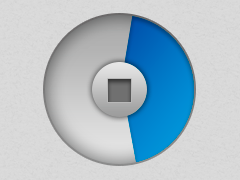
The Stop Button
 In order to allow users to stop the audio track, we need to create a dedicated button that will be placed exactly in the center of the circular progress bar shown on the back face:
* Create the stop button and update the getStopButton reference.
* @param {Object} config The configuration used to create the button.
* @private
*/
applyStopButton: function(config) {
return Ext.factory(config, Ext.Button, this.getStopButton());
},
/**
* Update the Stop button creating the new one and destroying
* the old one if any.
* @param {Ext.Button} newButton The new button created.
* @param {Ext.Button} oldButton The old button that eventually already exists.
* @private
*/
updateStopButton: function(newButton, oldButton){
if (newButton) {
newButton.renderTo(this.progressEl);
newButton.on(‘tap’, ‘showFront’, this);
}
else if (oldButton) {
oldButton.destroy();
}
}
The “applyStopButton” is called automatically when the component renders. It is sent as the only param of the default configuration object we specified inside the “stopButton” config.
In this case, we are going to create and return an “Ext.Button” component and pass the default configuration to the “Ext.Factory” function. This function is really awesome because it allows us to update a reference function that, in our case, will be “getStopButton”. In this way, if you want to retrieve the newly created stop button, and update, for instance, its UI config from “white” to “action”, you can easily do that through the following line of code:
where “<CMP>” will be the “Ext.tux.AudioCover” component you want to update.
Let’s bring the Progress Bar to life
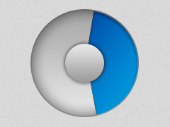 The last function we need to define in our component is the one that will constantly synchronize the slices rotation with the audio file play time, the “onUpdateTime” function:
* Core component function used to synchronize the slices
* rotation to simulate the progress effect.
* This function is called everytime the Media element changes
* is current time.
* @param {Ext.Media} media The linked media element.
* @param {Number} time The current media time in seconds.
* @private.
*/
onUpdateTime: function(media, time){
var deg1 = 0,
deg2 = 180;
if(time === 0) {
return;
}
// Let’s calculate the new slice rotation
var sliceDeg = (time * 360) / this.getDuration();
if(sliceDeg === 0) {
return;
}
/* If the current time passed the half, we need to rotate
* the second slice instead of the first one. */
if(sliceDeg > 180) {
deg1 = 180;
deg2 = sliceDeg;
}
else {
deg1 = sliceDeg;
}
// Rotate the slices to simulate to synchronize the progress
this.slice1.setStyle(‘-webkit-transform’, Ext.String.format(‘rotateZ({0}deg)’, deg1));
this.slice2.setStyle(‘-webkit-transform’, Ext.String.format(‘rotateZ({0}deg)’, deg2));
}
Even in this case, the logic behind this code is really easy. The calculation is made using a simple mathematical proportion where “time” is the current track playtime (1 second, 30 seconds, etc.), 360° is the maximum possible rotation value, and using “this.getDuration()” we get the total duration of the audio track.
Using this small snippet, we now know how much one of the two slices needs to be rotated, but we still don’t know which one. In order to completely cover the 360° of the circular progress bar, we need to use two slices elements where each slice can be rotated a maximum of 180° (because of the CSS clip rule that we are going to define). For this reason, if the rotation value that we got with the above calculation is less than 180°, we need to rotate the first slice, otherwise we will rotate the second one.
Due to the CSS clip rules that we are going to define, if the first slice has a rotation equal to 0 it will be completely hidden, likewise a rotation of 180° will make it completely visible. If the second slice has a rotation of 180°, it is completely hidden, while a rotation of 360° makes it completely visible. When the rotation value is greater than 180°, the first slice needs to keep its rotation to 180°, and we need to update the rotation of the second one. If we don’t keep the rotation of the first slice to 180° when we update the second one, we would have weird rendering issues where the right half of the circular progress bar would appear white, and the second half would start to turn blue. In this way, our TUX will show a smooth circular progress that will cover all of the available 360°.
Final considerations on the code
Now we can finally and proudly say that the source code of our component has been completed. Sencha Touch is an extremely flexible framework and really easy to customize, so the next time you start to build a new web app don’t limit yourself to using only default components. Extend your creativity by building something original that will give your application a unique look.
Going back to our component, we still have to take care of the CSS definition. In the final part of our tutorial, we’ll wrap up with a review of the styling used for Ext.tux.AudioCover to make it not just a great functional component, but one that looks polished and production-ready as well.
What's your reaction?
 0
0

 0
0

Latest Content
Discover the Top 07 Architecture Patterns used in Modern Enterprise Software Development
Developing software without an architecture pattern may have been an option back then. However, that’s…
April 11, 2024

JavaScript Design Patterns: A Hands-On Guide with Real-world Examples
As a web developer, you know how popular JavaScript is in the web app development…
March 26, 2024
Virtual JS Days 2024のハイライト
2024年2月20日~22日、第3回目となる「Virtual JavaScript Days」が開催されました。JavaScript の幅広いトピックを採り上げた数多くのセッションを実施。その内容は、Senchaの最新製品、ReExt、Rapid Ext JSまで多岐にわたり、JavaScriptの最新のサンプルも含まれます。 このカンファレンスでは多くのトピックをカバーしています。Senchaでセールスエンジニアを務めるMarc Gusmano氏は、注目すべきセッションを主催しました。Marc は Sencha の最新製品「ReExt」について、詳細なプレゼンテーションを実施。その機能とメリットを、参加者に理解してもらうべく詳細に説明しました。 カンファレンスは、Senchaのジェネラルマネージャを務めるStephen Strake氏によるキーノートでスタートしました。キーノートでは、会社の将来のビジョンについての洞察を共有しています。世界中から JavaScript 開発者、エンジニア、愛好家が集まるとてもエキサイティングなイベントとなりました。これは、JavaScript…
March 25, 2024


