

 Rapid Ext JS (beta)
 ReExt
ReExt


Building Sencha Touch Custom Components, Part 3
November 16, 2012
103 Views
 In the final part of our tutorial series on Sencha Touch components, we’ll cover styling for our Ext.tux.AudioCover component. Over the last few posts, we’ve walked through the component’s code development, which you can find posted here and here, but now we want to customize our component’s look. In this case, we are proving to our fellow native developers that we can easily create a component in HTML5 that has not only the functionality of native, but the feel of it as well. We’ll start by defining our Sass file.
The Sass File
In order to finally complete our component development, we need to define our Sass file. Once compiled with the rest of the application theme, it will provide all the component element styles required to correctly render the user interface.
If you are not too familiar with Sass, I suggest you to take a look at one of the tutorials on the official website.
The mixin definition
The first thing to do with Sass when you start to develop a custom component is to create a dedicated “mixin”. This is important because a “mixin” easily allows you to define a standalone block of CSS rules that can be included inside other CSS classes, or, in our case, directly in the application theme.
You have to consider the “mixin” definition as a master rule because the framework already uses these “classes” for every default component. For example, we have a “mixin” for the “Ext.Panel” component, another one for the “Ext.Button” one and so on. By using this rule, maintenance of your component will be easier, and your application code will appear more clear and readable to other developers because they will immediately know where to find all the styles related to the TUX. So, let’s proceed by taking a look at how to define a “mixin”:
/**
* Includes Ext.tux.AudioCover styles.
*
* @member Ext.tux.AudioCover
*/
@mixin sencha-tux-audiocover {
}
Now, all we need to do is include our new mixin inside the Sass file which includes all the other mixins related to the default Sencha Touch components. In most cases, the file I’m talking about is “app.scss”:
@include sencha-tux-audiocover;
Make sure you include all the required .scss files.
When you compile the application theme, you will notice that nothing has really changed in the output CSS file. Don’t worry, this happens because we still need to specify some CSS classes inside our mixin. So, let’s start to define some variables for “cardEl” which has the CSS “x-flip-card” class applied to it.
The Variables
This is a pretty complex component from a graphical point of view, so we need a little help in order to correctly build the UI. For this reason, we are going to define some variables that will help us simplify the process.
As we have described previously, all the circular elements which compose the progress bar should be placed exactly at the same position and have the same size. If, for instance, we would like to change the size of the outer “cardEl”, we should also manually change all these rounded elements’ size and margins. But don’t worry, thanks to the variables we are going to define, we only need to change a single value in order to automatically update all these nodes. This is true because size, position and margins will be automatically calculated and updated at compile time, using as a reference the container element attributes instead of having some pre-defined static values.
Let’s proceed with the definition of all these variables.
/**
* Includes Ext.tux.AudioCover styles.
*
* @member Ext.tux.AudioCover
*/
@mixin sencha-tux-audiocover {
$size: 50px;
$margin: 5px;
$button-size: ($size * 40) / 100;
$button-icon-size: ($size * 15) / 100;
}
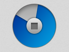
The explanation of the above block of code is really simple and intuitive: The “$size” variable defines the size of the container “coverEl” node and, consequently, all of the circular elements which compose the progress bar.
The variable “$button-size” provides us the size of the stop button that will be equal to 40% of the size of the “cardEl”, and the last “$button-icon-size”, which specifies the stop button icon size, will be 15% of the size.
We can now proceed with defining the styles of both the “cardEl” and its child elements.
The cardEl and its faces
Let’s take a look inside our custom “mixin” and review the following variable definitions:
.x-tux-audiocover {
.x-flip-card {
width: $size;
height: $size;
-webkit-transform-style: preserve-3d;
-webkit-transition: -webkit-transform 1s;
.x-face {
position: absolute;
width: 100%;
height: 100%;
-webkit-backface-visibility: hidden;
&.x-front {
background-size: 100% 100% !important;
border: solid 1px #d4d4d4;
}
&.x-back {
@include display-box;
@include box-pack(center);
@include box-align(center);
-webkit-transform: rotateY(180deg);
-webkit-box-sizing: border-box;
}
}
}
}
Looking at the above code, you’ll notice that the root class of our “mixin” is the “x-tux-audiocover”, exactly like the “baseCls” cachedConfig we have set in the template definition. By doing this, all the styles that we define inside our class will only be relative to this component.
Now, starting from the “x-flip-card” class, notice how its size is set by the “$size” variable. In addition, we also need to include a rule that will preserve the 3d transform of all its children and set the animation speed to one second. In case you want to slow down or speed up the flip animation, all you have to do is to change this value.
These faces will be positioned using the “absolute” property inside their “cardEl” container with their width and height set to 100% and the back faces set to hidden. In this way, we will avoid weird rendering issues that could occur during the flip transition.
It’s also important to notice the CSS rule is set to the “x-front” class which causes the background image to stretch horizontally and vertically and completely cover the element size, and the box layout/properties set to the progress bar “x-back” container class allows us to perfectly center all the progress bar children inside the back face.
Lastly, don’t forget that this face should be placed back to back to the front one, and rotated 180° degree on the Y axis. This will give our component a touch of three dimensionality.
The Stop Button
Like all the other elements that compose this TUX custom UI, even the stop button requires some additional styling to perfectly fit inside the progress bar center region and have the right icon size. The only thing you have to keep in mind is that since the stop button will be placed inside the back face, we have to specify all of its styles directly as children of the “x-back” class.
…
&.x-back {
@include display-box;
@include box-pack(center);
@include box-align(center);
-webkit-transform: rotateY(180deg);
-webkit-box-sizing: border-box;
.x-button {
@include border-radius($size);
min-height: $button-size;
width: $button-size;
height: $button-size;
.x-button-icon {
width: $button-icon-size;
height: $button-icon-size;
-webkit-mask-size: $button-icon-size;
-webkit-mask-repeat: no-repeat;
margin: 1px -3px;
background: #4F4F4F;
}
}
…
Finally, because we wanted this button to use a custom “UI” and icon, we need to define those in order to correctly render:
@include pictos-iconmask(‘stop’);
With this simple instruction, we are including the icon mask that will be used as the small square icon that is usually shown on stop buttons.
@include sencha-button-ui(‘white’, #FFF);
Here we are using Sass to create a custom button UI which will use a custom white background color. At this point, we are done with the Stop button.
Shared styles
As we have already mentioned, all the elements that compose the progress bar need to have the same position, size and circular shape.
For this reason, to avoid repetition of the same CSS styles, we are now going to define a set of rules that will be applied to the “progressEl” (with the base CSS class set as “x-progress”), the “x-slice” container elements and their children div.
…
.x-progress, .x-progress .x-slice, .x-progress .x-slice div {
@include border-radius($size / 2);
position: absolute;
top: 0;
left: 0;
width: $size – ($margin * 2);
height: $size – ($margin * 2);
}
…
Because all these elements are relative to the back face, don’t forget to define these styles inside the “x-back” root class.
Closing with the Slices
We still need to define the most important styles related to the slices elements and their children, so let’s analyze the last bunch of rules together.
.x-progress {
@include display-box;
@include box-pack(center);
@include box-align(center);
margin: $margin;
background-color: #FFF;
border: solid 1px #BBB;
.x-slice {
&.x-half {
clip: rect(0px, $size, $size, $size / 2 – $margin);
div {
clip: rect(0px, $size / 2 – $margin , $size, 0);
@include rotate(0deg);
}
}
&.x-end {
clip: rect(0px, $size / 2 – $margin, $size, 0);
div {
clip: rect(0, $size / 2 – $margin , $size, 0);
@include rotate(180deg);
}
}
div {
background-color: #3f89ee;
}
}
}
Starting with the “x-progress” class, notice how we have set the same box layout of the “x-back” element, paying attention to the fact that all of its children will be perfectly centered and aligned inside it.
You’ll also notice that we have applied the “clip” rules to the “x-slice” children, as illustrated in previous paragraphs.
Lastly, for the “slice1” and “slice2” nodes (which have the base CSS class set to “x-half”) we have set a blue background color. In this way, when these two elements rotate according to the audio file play time, their fill color will slowly take the place of the empty white one, simulating the progress bar motion.
Preview and download
We have reached the end of this tutorial. I really hope that it was easy to understand, you enjoyed it and the information has stirred your creativity, so you will start to develop your first custom component. Please, always keep in mind that Sencha has a large community, so don’t forget to share your work, when possible. Below you’ll find links for this extension in the Sencha Market, the GitHub project repository, and a live example of the extension in use.
What's your reaction?
 0
0

 0
0

Latest Content
Discover the Top 07 Architecture Patterns used in Modern Enterprise Software Development
Developing software without an architecture pattern may have been an option back then. However, that’s…
April 11, 2024

JavaScript Design Patterns: A Hands-On Guide with Real-world Examples
As a web developer, you know how popular JavaScript is in the web app development…
March 26, 2024

Virtual JS Days 2024のハイライト
2024年2月20日~22日、第3回目となる「Virtual JavaScript Days」が開催されました。JavaScript の幅広いトピックを採り上げた数多くのセッションを実施。その内容は、Senchaの最新製品、ReExt、Rapid Ext JSまで多岐にわたり、JavaScriptの最新のサンプルも含まれます。 このカンファレンスでは多くのトピックをカバーしています。Senchaでセールスエンジニアを務めるMarc Gusmano氏は、注目すべきセッションを主催しました。Marc は Sencha の最新製品「ReExt」について、詳細なプレゼンテーションを実施。その機能とメリットを、参加者に理解してもらうべく詳細に説明しました。 カンファレンスは、Senchaのジェネラルマネージャを務めるStephen Strake氏によるキーノートでスタートしました。キーノートでは、会社の将来のビジョンについての洞察を共有しています。世界中から JavaScript 開発者、エンジニア、愛好家が集まるとてもエキサイティングなイベントとなりました。これは、JavaScript…
March 25, 2024


