

 Rapid Ext JS (beta)
 ReExt
ReExt


Exploring the Layout System in Ext JS 5 and Sencha Touch
April 24, 2014
162 Views
 The layout system is one of the most powerful and unique parts of Sencha frameworks. Layouts handle the sizing and positioning of every Component in your application. Ext JS and Sencha Touch have many similarities between them, and Ext JS 5 now supports tablets as well. Let’s take a look at how the layout system works across the Sencha frameworks.
A Short History of Layouts
Bare HTML has always lacked a rigidly defined layout system. For many years, developing websites and applications that rendered consistently across browsers was very challenging because of a gap in CSS implementations — some industry veterans may recall having to write different “float” rules for different platforms to achieve something as simple as two-column layouts.
Frameworks including Ext JS and Sencha Touch were created specifically to help alleviate these cross-browser issues, ensuring that developers could spend more time adding features and less time nitpicking CSS differences. As many new HTML and CSS standards have matured and been adopted by browser vendors, the Sencha frameworks have also grown to support these standards while maintaining backwards compatibility for older legacy platforms.
Both Ext JS 5 and Sencha Touch provide abstracted cross-platform layout systems. This is accomplished in different ways behind the scenes, but the surface API is nearly identical for the shared layouts. The general idea is to eliminate the tedious work associated with implementing complex layouts by using a clean and concise JavaScript API.
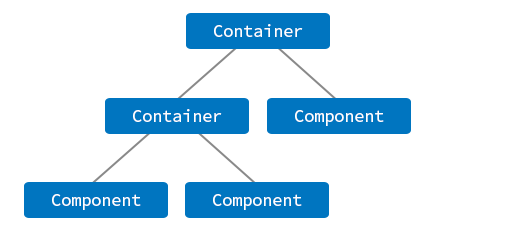
Sencha applications are comprised of Components; a Container is a special type of Component that can contain other Components inside various types of “layouts”. By layering Containers and Components, we can build robust interfaces quickly and easily without having to worry about cross-browser quirks.
The Similarities
While Ext JS and Sencha Touch target different platforms, they are both HTML5 frameworks, and many of the higher-level concepts remain the same. Because the paradigm for building web apps is shared between Ext JS and Sencha Touch, developers familiar with one framework can easily understand the other. Layouts are no exception.
As of Sencha Touch 2.3.1 and Ext JS 5.0.0 beta, the following layouts are supported by both frameworks:
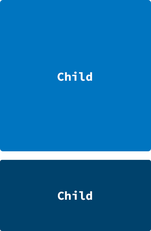
Fit
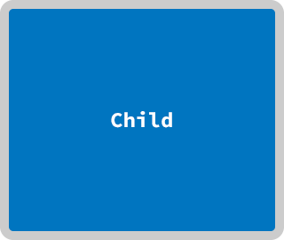
A single child occupies all of its parent’s space (Touch)(Ext JS)
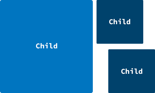
Card
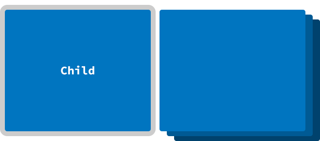
Similar to Fit, but with multiple children inside of a container, and only one child is visible at any given time; this is used by Tab Panels (Touch)(Ext JS)
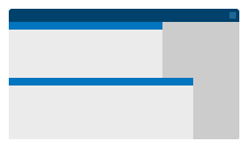
HBox
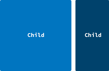
Children are positioned horizontally (Touch)(Ext JS)
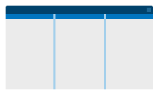
VBox
Children are positioned vertically (Touch)(Ext JS)
Float (Touch) / Absolute (Ext JS)
Children are positioned via top/left or x/y coordinates
The JavaScript API for utilizing these layouts is almost identical between Ext JS and Sencha Touch. For example:
Ext.create(‘Ext.Container’, {
layout : ‘hbox’,
items : [
//…
] });
// Ext JS 5.0.0
Ext.create(‘Ext.container.Container’, {
layout : ‘hbox’,
items : [
//…
]
});
As you can see, there are some differences in the Ext JS and Sencha Touch APIs, but the APIs related to layouts are essentially the same.
The Differences
The range of supported devices is notably different between Ext JS and Sencha Touch, and the differences in the layout systems can be attributed mainly to the UI/UX considerations specific to the targeted platforms.
Ext JS has historically leaned towards desktop computers, but now also supports tablets in Ext JS 5. Sencha Touch, on the other hand, provides an experience more suited towards mobile devices (phones, tablets, and other touch-screens).
As a result, the layout system in each framework does have marked differences. The most obvious difference is that some layout classes exist in one framework but not the other (see below). Other differences are harder to see because they go all the way down to how some of the shared layouts are implemented at the HTML level.
Ext JS-only Layouts
Border
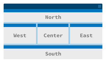
A typical starting layout for most apps, containing north, south, east, west, and center regions; typically set on the Viewport (Ext JS)
- Sencha Touch support of “docking” components lets you achieve the same (Touch)
Table
Children are positioned into rows and columns (Ext JS)
Column
Similar to HBox or Table without rows (Ext JS)
Anchor
Similar to VBox, but intended for scrollable content (Ext JS)
Form
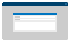
For easy positioning of form fields (Ext JS)
- Note: Ext JS 5 introduced some improvements to the Form layout.
Center
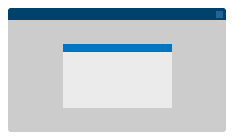
For centering a single child inside a parent (Ext JS)
Comparing HBox in Ext JS 5 vs. Sencha Touch
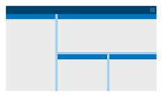
Box layouts are perhaps the most popular layouts in Ext JS and Sencha Touch because they are easy to use and are very powerful at positioning components horizontally or vertically. Box layouts automatically handle the horizontal or vertical sizing of Components, which is especially helpful when Components require a flexible height or width (via the “flex” config).
Let’s take a deep dive into the HBox layout to see how Ext JS and Sencha Touch approach the same concept in different ways.
Consider the following scenario, where we have two Components aligned horizontally inside a Container:

The JavaScript code is virtually identical in both Ext JS 5 and Sencha Touch:
xtype : ‘container’,
layout : ‘hbox’,
style : ‘background: gray;’,
padding : 10,
defaults: {
xtype : ‘component’,
height : 100
},
items: [{
style : ‘background: yellow;’,
width : 100
}, {
style : ‘background: green;’,
flex : 1
}]
}
You can also view the examples in Sencha Fiddle:
- Ext JS 5: https://fiddle.sencha.com/#fiddle/4uv
- Sencha Touch: https://fiddle.sencha.com/#fiddle/4v0
Now, let’s take a look behind the curtain and inspect how the frameworks render the physical DOM (using Google Chrome).
First, let’s look at Ext JS 5 markup:
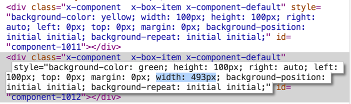
The two DIVs above are the yellow and the green squares, respectively. Though not shown in the screenshot, both have position: absolute set. Notice that the second DIV has left: 100px and width: 493px set.
Looking at our earlier JavaScript code, we specifically assigned a width of 100px to our yellow Component, but we wanted the green Component “flex” to fill the rest of the parent’s width (in this case, 493px). Ext JS handled all of the calculations for us, so again we don’t have to worry about any cross-browser quirks. (We’ll revisit the idea of “calculated” layouts in a moment.)
Now, let’s take a look at Sencha Touch markup:
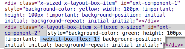
Yet again, we have two DIVs: the yellow and the green squares, respectively. Notice that the second DIV has webkit-box-flex: 1 set. Though not shown in the screenshot, the parent DIV has display: -webkit-box; set.
If you are not familiar with the CSS3 flexbox, it is a pretty mature CSS3 spec implemented by all modern browsers. It lets you easily position and size children in a variety of ways that previously required far too much HTML and CSS trickery.
Thus, Sencha Touch offloads the “flex” calculations of our green Component to the browsers’ native layout engine (via CSS flexbox) rather than utilizing JavaScript to calculate and position the elements manually.
The immediate question that pops up is “Why isn’t Ext JS using CSS3 flexbox?”
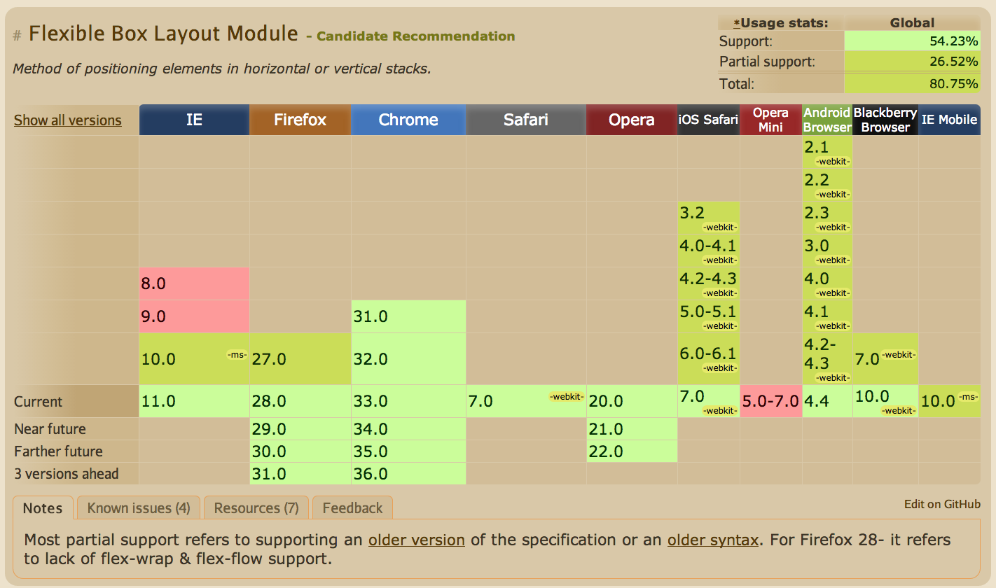
The answer is rather simple: platform support. Sencha Touch is targeting only mobile browsers, where all of the supported platforms implement the CSS3 flexbox specification. Ext JS 5 supports many legacy browsers, and we can see in the graphic below that many browsers still in use today don’t support CSS3 flexbox.
To compensate for the fact that the framework has to spend additional time calculating layouts, Ext JS allows us to suspend and resume layouts at any point during application runtime.
// do stuff…
Ext.resumeLayouts(true);
Using this optimization technique will usually improve performance for Ext JS applications because we can avoid making many modifications to the DOM tree at once. This is particularly important on mobile devices (e.g. tablets) as they typically have less powerful processors compared to desktop computers.
Conclusion
As you can see, the driving force behind each framework’s layout implementation is the web standards supported by the target platforms. Ext JS 5 has taken a huge step forward by expanding support for tablets, borrowing concepts that have been proven to work in Sencha Touch.
In spite of the under-the-hood differences between Ext JS and Sencha Touch, the two frameworks have consistent APIs for their layouts and now share many other core parts of their libraries (like data, charts, and more). See our What’s New in Ext JS 5 guide for more details.
Additional Reading
- Ext JS 5 Layout Examples
- Ext JS 4 Layout Guide (still applicable to Ext JS 5)
- Sencha Touch Layout Guide
- A Complete Guide to CSS Flexbox
What's your reaction?
 0
0

 0
0

Latest Content

How to Write Unit Tests with Sencha Test
In modern software development, unit testing has become an essential practice to ensure the quality…
April 22, 2024

Discover the Top 07 Architecture Patterns used in Modern Enterprise Software Development
Developing software without an architecture pattern may have been an option back then. However, that’s…
April 11, 2024

JavaScript Design Patterns: A Hands-On Guide with Real-world Examples
As a web developer, you know how popular JavaScript is in the web app development…
March 26, 2024


