

 Rapid Ext JS (beta)
 ReExt
ReExt


New Themes in Sencha Touch 2.2
May 14, 2013
114 Views
Sencha Touch 2.2 provides new capabilities for theming. Themes let you customize the CSS in your application for different platforms. A platform can be a different browser such as Chrome, Internet Explorer 10, or Safari, or a device category such as Android, iOS, BlackBerry 10, Windows Phone, or Microsoft Surface Pro or RT. With Sencha Touch, your application can detect which platform is in use and apply the appropriate theme for the platform. This way Sencha Touch gives you the power to customize your application’s appearance for the browsers or devices on which it runs.
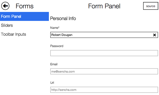
Windows Phone theme example:
Sencha Touch provides a base theme that you can customize, or built-in themes for Sencha Touch, Internet Explorer 10, and BlackBerry 10 devices. You can create themes using Sass, which installs for you with the new Sencha Cmd 3.1. Sencha Cmd works with Ruby 1.9.3 to provide Compass and Sass for managing the packaged themes or creating custom themes for your applications.
You can use the base theme as a starting point. The base theme contains minimal styling information for just the framework. From there, you can build your own custom theme using your CSS.
In the following example taken from an application’s app.json, the Apple theme loads if the platform is iOS.
{
“path”: “resources/css/sencha-touch.css”,
“platform”: [“ios”],
“Theme”: “Apple”
} ]
You can test themes by using the theme parameter in the URL when running your app:
http://localhost/sdk/touch/examples/kitchensink/index.html?theme=Apple
Platforms
Platforms give you the ability to load specific resources in your app based on the platform your app is running on. In the following example, the sencha-touch.css file is available if the platform is Chrome, Safari, iOS, Android, or Firefox:
{
“path”: “resources/css/sencha-touch.css”,
“platform”: [“chrome”, “safari”, “ios”, “android”, “firefox”] } ]
You can also specify multiple platforms, and use it to load JS resources. The following example loads the vendorfiles.js resource if the platform is Chrome, Safari, or iOS:
{
“path”: “vendorfiles.js”,
“platform”: [“chrome”, “safari”, “ios”] } ]
Each of these examples only loads the resource if the platform of the device running the application matches a platform that you specify for the resource. You can use the ?platform parameter in a URL to test platform functionality.
The following example URL tests for Internet Explorer 10:
http://localhost/sdk/touch/examples/kitchensink/index.html?platform=ie10
You can also detect which platform the device is running on from within your application by using the platformConfig function.
The list of available platforms are:
- Phone
- Tablet
- Desktop
- iOS
- Android
- BlackBerry
- Safari
- Chrome
- IE10
- Firefox
Icons
One element of themes in Sencha Touch 2.2 is the new use of icons as fonts. Previously, scaling icons required a great deal of overhead where the application had to draw the picture for the icon and then redraw, rescale, and change it as the app appeared on different browsers and devices.
An icon can be like this button symbol:
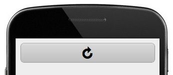
New in Touch 2.2, icons are now handled as fonts, which enables very fast scaling without the need to redraw the picture. Icons appear on buttons and tabs.
To convert your existing icons to fonts, you can use Pictos Server, Pictonic, icomoon.io, or http://fontstruct.com/ — some of these are free or available with trial subscriptions.
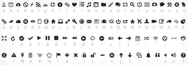
Using the Pictos Font
The Pictos font provides a large collection of free icons. You can find a full list of characters available for the Pictos font at http://www.pictos.cc. Sencha Touch provides free access to the Pictos Font Pack:
When you build your application using Sencha Cmd, the font libraries are copied to your application file.
Sencha Touch conveniently maps icon names to actual icons, so you can use them within your application.
Here’s an example:
Alternatively, you can use the Compass icon mixin to map a specific character of the icon font to an iconCls which you can use in your app:
Using Other Icon Fonts
The Pictos font is not the only font you can use in your application. If you know of another font or you have custom converted your icons to fonts, it is very easy to use that font with the icon mixin.
Just like with the Pictos font, you need to specify the iconCls and character to be used for the icon. Additionally, you need to specify the name of the icon font, which needs to match the font family of the icon font you have, plus you need to make sure the font has been included in your CSS using the icon-font mixin.
This example specifies the Home icon in the custom MyFont:
The following example shows how to include the Pictos font using the icon-font mixin:
The first parameter is the name of the font face, which must match the name you use as the CSS font-family. The second parameter uses the inline-font-files Compass function to base64-encode the font file inline into the CSS file with paths to the WOFF, TTF, and SVG versions of the font files.
Here’s a good list of other icon fonts (some paid and some free): http://css-tricks.com/flat-icons-icon-fonts/
Conclusion
With the new Sencha Touch themes, you have the power you need to target your applications to specific mobile devices and platforms. Themes and icons help make your applications visually appealing with better performance. With the Sencha Touch themes, you can portray your application consistently across a wide range of device types. Consistency helps reduce documentation and support needs, so you reduce costs and can focus on building new features.
What's your reaction?
 0
0

 0
0

Latest Content
Ext JS Dynamic Forms: Hands-On Guide to Create Data Forms
Dynamic forms are changing the online world these days. ExtJS can help you integrate such…
April 23, 2024

How to Write Unit Tests with Sencha Test
In modern software development, unit testing has become an essential practice to ensure the quality…
April 22, 2024

Discover the Top 07 Architecture Patterns used in Modern Enterprise Software Development
Developing software without an architecture pattern may have been an option back then. However, that’s…
April 11, 2024


