

 Rapid Ext JS (beta)
 ReExt
ReExt


Using Ext JS Components in Your React Apps – Part 2
April 12, 2017
118 Views
Enhancing the Grid and Adding Other Components
In part 1 of this series, we explained how to get started with Ext JS components in your React app, and built a sample Hacker News app that leveraged the Ext JS Grid. In this installment, we’ll enhance our use of the grid, so it is more useful. We’ll also add more navigation and visualization components.
If you haven’t already, please start at the beginning of this series and follow the instructions to download and build the sample app.
Augmenting the Grid (Tag v1.2)
One of the big benefits of using enterprise-grade Ext JS components, including the Grid, is that you can leverage built-in functionality such as sorting and filtering. The Ext JS Grid is designed to scale from dozens to millions of rows without excessive client-side memory or processing overhead.
Our original implementation listed the articles with additional information including author, score, and posting date, so let’s add more information to our Grid. I’ll only add a single column, but the same approach can be used for any other fields available from the data source.
Recall that our data handling goes through the store before the Grid. The store basically translates the data returned from the server into objects that the Grid can manipulate. In order to add new fields, we’ll need to add them to both the store and the Grid.
Our data is passed to the store as a JSON string, so adding a new field is as simple as telling it which properties to use. Our old code just used the title and URL:
fields: ['title', 'url'],
The server already returns the other fields, so including the points field is as simple as adding it to the fields member:
fields: ['title', 'url', 'points'],
Now, all three fields are available from the store, and we just need to add another column to the Grid’s columns prop:
{ text: 'Points', dataIndex: 'points', xtype: 'numbercolumn' }
Note that the column is titled “Points”, and it uses the property “points” from the store. By configuring it as a numbercolumn, the Grid knows to treat the values as numbers for the purpose of sorting and such.
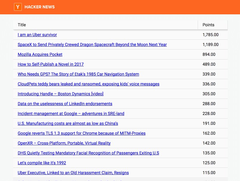
As you would expect, you can click on the column headers to sort by the values in that column. You can of course add additional controls to enable searching and filtering, or use advanced grid features such as in-cell editing, grouping, and customized row rendering. You can even configure the grid to handle sorting, filtering, and paging on the server to avoid overloading the client even if you’re working with tens or hundreds of millions of rows.
Adding More Components (Tag v2.0)
Now that we have a basic Grid to show the articles, let’s say we want to add a heatmap that shows when the articles were created by day and hour. Before we add the heatmap, we’ll first need to add a way to navigate between the Grid and the heatmap. The Ext JS TabPanel is perfect for this task.
Before we get into details, I’d like to point out that I took some shortcuts when adding these components. Normally, we recommend separating components into distinct files, so they are easier to organize and maintain. For brevity, I chose to implement these components within the existing app.js. When working on real projects, please adhere to best practices rather than taking shortcuts like I did here.
First, we’ll need to import Panel and TabPanel from Ext JS Reactor just like we did for the Grid earlier. I renamed the existing App component from App to Frontpage, then replaced the App.render method to show our TabPanel.
return


       ;
Note the use of the imported TabPanel and Panel components, and the use of props to specify the component configurations. Note also that the Panels are nested inside the TabPanel, indicating that they are children of the TabPanel. You can have more tabs if you would like, and you can nest further components if desired (although we recommend leveraging components to encapsulate nesting and keep the render template relatively simple.) The title text for each tab is specified in the title prop for the Panel components, and each Panel contains another component, which renders the contents of that tab.
This doesn’t align directly with the v2.0 tag in the example project, so you can’t actually run the app until you’ve implemented the Heatmap component. If you were to run it, it would look something like this:
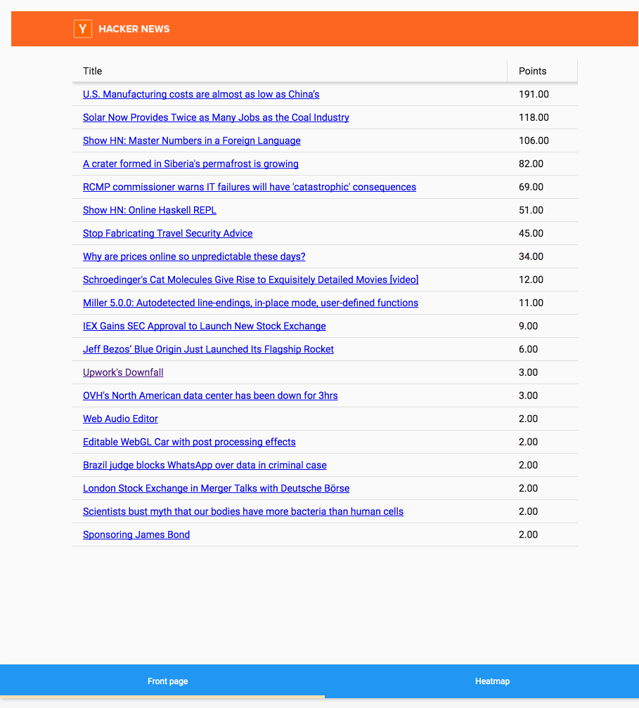
Note how the tabs appear at the bottom of the page like we configured them, and the tabs are titled properly.
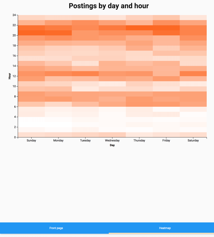
Now, we just need to implement the Heatmap component. This will be based on the Ext JS D3_Heatmap component, which uses the popular Data-Driven Documents (d3) library for data visualizations along with the Ext JS data infrastructure.
We start by importing D3_Heatmap just like we imported the TabPanel and Panel. Then, we define our Heatmap component. Because we’re using the babel plugin, we can actually leverage newer ES6-style classes rather than the React.createClass syntax we’ve used so far.
class Heatmap extends React.Component {
      constructor(props) {
	    super(props);
	    this.state = {
		  store: Ext.create('Ext.data.Store', {
			proxy: {
			      type: 'ajax',
			      url: '/rec_counts.json',
			      reader: {
				    type: 'json',
				    rootProperty:'count_by_day_and_hour'
			      }
			},
			autoLoad: true
		   })
	     };
      }
      render() {
	    return
Postings by day and hour
; } }
We use the constructor to initialize our store, similar to what we did with the Grid. Because our remote data source doesn’t actually contain this information, I mocked up a local data source with the heatmap data.
Our D3_Heatmap component gets the usual configuration props, plus some information about the axes to use in the visualization. When we run the app, it will render the visualization and pull data from the store automatically.
Note that the D3_Heatmap component requires an installation of Ext JS that includes the D3 integration – such as you would get with Ext JS Premium. You will also need to add ‘d3’ to the packages configuration for the ExtJSReactorWebpackPlugin.
By now, you’ve seen how simple it is to get started with Ext JS Reactor, adding full-featured, robust Ext JS components to your React project. Just add a few plugins, then start adding components and props as usual.
Don’t forget that Ext JS Reactor is compatible with other Sencha tools that improve productivity. For example, Sencha Themer enables you to easily define a complete, cohesive, consistent look and feel for Ext JS Reactor components in your React apps.
Next Steps
Try Ext JS Reactor on GitHub and share your feedback. We really appreciate all of the input community members have shared already.
What's your reaction?
 0
0

 0
0

Latest Content

Ext JS Performance Optimization for Large-scale Applications
Are you facing issues with Ext JS applications’ performance as they scale up? Don’t worry!…
April 23, 2024
Ext JS Dynamic Forms: Hands-On Guide to Create Data Forms
Dynamic forms are changing the online world these days. ExtJS can help you integrate such…
April 23, 2024

How to Write Unit Tests with Sencha Test
In modern software development, unit testing has become an essential practice to ensure the quality…
April 22, 2024


