Designing Responsive Applications with Ext JS
Get a summary of this article:

In today’s world, users expect to be able to use web applications not only on their desktop computers, but also their mobile devices, which come in all shapes and sizes. The requirement to make an application so adaptive can seem overwhelming. Fortunately Ext JS 5 provides all the tools needed to make your application conform to any screen size, shape or orientation.
Introducing responsiveConfig
With the new tablet support in Ext JS 5 comes “responsiveConfig”, a powerful new feature for making applications respond dynamically to changes in screen size or orientation. responsiveConfig is enabled using one of two classes:
- Ext.plugin.Responsive: Adds responsive capabilities to an Ext.Component
- Ext.mixin.Responsive: Adds responsive capabilities to any other class
Making Components Responsive
For performance reasons, Ext JS Components do not have responsive features enabled by default, so to make a Component responsive you’ll need to use the responsive plugin. Add the responsive plugin to the class body to make all instances responsive, or add it to the instance config to enable responsiveness for a single Component instance:
plugins: ‘responsive’
Once you have added the responsive plugin to your Component config, your Component will gain a “responsiveConfig” configuration option. responsiveConfig is simply an object with keys that represent conditions under which certain configs will be applied. For example, suppose your application has a Tab Panel, and you want the Tab Bar to be left aligned in landscape mode, but top aligned in portrait mode. You can use the words “landscape” and “portrait” as keys in the responsiveConfig object to dynamically set the Panel’s ‘tabPosition‘ config in response to device orientation change:
Ext.define(‘MyApp.view.Main’, {
extend: ‘Ext.tab.Panel’,
plugins: ‘responsive’,
responsiveConfig: {
landscape: {
tabPosition: ‘left’
},
portrait: {
tabPosition: ‘top’
}
},
items: [
{ title: ‘Foo’ },
{ title: ‘Bar’ }
]
});
Rules
Each key, or “rule”, in the responsiveConfig object is a simple JavaScript expression. The following variables are available for use in responsiveConfig rules:
- ‘landscape’ – True if the device orientation is landscape (always ‘true’ on desktop devices)
- ‘portrait’ – True if the device orientation is portrait (always ‘false’ on desktop devices)
- ‘tall’ – True if ‘width’ is less than ‘height’ regardless of device type
- ‘wide’ – True if ‘width’ is greater than ‘height’ regardless of device type
- ‘width’ – The width of the viewport
- height’ – The height of the viewport
You can combine these variables in a variety of ways to create complex responsive rules. For example, the following responsiveConfig hides a Component if the viewport is less than 768 pixels wide and the viewport’s height is greater than its width:
responsiveConfig: {
‘width < 768 && tall’: { visible: true }, ‘width >= 768’: {
visible: false
}
}
Which Configs Can Be Responsive?
Internally, the framework monitors the viewport for resize and orientation change, and it re-evaluates all of the responsive rules whenever either one of these events occurs. Any matching rules will have setters called for all of their configs. This means that in order for a configuration option to be used with responsiveConfig, it must have a setter. In the above example, we can use “visible” as a responsiveConfig because Ext.Component has a setVisible() method.
Making Classes Responsive
responsiveConfig is most useful for Components, but sometimes you may find the need to make other classes respond to screen size as well. For classes other than Ext.Component, this is accomplished by mixing in Ext.mixin.Responsive. For example, an instance of the following class will have its “foo” config updated whenever the screen shape changes from “wide” to “tall” or vice versa:
Ext.define(‘MyClass’, {
mixins: [‘Ext.mixin.Responsive’],
config: {
foo: null
},
responsiveConfig: {
wide: {
foo: 1
},
tall: {
foo: 2
}
},
constructor: function(config) {
this.initConfig(config);
},
updateFoo: function(foo) {
console.log(foo); // logs “1” or “2” as screen shape changes between wide and tall
}
});
Try it Out
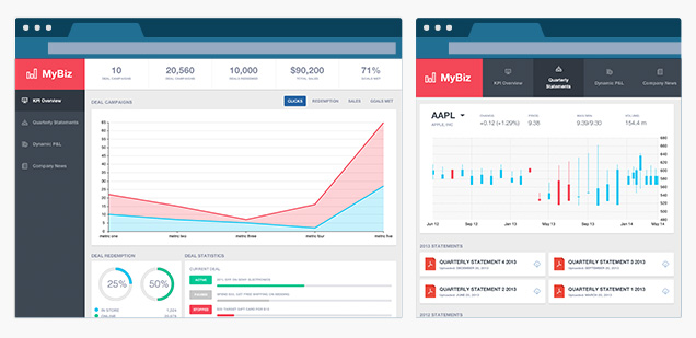
We wanted to make sure that the new responsive design features of Ext JS could stand the test of a real-world application, so we built an application that leverages responsiveConfig to adapt to a wide range of screen sizes and orientations on both desktops and tablets. The app can be found here.
Try resizing your desktop browser window, or rotating your tablet, and look for the following changes to the application’s presentation and layout:
- Main navigation is positioned to the left in “wide” mode and to the top in “tall” mode
- Tab icons are aligned to the top in “tall” mode, and to the left in “wide” mode
- Tab text is centered in “tall” mode and left aligned in “wide” mode
- In “tall” mode if the screen becomes too narrow for the navigation bar, an overflow menu tool will display, and the navigation items will display in a menu.
We’re sure that these new features of Ext JS 5 will make the task of developing cross-device applications a lot easier, and we hope you’ll give it a try. Who knows, you might even have fun!

In the modern web development landscape, the ability to leverage existing solutions is a superpower.…

This guide covers the technical steps for upgrading Ext JS 7.x applications to 8.0. Upgrading…

This guide covers the technical steps for upgrading Ext JS 6.x applications to 8.0. Upgrading…


