


 Ask Sencha AI
How to Build a Great Looking Universal App with Ext JS – Part 1
October 21, 2015
3387 Views
Get a summary of this article:
Background
Back in 2011, I wanted to create an app. I love music, and I am a huge fan of Spotify. I love that I can listen to a huge database of songs. The only thing that always bothered me was that I had to manually search for songs. That’s fine when I’m using my laptop, but it’s not so great when I’m walking or biking, and I use Spotify on my phone. Typing on a virtual keyboard is just not fun.
So, I created a Sencha Touch app that could connect to my LastFm account (an online database that can “scrobble” and save music that you’ve listened to). My app lists all the music I like, and with one button tap, I can play the song in Spotify.
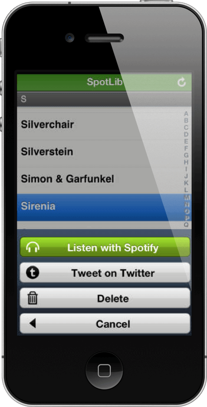
Sencha Touch was great for building this app. It has a powerful, smooth scrolling list and stylesheets that make my app look great on my iPhone. It was quick to build and ready to use.
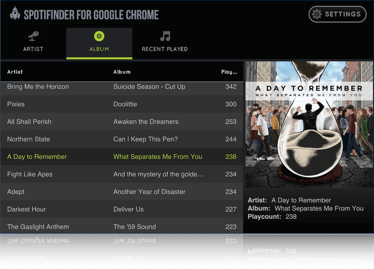
I liked this app so much that I decided to share it. I deployed my app in the Apple App Store, by wrapping it with Cordova. Then, I noticed I was also using it on my desktop. It was just easier to choose songs, so I deployed my app on my webserver and hosted it in the Google Chrome Web Store.
A week later, I checked my reviews on the Chrome Web Store. I was heartbroken to see that I only had bad reviews: “What a weird looking app” and “Why can’t I use the mouse wheel to scroll?” It totally made sense though – my app was originally designed for iPhones. It looked like an iPhone app because of the stylesheet, but it behaved like a touch app because it was built with Sencha Touch using Touch events & gestures. To scroll the music list, users had to tap the list and drag it up or down. That works great on touch devices, but it’s odd on a desktop. I realized that I needed a desktop version of my app too.
That was when I started to play around with Ext JS, which is a great framework for creating desktop applications. It has fast performing desktop components like the grid, and a similar MVC architecture and class system as in Sencha Touch 2. I created the desktop version, and later I migrated my Ext JS 4 app to Ext JS 5. I chose Ext JS 5 because I wanted to clean up my code and use the new MVVM pattern, and also use touch events, responsive design, and stylesheets for a tablet version of my app. But when I realized I had to maintain two different code bases, with two frameworks, I turned to Ext JS 6.
Now, with Ext JS 6, you can create universal apps. With one codebase, your apps run on any supported device type.
Tech Specs of My App
Before we move on, here are some technical specs for how my app works.
- To play songs in Spotify, I use URL Schemes.
- To retrieve data from LastFm, I use an external JavaScript API, that must be in a custom written proxy, which is part of a package.
- The LastFm username is saved in the HTML5 browser local storage.
- Phones will get modern touch components, for now just iOS views.
- Tablets and desktops will get rich classic desktop components, with a Spotify look & feel.
- MVVM pattern is used.
Universal Apps vs Responsive Web Design
There are differences in how Universal Apps work in Sencha frameworks, and how Responsive Web Design is used for mobile websites to respond to certain environments.
Responsive Design for websites is usually done within a stylesheet using relative units, values in percentages, and breakpoints (mediaqueries) that can re-order and show/hide certain HTML elements.
Take a look at the code snippet below:
@media all and (min-width: 800px) and (max-width: 1024px) {
 ul li.products {
 	width: 50%;
	display: inline-block;
 }
}
@media all and (min-width: 1025px) {
 ul li.products {
 	width: 25%;
display: inline-block;
 }
}
@media all and (max-width: 799px){
 ul li.products {
 	display: none;
 }
}
The previous code example has a few breakpoints. Small screens with a viewport width smaller than 799px, screens between 800px and 1024px, and large viewports with screens wider than 1025px. On big screens, there are list elements positions next to each other with a size of 25% width. For medium screens it’s 50%, and for small screens (such as phones), the list will be hidden.
This technique is great for websites, but not for real world applications. Why?
- When you are on a mobile phone, chances are that you are on a slow mobile network or using an (expensive) data plan. That’s very expensive, and you’re not even seeing these elements and data.
- Also, you may want to change the text on a smaller screen size. I’ve worked a lot with copywriters, and they believe that text on a phone should be written differently than what’s on a desktop. Nobody likes to read whole books of text on a small screen.
- By using only responsive web design, you’re probably missing a lot of opportunities to refine content or use device features, because you’re serving one code base. For example, your fancy floating calendar component looks great on a desktop, but it doesn’t work well on a phone. A text hyperlink works fine when you control your app with a mouse, but you will probably have trouble tapping it on a small touch device. Users are used to native app behavior, such as the built-in datepicker on an iPhone, or a big button as a link. Most often, responsive mobile websites don’t deliver the same experience as a native app.
That’s why the Sencha approach is different and better. Universal apps in Ext JS 6 are far beyond just responsive design. We know you want to control the UI with more than just re-ordering, show/hiding elements. There are various approaches that you can take, and most of these, are not just limited to views. You can also control data and behavior.
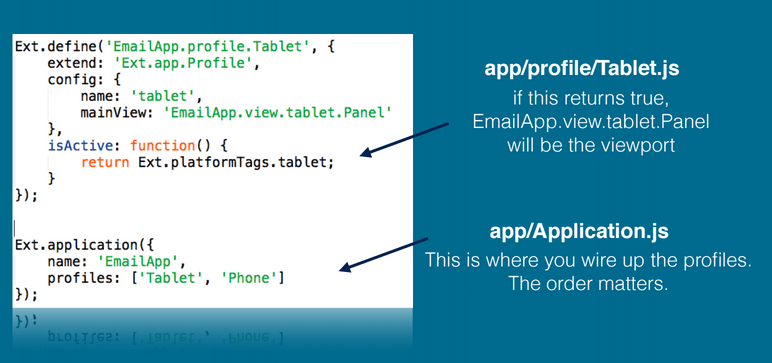
Toolkit / Universal app approach: The user experience is chosen before the framework is downloaded.
How it works: You can create different views with touch (modern toolkit) or desktop (classic toolkit) component sets. The microloader will detect your device, OS, or browser, and serve the right component set for you, by loading a build profile. You can attach a particular theme to that build profile. You can create as many build profiles as you like, and it’s not only limited to views, you can also serve different data stores or behavior code.
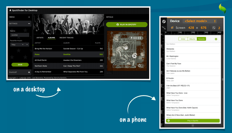
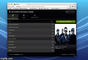
In the screenshot below, you can see how my application looks on a desktop, and how it looks on an iPhone:
Device specific stylesheets: The stylesheet is chosen before the framework is downloaded.
How it works: Ext JS 6 ships with themes (Sass stylesheets) that are great for classic toolkit, touch interfaces (with the look and feel of iOS, Android, and Windows Phone), or stylesheets that look great on both toolkits. The microloader can detect the environment, and serve the correct theme.
Device Profiles: The profile for each user is chosen when the application launches.
How it works: It’s possible to create a device profile, which contains different code or different component positioning. For example, when you open an email app on your phone, you see a list with an overview of all emails, and when you tap on an item, it opens the email on top. However, when you open the email application on a tablet, the list is docked to the left, and the body of the email is positioned on the right side of the screen. You can achieve these layouts with device profiles. It’s not just re-positioning certain components (list docked or not). It’s also different behavior under the hood (when you tap an email, it opens an extra window on top vs. loading next to the list).
Responsive Design with JavaScript: Code responds to custom criteria at runtime.
How it works: JavaScript responds to certain conditions (like screen size) at runtime. It’s possible to create any custom condition and have the view, data, or behavior respond.
Traditional Web Design with CSS: The view responds to an environment at runtime.
How it works: You can also use traditional responsive web design. You can use it for styling simple elements in views.
Conclusion
In this article, I’ve described what an Ext JS 6 universal app is, what I like about the universal app approach, and why I converted my app. In Part 2, I’ll show you exactly how I converted my music app to a universal app.


Latest Content

JS Days Is Back: A Free Virtual Conference for JavaScript Developers
Sencha is bringing back JS Days, a free, two-day online conference for JavaScript developers. Dates:…
July 2, 2026

What Is DORA? A Complete Guide to the EU's Digital Operational Resilience Act (2026)
Last Updated: June 2026 The Digital Operational Resilience Act (DORA) is one of the most…
June 17, 2026

Top 8 Best Practices for Enterprise Software Development in 2026
Enterprise software development in 2026 demands a different approach than consumer application development. Enterprise teams…
June 3, 2026


