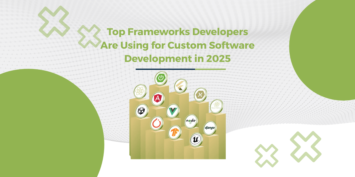
Introducing React ReExt – Sencha Ext JS Components in React! LEARN MORE

How to Quickly Customize Ext JS Data Grid (Part 1/6) – Built-In Grid & Column Properties

February 27, 2020 190 Views
Show

Ext JS Data Grid is lightweight, powerful, and adaptable. Users can quickly customize the look and feel of the grid with Ext JS to suit their application. In a 6-part blog series, I’ll go over various methods for quickly customizing an Ext JS Data Grid.

We will create a simple grid that will display NBA 2020 player ratings. Don’t hesitate to try creating your own data grid using Javascript Grid Libraries! Because it’s fun! It supports various frameworks for JS grid, React grid, Angular grid, and Webcomponents grid.

This first blog demonstrates customization using Built-In Grid and Column Properties.


Setup Ext JS Grid

We first define a Ext.data.Model which is basically a collection of fields representing a type of data. Here we are defining the fields ‘player’, ‘team’ and ‘rating’.

Ext.define(‘Player’, {
extend: ‘Ext.data.Model’,
fields: [‘player’, ‘team’, {
name: ‘rating’,
type: ‘int’
}] });

Now setup the Ext.data.Store containing the user instances. The example shows individual data, but in a real world application, the data could also be loaded from a server. You can do that easily using Ext.data.proxy.Proxy

Here we are storing the data associated with ‘player’,’ team’ and ‘rating’.

var store = Ext.create(‘Ext.data.Store’, {
model: ‘Player’,
data: [{
player: ‘Kemba Walker’,
team: ‘Boston Celtics’,
rating: 88
}, {
player: ‘Josh Richardson’,
team: ‘Philadelphia 76ers’,
rating: 79
}] });

To display the data, we will use Ext.grid.Panel and customize it.

Ext.create(‘Ext.grid.Panel’, {
renderTo: document.body,
title: ‘NBA 2K20 player rating’,
//Define store
store: store,
columns: [{
dataIndex: ‘player’,
text: ‘Name’,
}, {
dataIndex: ‘rating’,
text: ‘Rating’,
}, {
dataIndex: ‘team’,
text: ‘Team’,
}] });

Customize Grid and Column Properties

The grid created above with no customization looks dry and static. 
Here are some popular properties you can use to make the grid more feature friendly. 

Grid Properties:

  • collapsible: expand/collapse toggle tool added to the header
  • headerBorders [classic]: display or hide grid borders
  • selModel [classic]: configuration for selection strategy
  • hideHeaders : hide column headers
  • title : display title in grid title bar
  • width, height: specify grid width and height
  • store: contains the data displayed

Column Properties:

  • dataIndex : field name in model
  • text: column header text
  • locked: lock a specific column
  • sortable: allow column sorting
  • width: adjust column width
  • flex: adjust column flex
  • align: adjust column align

simple-grid

Ext.create(‘Ext.grid.Panel’, {
renderTo: document.body,
title: ‘NBA 2K20 player rating’,
//Turn on collapsible
collapsible: true,
//Display borders
headerBorders: true,
//Define store
store: store,
columns: [{
dataIndex: ‘player’,
text: ‘Name’,
//Lock column
locked: true,
width: 150,
//Deactivate sort
sortable: false
}, {
dataIndex: ‘rating’,
text: ‘Rating’,
flex: 1
}, {
dataIndex: ‘team’,
text: ‘Team’,
flex: 1,
//Deactivate sort
sortable: false
}] });

Explore the code in the Fiddle tool

For more config properties, view the extensive Ext JS Grid and Panel documentation.

Stay tuned for our next blog covering “Grouping Methods” to customize grids. 


Build Your Data Grid with Ext JS 7.1

The free 30-day trial of Ext JS 7.1 provides full access to the product features. Get started today and see how you can build a high-performing data grid for your application.