How to Organize Your Application’s UI Using Ext JS Layout Components
Get a summary of this article:
The user interface (UI) is one of the most important parts of a web app or website. It’s the part that users interact with, so developers must create UIs according to users’ expectations. For example, users today want fast, responsive, and beautiful UIs. However, creating such UIs can be quite challenging. Fortunately, developers can utilize front-end JavaScript frameworks to create efficient and visually appealing UIs faster. Ext JS is one such framework. It provides over 140+ ready-to-use and fully tested UI components for creating functional and beautiful UIs quickly.
Ext JS also has an efficient layout system that makes it easier for developers to manage and organize the UI/UI component of their apps.
This article will discuss:
- The basics of Ext JS Layouts/Layout components
- Implementation of Ext JS layout components in an app/your next project
- Best Practices for Creating a Consistent and Efficient UI
Key Takeaways
- Ext JS Layouts: Ext JS provides a robust layout system, which helps manage and organize the UI components within Ext JS apps. Layouts define the sizes and positions of the components.
- Wide Range of Ext JS Components: Ext JS provides over 140 pre-built UI components. Each UI component is fully tested and customizable. They help create responsive and visually appealing UIs.
- Choosing the Right Layout: Ext JS offers various layouts, such as Hbox for horizontal arrangements, Vbox for vertical layouts, and Border for complex multi-region designs.
Exploring Ext JS Layout Components: An Introduction
Before we cover the core concept of layouts in Ext JS, let’s first discuss other basic aspects associated with layouts.
- In an Ext JS app, the UI is primarily made up of one or multiple widgets. These widgets are called Components.
- Every Component is a subclass of the Ext.Component. This allows these components to render themselves onto a page, show and hide themselves, and do much more.
- Ext JS provides numerous Components. Developers can easily extend any of these components to create a customized component.
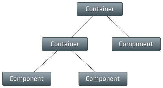
- In Ext JS, there is a special type of Component called Container. A Container can contain other Components. Containers manage the Component lifecycle of their children. This includes creation, rendering, positioning, sizing, and destruction.
- An Ext JS app typically contains several layers of nested Components in a tree-like structure. This structure is called the Component hierarchy. The image below depicts the Component hierarchy:
Ext JS Layout Components
The layout system is a powerful feature offered by Ext JS. It basically handles the positioning and sizing of every Component in your app.
In an Ext JS app, every container has a layout. This layout defines the initial sizing and positioning of the container’s child Components. Basically, the UI framework calls the Container’s updateLayout method. This tells Layout to calculate the correct sizes and positions for all of the child components and update the DOM.
Just like a Container, a Component also has a Layout. The layout is responsible for managing the sizes and positions of internal child items of the Component.
Generally, you don’t need Component Layout configuration because Ext JS provides separate layout managers for all of the provided Components. However, you can use this configuration when creating a custom Component.
Ext JS offers various layouts for containers, with each layout offering different arrangements for the child components. Commonly used Ext JS layouts include:
- Card: This layout is responsible for managing multiple child Components, where only one child component is visible at a time. The Card layout is useful for wizards, tab implementations, etc.
- Fit: As the name suggests, this layout fits a single child component within the container so that it expands to take up the entire space. This layout is suitable for containers with only one child component.
- Hbox: Arranges child components horizontally in a single row, either from left to right or right to left.
- Vbox: Arranges child components vertically.
- Border: This layout is used to divide the container into five regions (north, south, east, west, and center).
Understanding the Importance of Effective UI Layouts
Effective UI layouts help us create user-friendly, responsive, and beautiful UIs. They ensure:
- Consistency: By using UI layouts or a component library, we can create a consistent look and feel across our app, which enhances the user experience.
- Responsiveness: With effective UI layouts, we can create a responsive UI. This means the UI will adjust according to different screen sizes and orientations. This helps provide a good user experience on both desktop and mobile devices.
- Usability: UI layouts help us create a user-friendly UI and digital products that users can easily navigate and interact with. This improves user engagement and satisfaction.
- Maintenance: Well-structured layouts make it easier to maintain and update the UI/application.
Implementing Ext JS Layout Components
Setting Up Your Ext JS Environment
- Download the Ext JS zip file from the official website.
- Unzip the downloaded file. Then, open the folder.
- Install Sencha Cmd, a CLI/command line tool to create Ext JS apps. You’ll find the file for the installation of Cmd in the folder you unzipped in the previous step.
Creating a Basic Container
Here is an example code for creating a container:
// Explicitly create a Container
Ext.create('Ext.container.Container', {
width: 400,
renderTo: Ext.getBody(),
    border: 1,
    style: {borderColor:'#000000', borderStyle:'solid', borderWidth:'1px'},
    defaults: {
        labelWidth: 80,
        // implicitly create Container by specifying xtype
        xtype: 'datefield',
        flex: 1,
        style: {
            padding: '10px'
        }
    },
    items: [{
        xtype: 'datefield',
        name: 'startDate',
        fieldLabel: 'Start date'
    },{
        xtype: 'datefield',
        name: 'endDate',
        fieldLabel: 'End date'
    }]
});
Implementing Different Ext JS Layouts
Hbox Component
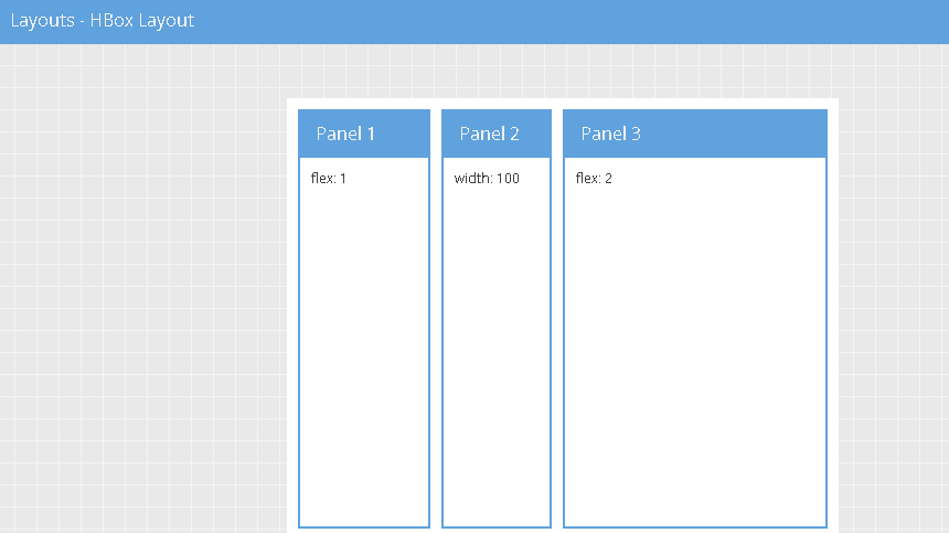
Here is a basic example of using the Hbox layout:
Ext.create('Ext.Panel', {
    width: 500,
    height: 300,
    title: "HBoxLayout Panel",
    layout: {
        type: 'hbox',
        align: 'stretch'
    },
    renderTo: document.body,
    items: [{
        xtype: 'panel',
        title: 'Inner Panel One',
        flex: 2
    },{
        xtype: 'panel',
        title: 'Inner Panel Two',
        flex: 1
    },{
        xtype: 'panel',
        title: 'Inner Panel Three',
        flex: 1
    }]
});
In the above example, we’ve created an Ext JS panel (Ext.Panel) instead of Ext JS container (Ext.container.Container). Ext.Panel is also a type of component that extends Ext.container.Container. It includes additional features such as:
- Headers
- Toolbars
- A specific rendering structure designed for more complex layouts and configurations.
Vbox
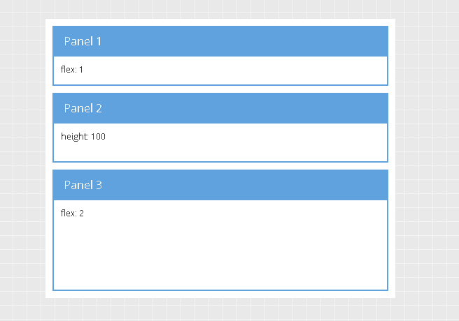
Here is an example code for implementing the Vbox layout:
Ext.create('Ext.Panel', {
    width: 500,
    height: 400,
    title: "VBoxLayout Panel",
    layout: {
        type: 'vbox',
    },
    renderTo: document.body,
    items: [{
        xtype: 'panel',
        title: 'Inner Panel One',
        width: 250,
        flex: 2
    },
    {
        xtype: 'panel',
        title: 'Inner Panel Two',
        width: 250,
        flex: 4
    },
    {
        xtype: 'panel',
        title: 'Inner Panel Three',
        width: '50%',
        flex: 4
    }]
});
Border
Ext.create('Ext.panel.Panel', {
    width: 500,
    height: 300,
    title: 'Border Layout',
    layout: 'border',
    items: [{
        title: 'South Region is resizable',
        region: 'south',     // position for region
        xtype: 'panel',
        height: 100,
        split: true,         // enable resizing
        margin: '0 5 5 5'
    },{
        // xtype: 'panel' implied by default
        title: 'West Region is collapsible',
        region:'west',
        xtype: 'panel',
        margin: '5 0 0 5',
        width: 200,
        collapsible: true,   // make collapsible
        id: 'west-region-container',
        layout: 'fit'
    },{
        title: 'Center Region',
        region: 'center',     // center region is required, no width/height specified
        xtype: 'panel',
        layout: 'fit',
        margin: '5 5 0 0'
    }],
    renderTo: Ext.getBody()
});
Best Practices for Creating a Consistent and Efficient UI

- Focus on creating a consistent design across your app. Utilize a design system or style guide that defines consistent UI elements. These include colors, typography, spacing, and component styling.
- Follow established UI patterns for common interactions. These include forms, navigation, alerts, etc. This ensures familiarity and predictability for users.
- Use effective layout components to ensure consistent design.
- Ensure your UI is responsive. This means your UI should adjust according to different devices/screen sizes.
- Make your UI accessible to all users. For example, you can use ARIA attributes through the Ext JS Classic toolkit, which has built-in support for ARIA.
- Use efficient rendering techniques provided by frameworks like Ext JS. This helps minimize DOM manipulations and improves app performance.
Why Ext JS UI Components are Ideal for App Development
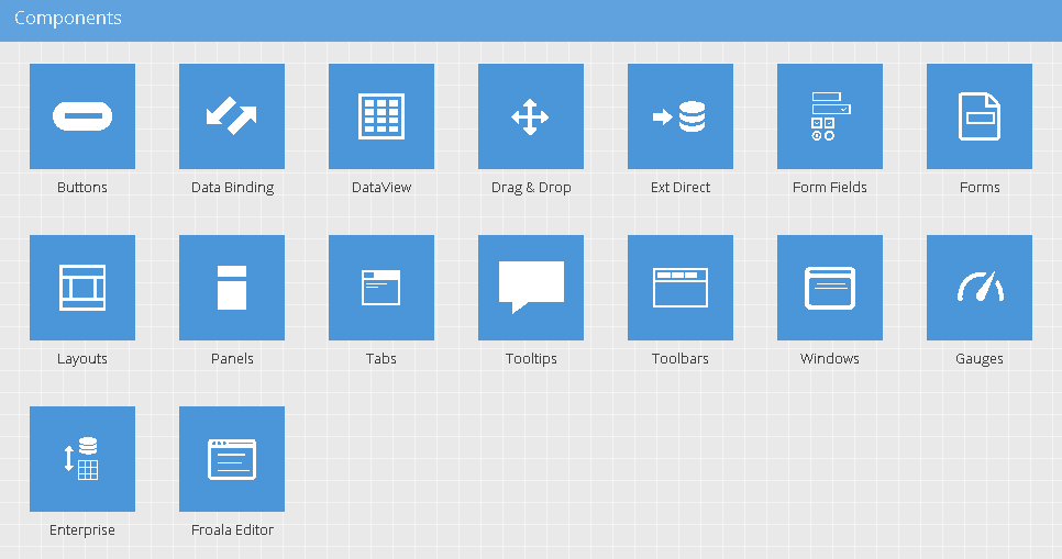
Ext JS UI components are perfect for app development due to several key reasons:
- Ext JS provides a wide range of UI components (140+ basic and advanced components/complex components). These include buttons, forms, grids, carousels, sliders, calendar, and many more.
- All Ext JS components are highly customizable and well-tested. This saves developers time and effort in building common UI elements from scratch.
- Ext JS components are built using a unified design language. Thus, they provide a consistent look and feel across the app.
- With Ext JS, developers can create responsive layouts that adjust according to different screen sizes and devices.
- Ext JS offers power data handling features for components. For example, the grid component easily binds to data sources such as JSON, XML, or arrays. Thus supporting dynamic updates.
Conclusion
Ext JS offers a powerful layout system that defines the positioning and sizing of all the Components in your Ext JS app. Using these layouts, developers can create consistent, effective, and beautiful UIs. Some of the most commonly used Ext JS layout components include:
- Hbox
- Vbox
- Column
- Border
- Fit
- Card
FAQs
Why should I use Ext JS layouts to organize my application’s UI?
Using Ext JS layouts for creating UIs offers several benefits, such as
- Design consistency
- Responsive design
- Efficiency (developers don’t have to write lengthy code for positioning and sizing various components).
How do I choose the right layout for my application?
Considering the following aspects can help you select the right layout for your app:
- UI requirements
- Component interaction
- Device compatibility
- Data presentation
What are some common Ext JS layout types?
Common Ext JS layouts include:
- Column
- Hbox
- Vbox
- Border
- Fit
- Card
Get Started with Ext JS UI: Accelerate Your App Development Today! Claim Your Free Trial!

In the modern web development landscape, the ability to leverage existing solutions is a superpower.…
This guide covers the technical steps for upgrading Ext JS 7.x applications to 8.0. Upgrading…
This guide covers the technical steps for upgrading Ext JS 6.x applications to 8.0. Upgrading…


