






Building Responsive, Data-Driven Enterprise Applications with JavaScript
August 11, 2026
1767 Views
Get a summary of this article:


In enterprise software, responsiveness is no longer a nice-to-have. Users expect the same application to perform smoothly whether they are working at a desktop with a 4K monitor, reviewing operations from a tablet, or checking key metrics on a smartphone in the field.
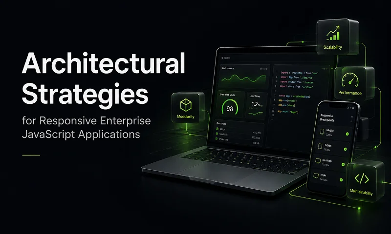
That expectation creates a real architectural challenge. Enterprise applications are not simple marketing sites or consumer dashboards. They are dense, workflow-heavy systems built around forms, data grids, pivot tables, nested views, and role-specific actions. A layout that works beautifully on desktop can become unusable on a phone if it is merely “shrunk down.”
So the real question is this: how do you build rich, data-heavy enterprise applications for every screen without maintaining fragmented codebases or shipping oversized desktop bundles to mobile users?
This is exactly the problem Ext JS was designed to solve. With the right architecture, teams can build responsive enterprise applications from a single codebase, while still optimizing UX, performance, and bundle size for each device class.
Why Enterprise Responsiveness Is Different
Consumer responsive design often focuses on rearranging content. Cards stack vertically, sidebars collapse, and navigation becomes a hamburger menu. That works well for content-centric websites.
Enterprise software is different.
Users routinely work with:
- high-density financial grids
- operational dashboards
- approval workflows
- multi-step forms
- real-time telemetry
- trees, pivots, and reporting views
You cannot simply compress a 120-column grid into a smartphone viewport and call it responsive. In enterprise applications, responsiveness must preserve usability, performance, and workflow continuity.
A modern enterprise responsive strategy should be built on four pillars:
1. Single unified codebase
Business logic, models, stores, and API connectors should be written once and shared across all platforms.
2. Context-aware UX
Desktop users may need hover interactions, keyboard shortcuts, and data-dense screens. Mobile users need touch-friendly components, simplified navigation, swipe patterns, and cleaner visual hierarchy.
3. Reduced development cost
A single framework and repository reduces duplication, lowers testing overhead, and simplifies feature delivery.
4. Consistent security and governance
When business rules or API protections change, updates happen in one place and apply consistently everywhere.
Choosing the Right Toolkit: Classic vs. Modern
One of the first architectural decisions in any Ext JS project is choosing between the Classic Toolkit and the Modern Toolkit.
| Feature | Classic Toolkit | Modern Toolkit |
|---|---|---|
| Primary Focus | Legacy browser support, desktop-heavy layouts, advanced desktop extensions | High-performance cross-platform apps for desktop, tablet, and mobile |
| Underlying Tech | Legacy rendering patterns and custom layout systems | Modern HTML5 rendering and CSS Flexbox |
| Best Fit | Legacy enterprise desktop environments and migration scenarios | New universal applications and modernization efforts |
| UI Strength | Pixel-perfect desktop controls, complex nested grids, advanced desktop behaviors | Touch-friendly components, modern grids, virtual stores, tree grids, pivot support |
The Classic Toolkit remains powerful for organizations that need legacy support or highly specialized desktop behavior. But for most new projects, the Modern Toolkit is the better strategic choice.
Why? Because it provides a more universal component model and is designed to perform well across all modern device classes. If your goal is a single responsive architecture for desktop, tablet, and mobile, Modern gives you the strongest foundation.
Static vs. Dynamic Adaptation: platformConfig and responsiveConfig
Ext JS offers two key mechanisms for responsive adaptation, and knowing when to use each is essential.
platformConfig: static, boot-time adaptation
platformConfig is evaluated once when the application starts. It is ideal for settings that should be decided at boot time and remain stable throughout the session.
Typical use cases include:
- shorter titles on phone screens
- different icons for mobile and desktop
- larger row heights for touch devices
- enabling desktop-only menus or actions
Because it runs only once during startup, it has essentially no runtime performance overhead.
Example
    Ext.define('MyApp.view.MainPanel', {
        extend: 'Ext.panel.Panel',
        xtype: 'mainpanel',

        platformConfig: {
            desktop: {
                title: 'Enterprise Analytics Dashboard Overview',
                iconCls: 'x-fa fa-desktop'
            },
            '!desktop': {
                title: 'Analytics',
                iconCls: 'x-fa fa-mobile'
            }
        }
    });
When to use it
Use platformConfig for minor, static differences between device classes.
responsiveConfig: dynamic, runtime adaptation
responsiveConfig is designed for live changes while the application is running. It responds to viewport size changes, orientation shifts, and browser resizing.
Typical use cases include:
- collapsing a side drawer below a width threshold
- switching a container from horizontal to vertical layout
- moving panels between regions
- hiding non-critical columns on smaller viewports
This capability is extremely useful, but it should be applied carefully. Runtime adaptation is more expensive than boot-time configuration, especially if used across deep component trees.
Example
    Ext.define('MyApp.view.ResponsiveContainer', {
        extend: 'Ext.container.Container',
        mixins: [
            'Ext.mixin.Responsive'
        ],

        responsiveConfig: {
            'width >= 800': {
                layout: 'hbox',
                region: 'west',
                collapsed: false
            },
            'width < 800': {
                layout: 'vbox',
                region: 'top',
                collapsed: true
            }
        }
    });
Best practice
Use responsiveConfig for high-level structural layout changes, not for recalculating styles across thousands of child components.
A simple rule of thumb
-
- If the decision can be made once at startup, use
platformConfig
-
- .
-
- If the UI must react live to resize or orientation changes, use
responsiveConfig
- .
Architectural Separation with Application Profiles
Sometimes configuration changes are not enough.
A desktop interface may need a multi-pane dashboard with dense navigation, while a phone experience may need bottom tabs, card views, and simplified task flows. Trying to handle that level of divergence in a single view class usually creates bloated, conditional-heavy code.
This is where Application Profiles provide a clean architectural solution.
Profiles allow you to separate the view layer by device type while still sharing:
- models
- stores
- view models
- controllers
- services
- API integrations
A profile such as MyApp.profile.Phone can determine whether it should activate through an isActive() method:
    Ext.define('MyApp.profile.Phone', {
        extend: 'Ext.app.Profile',

        isActive: function() {
            return Ext.os.is.Phone;
        },

        launch: function() {
            // Phone-specific initialization logic
        }
    });
At application startup, Ext JS evaluates the declared profiles and activates the first one that matches the current environment.
Why this matters
Application Profiles let you keep the business layer unified while giving each form factor its own purpose-built UI Components.
That means:
- cleaner code
- fewer device-specific conditionals in views
- easier collaboration across teams
- better maintainability as the application grows
Instead of forcing one overloaded UI to serve every context, you create device-appropriate experiences on top of a shared application core.
Optimizing Delivery with Sencha Cmd Build Profiles
Even with Application Profiles, performance can still suffer if every user downloads one large universal bundle.
That is especially problematic on mobile networks, where users may end up downloading desktop-specific classes, themes, and view hierarchies they will never use.
The answer is to use Sencha Cmd build profiles defined in app.json.
Example
    "builds": {
        "desktop": {
            "toolkit": "classic",
            "theme": "theme-triton"
        },
        "phone": {
            "toolkit": "modern",
            "theme": "theme-material"
        }
    }
When you run the production build, Sencha Cmd evaluates dependencies separately for each build target. It strips out unused classes and assets, producing dedicated bundles for desktop, phone, or tablet environments.
Why build profiles matter
This gives you:
- smaller app bundles
- faster startup on mobile
- less wasted JavaScript
- device-specific theming
- more efficient production delivery
In practice, this can dramatically reduce payload size for mobile users and significantly improve initial load performance.

Scaling Dense Data with Virtualization and Buffered Stores
Enterprise applications often need to work with enormous datasets, including:
- financial transactions
- operational inventory
- customer records
- IoT telemetry streams
- reporting tables with hundreds of thousands of rows
Rendering that volume directly into the DOM is not feasible. Performance collapses quickly, especially on mobile devices.
Ext JS addresses this with two complementary strategies.
1. Grid virtualization
Virtualized grids render only what is visible in the viewport, plus a small off-screen buffer. As the user scrolls, the grid recycles existing DOM nodes instead of constantly creating and destroying them.
This keeps rendering efficient and memory usage stable.
2. Buffered stores
Buffered stores load records from the backend in small chunks as needed, rather than downloading the entire dataset upfront.
Together, virtualization and buffered loading make it possible to work smoothly with extremely large data collections without locking up the browser.
Performance Alone Is Not Enough: Mobile Needs Different Data Presentation
A virtualized grid may technically handle 100,000 rows, but that does not automatically make it mobile-friendly.
A dense multi-column grid on a phone often creates a terrible experience:
- horizontal scrolling
- zooming and pinching
- poor readability
- difficult touch targeting
That is why responsive enterprise design should not just optimize rendering—it should optimize interaction.
A better pattern is to switch components by device profile:
- Desktop: full grid panel
- Tablet: simplified split view or reduced-column grid
- Phone: list view or card-based data view
The important part is that all of these can share the same underlying store and business logic. Only the presentation layer changes.
Decision Matrix: Which Tool Should You Use?
Here is a simple way to think about the four major responsive architecture tools in Ext JS:
| Technique | Best Used For | Performance Characteristics | Architectural Value |
|---|---|---|---|
| platformConfig | Static configuration tweaks at startup | Very low overhead | Keeps unified views declarative and clean |
| responsiveConfig | Live layout changes during resize/orientation events | Powerful, but should be used selectively | Supports dynamic adaptation at runtime |
| Application Profiles | Major UI differences across device classes | Efficient and maintainable | Separates views cleanly while sharing core logic |
| Sencha Cmd Build Profiles | Production bundle optimization | Strong positive impact | Delivers lightweight platform-specific assets |
A 3-Step Action Plan for Modern Enterprise Apps
If you are starting a new project or modernizing an existing one, this is a practical path forward:
1. Standardize on the Modern Toolkit
For most new enterprise applications, Modern provides the best combination of performance, cross-device support, and future-ready architecture.
2. Separate views with Application Profiles
Avoid filling views with device detection and nested conditional logic. Keep form-factor-specific UI isolated, while sharing the application’s core data and business layers.
3. Automate optimized builds with Sencha Cmd
Define build targets in app.json and generate dedicated bundles for each platform so users only download what they actually need.
Final Thoughts
Responsive enterprise architecture is not about shrinking a desktop UI until it fits a smaller screen. It is about designing applications that adapt intelligently to user context while preserving performance, usability, and maintainability.
Ext JS makes that possible through a combination of:
- shared application logic
- device-specific view architecture
- runtime and boot-time configuration tools
- platform-optimized build outputs
- high-performance data virtualization
For teams building data-rich enterprise systems, this approach offers the best of both worlds: a single codebase for developers and a tailored experience for every user, on every screen.



Latest Content


AI-Driven Test Grading with Ext JS, Node.js, and OpenAI: A Secure Enterprise Architecture
Learn how to build an AI-driven test grading system with Ext JS, Node.js, MySQL, and…
October 2, 2026

Secure Enterprise AI Analytics in JavaScript: A Leadership Guide to Data Governance, Compliance and Embedded Analytics
Enterprise analytics is entering a new phase. Business users increasingly expect applications to answer questions…
October 2, 2026

Sencha AI Just Got a Lot Bigger: One Chatbot, Every Sencha Product
Sencha’s AI assistant has grown from a focused Ext JS helper into a product-aware chatbot…
October 2, 2026