Ask Sencha AI
4 Low-Code Software Development Platforms Ranked by Scalability
 Team Sencha
Read More
Team Sencha
Read More
July 17, 2025
117 Views
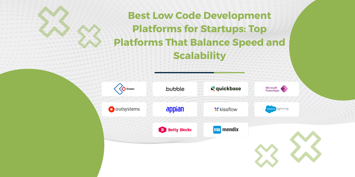
By 2026, Gartner says 80% of apps will be built using low code tools. That’s huge. And honestly, it makes sense. Low code software development makes things faster, lighter, and way less painful. Especially if you don’t want to write…
Subscribe to our newsletter
Be the first to learn about new Sencha resources and tips.