


 Ask Sencha AI
When to Choose Pre-Built UI Components for a Project
May 12, 2023
4792 Views
Get a summary of this article:
We know how important it is for web developers to design great user experiences. However, creating your own user interface from scratch can be difficult when you have limited time and resources. That’s why Sencha has built Ext JS components for you. These pre build UI components are helpful in saving time and effort to come up with the ideal UI for your project.
With the current speed of web development, UI design is more significant than ever. People expect a smooth and straightforward experience while using a web application, and the UI can either make or ruin that experience. Thus, it is essential to choose the proper pre build UI components.
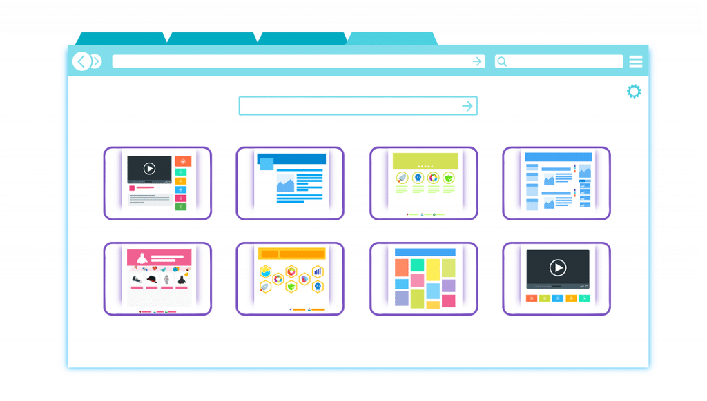
What Is a UI Component Library?
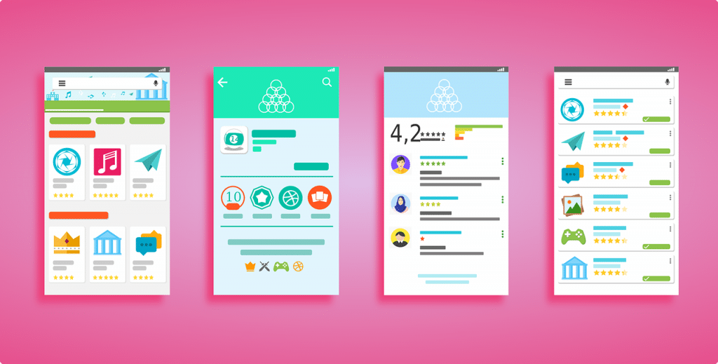
A UI component library is a set of pre build UI components that act as the basis for your application’s layout. These libraries give you access to components that can be simply added to your web app, saving you time and energy. Check out our blog to learn more about why you would need a UI component library.
Popular React UI libraries like Semantic UI React, React Bootstrap, and Chakra UI feature dynamic theming and an easy-to-follow API for constructing components. Additionally, these libraries supply both mobile-friendly and desktop-friendly components that are immediately usable after downloading.
UI component libraries are very advantageous for developers who prioritize performance and functionality over the creation of individual components. These libraries permit developers to construct elements that suit their requirements while keeping a consistent user interface. Moreover, with features like dark mode, dynamic theming, and pre-made components, assembling intricate interfaces can be done in much less time than usual.
Sencha Ext JS Components
Sencha Ext JS Components is a pre build UI components library for developing web applications with complex interfaces. It gives a wide extent of ready-to-use components that can be utilized to construct client interfacing in web applications.
An Ext JS application offers you widgets called Components. A Component is a group of DOM elements with complex functionality, and the Ext JS library provides a wide range of pre build UI Components that can be used to build user interfaces in web applications.
These are some of the pre-built components available in Sencha Ext JS:
- Grid: The grid component provides a tabular view of data with support for sorting, filtering, and pagination.
- Form: The form component provides a set of input fields that can be used to collect user input.
- Panel: The panel component is a container that can hold other components and provides a configurable header and footer.
- Tree: The tree component provides a hierarchical view of data supporting drag-and-drop operations.
- Chart: The chart component provides a way to visualize data in various chart types such as bar, line, and pie charts.
- TabPanel: The tab panel component provides a way to organize content in tabs.
- Window: The window component provides a modal or non-modal dialog box with customizable buttons.
- Menu: The menu component provides a dropdown menu with various items that can be clicked.
- Toolbar: The toolbar component provides a container for buttons, menus, and other components.
- DatePicker: The date picker component provides a user-friendly interface for selecting dates.
- GridFilter: The GridFilter component provides an intuitive way to filter data in a grid component, supporting various filter types like text, number, and date.
- DataView: The DataView component provides a flexible way to display data in various layouts like grids, lists, and tiles.
- Splitter: The Splitter component provides a draggable splitter bar that can be used to resize panels.
- ProgressBar: The ProgressBar component provides a visual indicator of the progress of an operation.
- ToolTip: The ToolTip component provides a tooltip message that can be displayed when the user hovers over an element.
- Slider: The Slider component provides a user-friendly way to select a value within a range.
- FieldSet: The FieldSet component provides a container for grouping related form fields.
- ComboBox: The ComboBox component provides a dropdown list with support for autocomplete and remote data loading.
- CalendarPanel: The CalendarPanel component provides a way to display a calendar with support for adding, editing, and deleting events.
- PivotGrid: The PivotGrid component provides a way to analyze and summarize large amounts of data with support for various aggregation functions.
Benefits of Using a Pre Build UI Components Library
-
Speed
Instead of having to construct each part of their application from the beginning, they can combine existing components that are already present in the library. This streamlines the development process and allows for faster completion times.
-
Customization
Most libraries enable programmers to alter the appearance of essential components by using different supported themes. This means that developers can personalize the look and feel of their program without developing CSS from nothing.
-
Accessibility
Good UI component libraries provide this by following accessibility standards, so developers don’t need to worry about ensuring their application is usable for people with disabilities.
-
Ease of Use
Established libraries frequently have excellent documentation that is simple to follow and well-organized. As a result, developers won’t have to spend a lot of time locating the components they require or learning how to use them.
-
Compatibility
With the large variety of devices and browsers being employed, it can be difficult to guarantee cross-browser and cross-device compatibility. Fortunately, many existing UI component libraries handle this issue, ensuring the components work without any problems on all gadgets and browsers.
Check UI Ext JS Components Tutorials On Sencha YouTube Channel
Challenges in Using a UI Component Library
When using a UI component library, there can be some challenges that developers may face. Here are some examples:
-
Misunderstood Philosophy
Not all UI components are the same, and each has its own philosophy. Some support theming options with customizations, while others may want you to stick to their designs and focus on implementing the features. It’s crucial to comprehend the guiding principles of the component library you select and confirm that they correspond with the objectives of your project.
-
Inconsistent Use
Using UI component libraries consistently is essential to developing a thorough understanding of how everything functions and how to use them. It’s recommended to pick a component library and stick to it because switching from one to another takes time. This may cause certain limitations to the developer’s complete control over the UI design.
-
Predetermined Choices
While UI component libraries can save time and effort, it’s important to be flexible when choosing libraries for your projects. You need to pick libraries depending on the use case and use the library most suited to your project.
-
Bundle Size
Component libraries can be quite large, so if you decide to use one, you may wind up loading a lot of code that you won’t need. Before choosing a component library, it is important to consider its bundle size and how it will affect your web application.
When to Choose a UI Component Library
As developers, we often face the challenge of creating a user interface that is both functional and aesthetically pleasing. Here are some scenarios in which using a React UI Component Library can be beneficial:
-
Administration Panels
Component libraries are useful for creating functional and understandable user interfaces, making them great for implementing typical back-office apps.
-
No Designer Project
Using a component library can help create elegant layouts and provide a nice user experience, even without a designer. This allows developers to focus on the functionality of the application while ensuring a good user experience.
-
Proof of Concept
Component libraries are great for prototyping, as they allow for building interfaces at great speed.
-
Project With Aligned Interests
When building a project with aligned interests, using a UI component library can provide pre-built components, ready-to-use interfaces, and dynamic theming. Popular options include Semantic UI, React UI libraries, React Bootstrap, and Chakra UI.
How to Choose a UI Component Library

When it comes to choosing a UI component library, there are several factors to consider. Let’s see what they are.
-
The Exposed Properties
The exposed properties of a UI component library play a crucial role in defining the visual appearance and behavior of an application. These properties allow developers to customize various aspects of the components, such as colors, sizes, styles, and interaction patterns, ensuring that the components align with the desired look and feel of the app. By providing a comprehensive set of exposed properties, a UI component library empowers developers to create visually appealing and cohesive user interfaces.
-
Personalization
Furthermore, personalization is a beneficial part of component libraries, allowing for a distinct style to be added to the application’s look without having to compose custom components.
-
Form Support and Validation
Additionally, form assistance and verification are critical factors to take into account. Properly managing forms is intricate, so selecting a library with built-in support and validation can save significant time and labor.
-
Number of Components
It is also essential to consider the number of components in the library. Although a lot of ready-made parts can be advantageous in some situations, it can be too much for small teams that need to dedicate their attention to application logic instead of design.
Key Features of Pre-Built UI Components
Pre-built UI components offer several key features that can benefit developers in creating efficient and effective web applications. Show below are some of them.
- A complete set of user interface components, covering everything from basic to complex components.
- Designed to be fast, light, and easy to use, making it a great choice for developers of all skill levels.
- Offers a variety of customization options, allowing you to tailor the library to your specific needs.
- Supports both client-side and server-side rendering, making it a versatile choice for many types of projects.
- Regularly updated with new features and bug fixes to ensure you always have access to the latest and greatest features.
- Developed with accessibility in mind and conforms to the latest accessibility standards and guidelines.
- Extensive documentation and an active developer community make it easy to get help when you need it.
- It is based on the popular Bootstrap framework and leverages its years of development and testing to provide a high-quality UI library.
- A variety of themes and styles are available to easily change the look and feel of your application.
- It integrates seamlessly with other popular react components and tools, making it a versatile and flexible choice for your next project.
Conclusion
To summarize, developers can gain a lot from utilizing pre-built UI components since they provide practical building blocks that reduce the amount of time and effort needed. Libraries like Semantic UI React, React UI libraries, React Bootstrap, and Chakra UI provide components for diverse design needs. It is of utmost importance to consider the right approach and elements like personalization, form support, and verification, as well as the number of components in the library. Developers need to select suitable web frameworks that are compatible with these pre-built components to streamline the development process.
Ultimately, it depends on what is required for the project and how skilled a developer is when making a choice between pre-made components or building customized ones. Pre-built components are convenient but can limit control and necessitate extra CSS work.
We recommend that developers consider the project requirements and design before selecting a UI library or deciding between pre-built components and custom components. If done thoughtfully, it is possible to gain the advantages of pre-made parts while creating user interfaces that satisfy the project specifications.
FAQs
What Is Component Library?
A component library is a collection of pre-built user interface components that developers can use when creating web applications.
What Is the Importance of UI Components?
UI components are important for web development as they offer a uniform and reusable approach to developing user interfaces.
What Is the Benefit of a Component Library?
A component library provides UI components that you can utilize in numerous projects. This will decrease the amount of development time and effort needed.
What Is the Advantage of Using Components?
Components offers several advantages. Some of them are ability to incorporate, remove, or alter components without affecting other aspects of the UI. Also, they provide a consistent design and performance throughout an application.
Try Sencha Ext JS extensive 140+ pre-built component library
 1
1

Latest Content

12 Best Application Development Software Tools for Enterprise Teams in 2026
Enterprise teams in 2026 build applications using a stack of complementary application development software tools…
July 16, 2026

7 Best React Data Grids in 2026: Performance, Features, and Pricing Compared
React data grid selection significantly affects enterprise application development outcomes because grids are often the…
July 16, 2026

Front-End Frameworks for Banks and Financial Institutions: A 2026 Guide
Banks and financial institutions face front-end framework choices that affect application performance, security, regulatory compliance,…
July 15, 2026


