



 Ask Sencha AI
React Grid Component: Layout and Data Grids in One Framework
October 9, 2026
116 Views
Get a summary of this article:
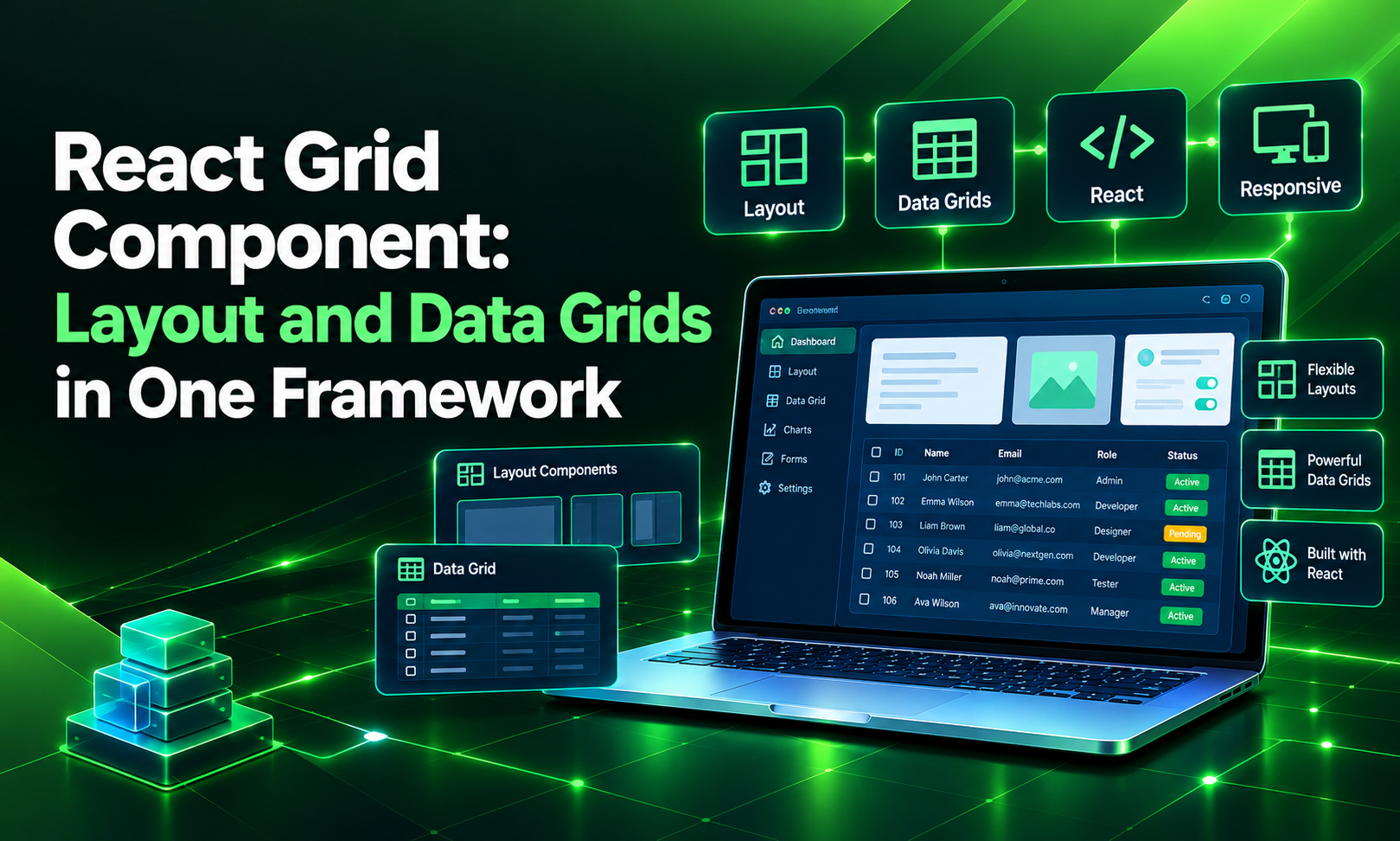
Search for “React grid component,” and you will find two very different things. Half the results are about layout grids: rows and columns that arrange panels, cards and forms on a page. The other half are about data grids: interactive tables for sorting, filtering and editing records.
Most business applications need both. A dashboard has a layout grid holding a navigation panel, a filter sidebar and a details pane, and in the middle of it sits a data grid with thousands of rows. In most React stacks, those two grids come from different libraries, with different styling systems and different ways of talking to each other.
This guide explains both meanings of “React grid component,” covers the usual options for each, and shows how ReExt gives you both from one framework: Ext JS layouts for structuring the screen and the Ext JS data grid for working with data, all inside React.
What is a React grid component?
The term covers two kinds of component that solve different problems:
| Layout grid | Data grid | |
|---|---|---|
| Purpose | Arranges UI elements on the page | Displays and manipulates records |
| Contains | Panels, cards, forms, other components | Rows of data in typed columns |
| Typical features | Columns, rows, gaps, breakpoints, resizable regions | Sorting, filtering, grouping, editing, export |
| Common options | CSS Grid, Flexbox, MUI Grid, React-Bootstrap | AG Grid, MUI X Data Grid, TanStack Table, Ext JS grid via ReExt |
| Typical question | “How do I put three panels side by side?” | “How do I let users edit 50,000 rows?” |
If you are building marketing pages or simple apps, you probably only need a layout grid. If you are building an enterprise application, you almost certainly need both, and how well they work together matters more than you might expect.
Layout grid components in React
React has no built-in layout system, so teams pick one of these:
- CSS Grid and Flexbox. Native browser layout. Flexible and fast, with no dependencies, but every behavior beyond placement, such as collapsible sidebars or draggable splitters, is custom code.
- MUI Grid and similar UI-kit grids. A 12-column responsive system built on Flexbox or CSS Grid. Great for responsive pages; it places components but doesn’t give you application panels with headers, toolbars or collapse.
- React-Bootstrap and Tailwind utilities. Responsive row and column classes. Familiar and lightweight, aimed at pages more than at desktop-style applications.
These tools are excellent for responsive, content-driven pages. Enterprise screens ask for more: panels that collapse, regions users can resize by dragging a splitter, tabbed areas, accordions, and docked toolbars. Each of those becomes extra code or another library.
Data grid components in React
For data, the common options are AG Grid, MUI X Data Grid, TanStack Table, Syncfusion, KendoReact, and the Ext JS grid via ReExt. They differ in features, licensing, and how much you build yourself. Our complete guide to React data grid compares them in detail.
Why enterprise apps need both, from one framework
Picture a typical operations screen: a header, a navigation tree on the left, a filter panel, a large orders grid in the middle, and a details pane on the right that updates when a row is selected.
Built with separate libraries, that screen means:
- Two styling systems. The layout kit’s theme and the grid vendor’s theme rarely match without custom CSS.
- Manual wiring. Panel resizing, collapse and grid resizing have to be coordinated by hand.
- Two upgrade schedules. A React upgrade can break one library while the other is fine.
- More dependencies. More packages to audit, license and maintain.
With a single component framework, layout regions and the grid share one theme, resize together, and are configured the same way. That’s the core idea behind using Ext JS components in React through ReExt: the layouts and the data grid come from the same framework, and both are designed for data-heavy business apps.
Layout grids with ReExt
ReExt renders Ext JS components in React. Panels and containers accept child ReExt components, and the parent’s layout config decides how the children are arranged. Ext JS ships a full set of layouts built for application screens:
| Layout | What it does | Typical use |
|---|---|---|
| vbox | Stacks children vertically | Forms, page sections |
| hbox | Places children side by side | KPI cards, toolbars, split views |
| border | North, south, east, west and center regions with optional splitters | Full application shells and dashboards |
| fit | One child fills the container | A grid filling a panel |
| card | Shows one child at a time | Wizards, switchable views |
| accordion | Collapsible stacked panels | Navigation and filter sidebars |
| column / table | Column- or table-based placement | Dense forms and settings screens |
Vertical and horizontal layouts
If a parent has no layout, ReExt defaults to vbox with align: ‘stretch’, and each child gets childFlex={1}. So this stacks two panels of equal height:
    <ReExt xtype="panel" style={{ height: 400 }} config={{ title: 'Overview' }}>
      <ReExt xtype="panel" config={{ title: 'Summary', html: 'Top section' }} />
      <ReExt xtype="panel" config={{ title: 'Activity', html: 'Bottom section' }} />
    </ReExt>
Switch to hbox to place children side by side, and use childFlex for proportions or childWidth for a fixed size. Here are three KPI cards where the middle one is twice as wide:
    <ReExt
      xtype="container"
      style={{ height: 140 }}
      config={{ layout: { type: 'hbox', align: 'stretch' } }}
    >
      <ReExt childFlex={1} xtype="panel" config={{ title: 'Open orders', html: '<h2>128</h2>', bodyPadding: 12 }} />
      <ReExt childFlex={2} xtype="panel" config={{ title: 'Revenue this month', html: '<h2>$1.42M</h2>', bodyPadding: 12 }} />
      <ReExt childFlex={1} xtype="panel" config={{ title: 'Late shipments', html: '<h2>7</h2>', bodyPadding: 12 }} />
    </ReExt>
In a vbox, childHeight sets a fixed height the same way childWidth does in an hbox.
Border layout: the application shell
The border layout is where Ext JS stands apart from typical React grid layout. Each child takes a region, and childSplit adds a draggable splitter so users can resize it:
    <ReExt xtype="panel" style={{ height: 600 }} config={{ layout: 'border' }}>
      <ReExt xtype="panel" childRegion="north" childHeight={56} config={{ html: 'Header' }} />
      <ReExt xtype="panel" childRegion="west" childWidth={220} childSplit={true}
        config={{ title: 'Navigation', collapsible: true }} />
      <ReExt xtype="panel" childRegion="center" config={{ title: 'Main content' }} />
      <ReExt xtype="panel" childRegion="east" childWidth={260} childSplit={true}
        config={{ title: 'Details', collapsible: true }} />
    </ReExt>
That’s a complete application shell, with a resizable navigation sidebar and details pane that users can collapse, in about ten lines and without custom CSS.
Putting it together: a dashboard with layout and data grid
Now combine both kinds of grid component. This orders dashboard uses a border layout for the shell, a filter panel on the left, the Ext JS data grid in the center, and a details pane on the right that updates from React state when a row is selected.
It assumes ReExt is installed and your app is wrapped in ReExtProvider, as covered in our Ext JS grid in React tutorial.
    import { useMemo, useRef, useState } from 'react';
    import ReExt from '@sencha/reext';

    const orders = [
      { id: 1, customer: 'Acme Corp',  region: 'EMEA', amount: 12500, status: 'Open' },
      { id: 2, customer: 'Globex',     region: 'APAC', amount: 8200,  status: 'Shipped' },
      { id: 3, customer: 'Initech',    region: 'EMEA', amount: 4300,  status: 'Closed' },
      { id: 4, customer: 'Umbrella',   region: 'AMER', amount: 15800, status: 'Open' },
      { id: 5, customer: 'Stark Ind.', region: 'AMER', amount: 9600,  status: 'Shipped' },
    ];

    export default function OrdersDashboard() {
      const gridRef = useRef(null);
      const [selected, setSelected] = useState(null);

      // Stable grid config, so the grid isn't rebuilt when the details pane changes.
      const gridConfig = useMemo(() => ({
        title: 'Orders',
        store: { data: orders },
        columns: [
          { text: 'Customer', dataIndex: 'customer', flex: 1 },
          { text: 'Region', dataIndex: 'region', width: 100 },
          { text: 'Amount', dataIndex: 'amount', width: 120,
            xtype: 'numbercolumn', format: '$0,000', align: 'right' },
          { text: 'Status', dataIndex: 'status', width: 100 },
        ],
      }), []);

      const filterByRegion = (field, value) => {
        const store = gridRef.current?.getStore();
        if (!store) return;
        store.clearFilter();
        if (value && value !== 'All') store.filter('region', value);
      };

      const details = selected
        ? `<b>${Ext.String.htmlEncode(selected.customer)}</b><br>
           Region: ${selected.region}<br>
           Amount: ${Ext.util.Format.number(selected.amount, '$0,000')}<br>
           Status: ${selected.status}`
        : 'Select an order to see its details.';

      return (
        <ReExt xtype="panel" style={{ height: 600 }} config={{ layout: 'border' }}>
          <ReExt xtype="panel" childRegion="north" childHeight={48}
            config={{ html: '<b>Operations dashboard</b>', bodyPadding: 14 }} />

          <ReExt xtype="panel" childRegion="west" childWidth={220} childSplit={true}
            config={{ title: 'Filters', collapsible: true, bodyPadding: 10 }}>
            <ReExt xtype="combobox" childHeight={32}
              config={{
                fieldLabel: 'Region', labelWidth: 55, editable: false,
                store: ['All', 'EMEA', 'APAC', 'AMER'], value: 'All',
              }}
              onChange={filterByRegion}
            />
          </ReExt>

          <ReExt xtype="grid" childRegion="center" config={gridConfig}
            ready={(cmp) => { gridRef.current = cmp; }}
            onSelectionchange={(selModel, records) =>
              setSelected(records[0] ? records[0].getData() : null)
            }
          />

          <ReExt xtype="panel" childRegion="east" childWidth={260} childSplit={true}
            config={{ title: 'Details', collapsible: true, bodyPadding: 12, html: details }} />
        </ReExt>
      );
    }
What you get from roughly 70 lines:
- A full application shell. Header, resizable and collapsible sidebars, and a center region that fills the remaining space.
- A real data grid with sortable, resizable columns and formatted numbers.
- Layout and grid working together. Drag a splitter and the grid resizes with it; collapse the filter panel and the grid takes the space.
- React in control. The selected row lives in React state, and the details pane re-renders from it.
- One theme. The header, panels, combobox and grid all share the Ext JS theme, with no CSS needed to make them match.
When to use CSS Grid instead
Ext JS layouts are built for desktop-style business applications. For some screens, a plain CSS layout is the better tool:
- Marketing and content pages, where responsive reflow on phones matters more than resizable panels.
- Mobile-first consumer apps, where layouts change shape across breakpoints.
- Simple pages with no data work, where adding a framework layer isn’t worth it.
You don’t have to choose one for the whole app. A common pattern is CSS Grid or your existing design system for public pages and simple screens, and ReExt layouts with the data grid for the data-heavy screens where users spend their working day.
| Use this | When the screen… |
|---|---|
| CSS Grid / Flexbox | Is content-driven, responsive and light on interaction |
| A UI-kit grid (MUI, Bootstrap) | Needs responsive columns inside an existing design system |
| ReExt layouts + data grid | Is a data-heavy business screen with panels, splitters, filters and large grids |
Best practices for React grid components
- Decide which grid you mean. Write down whether the screen needs layout, data, or both before choosing libraries.
- Give layouts an explicit height. Border and box layouts size their children from the parent, so the outer container needs a height, or a parent that provides one.
- Let the layout size the grid. Put the data grid in a center region or a flexed child rather than fixing its height, so it resizes with splitters and windows.
- Keep grid config stable. Define it outside the component or in useMemo, so state changes elsewhere on the screen don’t rebuild the grid.
- Keep data logic in the store. Filter, sort and group through the grid’s store rather than passing new arrays from React.
- Use one theme. Mixing layout and grid libraries is where visual inconsistency usually starts.
Frequently asked questions
What is a grid component in React?
It can mean two things. A layout grid arranges components on the page in rows and columns. A data grid displays records in an interactive table with sorting, filtering and editing. Enterprise apps usually need both.
What is the best React grid component?
For layout on content pages, CSS Grid or your UI kit’s grid is usually enough. For data-heavy business screens that need panels, splitters and a full-featured data grid working together, a framework that provides both, such as Ext JS components via ReExt, avoids stitching libraries together.
Can ReExt do layouts as well as data grids?
Yes. ReExt panels and containers accept child components and support Ext JS layouts such as vbox, hbox and border. Border-layout children take a region with childRegion and can be resized with childSplit.
Do I have to use ReExt for every screen?
No. You can use ReExt for data-heavy screens and keep CSS Grid or your existing design system elsewhere in the same React app.
Does ReExt work with Next.js?
Yes. ReExt has setup paths for Vite, Create React App and Next.js with JavaScript or TypeScript. In Next.js, components that use ReExt run on the client, so add ‘use client’ to those files.
One framework for both kinds of grid
“React grid component” means layout to some developers and data to others, but in enterprise apps the two meet on the same screen. Using one framework for both gives you a consistent look, layouts and grids that resize together, fewer dependencies, and one way of configuring everything.
ReExt brings that to React: Ext JS layouts for the application shell, and the Ext JS data grid for the work your users do inside it.
Try it yourself: start a ReExt trial, follow the Ext JS grid in React tutorial, or read our complete guide to React data grids.


Latest Content

How to Build a Reusable React Grid Component
In most enterprise React apps, the grid shows up on dozens of screens: orders, customers,…
October 9, 2026

How to Use the Ext JS Grid in React: Setup, Columns, Editing and Grouping
Set up the Ext JS grid in React with ReExt, then add typed columns, store-backed…
October 6, 2026

React Data Grid: The Complete 2026 Guide for Enterprise Apps
Almost every business application eventually becomes a grid. Orders, invoices, trades, tickets, inventory, patients, shipments:…
October 6, 2026