


 Ask Sencha AI
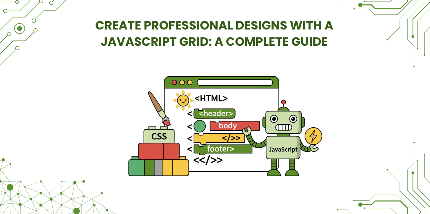
How to Create Professional Designs with a JavaScript Grid: A Complete 2026 Guide
June 30, 2023
17528 Views
Get a summary of this article:
A professional JavaScript grid design combines clean layout fundamentals with enterprise-grade performance and accessibility. This guide explains what a website grid is, how JavaScript grids function, the design principles that distinguish professional layouts, and how to build data-intensive grids that handle large datasets while staying responsive and accessible. It also covers when to use a comprehensive grid framework such as Ext JS for enterprise applications.
Key Takeaways
- A website grid provides structure, balance, and visual consistency, which improves both readability and user experience.
- Professional grid design balances visual appeal with accessibility, performance, and responsiveness.
- Modern JavaScript data grids handle very large datasets through virtualization and buffered rendering.
- Accessibility compliance under WCAG 2.2 is mandatory for many enterprise applications.
- For data-intensive enterprise applications, a dedicated framework such as Ext JS provides grid capabilities that would otherwise require many separate libraries.
Introduction
Website grids are fundamental to organizing and presenting content effectively. A well-designed grid provides structure, balance, and consistency, making a design visually appealing and easy to navigate. JavaScript grids extend this idea further: they let developers create and manipulate website layouts dynamically, and for data-intensive applications, they manage rich, interactive presentations of tabular data.
This guide covers what a website grid is and why it matters, how JavaScript grids function, the elements and best practices of JavaScript grid layout design, and how to build data-intensive grids that perform well at enterprise scale. It also explains where a comprehensive framework such as Ext JS fits when grids must handle large data volumes alongside professional design.
What Is a Website Grid and Why Does It Matter?
A website grid is a structural JavaScript framework that helps designers align, order, and organize content on web pages. It acts as a visual guide for the user interface, making the layout easier to scan, more visually balanced, and more consistent across the site. Designers rely on grids to establish hierarchy and to create the kind of order that users perceive, even when they cannot articulate why a layout feels well-made.
Grids matter because they shape the user experience. They improve readability through consistent spacing and alignment, they make navigation feel predictable, and they support responsive design by providing a clear structure that adapts across screen sizes. Whether the goal is a marketing page, a documentation site, or a complex enterprise dashboard, a grid is one of the most important design tools available.
How JavaScript Grids Function
A JavaScript grid is a tool that creates and manages grid layouts or grid-based data displays dynamically in the browser. At its core, it lets developers define a grid structure by specifying columns and rows, setting their widths and heights, and determining the spacing between them. Once the structure is defined, the grid can be populated with content: text, images, controls, and other UI components are placed and positioned within the cells.
Beyond static layout, JavaScript grids provide interactive capabilities. They support sorting, filtering, resizing, drag-and-drop, and inline editing, which makes them more than passive containers for content. Responsiveness is also a core part of the design: a modern JavaScript grid layout adapts seamlessly to different screen sizes and input methods, providing a consistent experience across desktop, tablet, and mobile devices.
Also Read: 25 Best JavaScript Libraries for Enterprise Development in 2026
Key Elements of Grid Layout Design
Several components define the structure of a grid layout, and understanding each one helps make better design decisions.
- Format: the overall area that contains the design, which in web design is the browser window.
- Margin: the space between the edges of the format and the content area.
- Flowlines: horizontal and vertical lines that guide how content flows within the grid.
- Modules: the individual units inside the grid that act as containers for text, images, or other elements.
- Spatial zones: distinct regions within the grid that serve specific purposes, such as headers, content areas, and footers.
- Columns: the vertical divisions that provide a framework for arranging content.
- Rows: the horizontal divisions that allow content to be organized and aligned across the layout.
- Gutters: the spaces between columns or rows that provide visual separation and breathing room.
- Markers: visual indicators that help align and position elements consistently within the grid.
Why Grids Are Essential in Web Design
Grids are essential because they provide a structured framework for organizing and presenting content. They act as visual guides that help designers align elements, create balance, and establish hierarchy. Their primary role is improving the overall user experience: they make content easier to read through consistent spacing and alignment, they help users navigate and understand the layout more easily, and they create the visual order that distinguishes professional designs from amateur ones.
Grids also contribute directly to aesthetic appeal. They create a sense of order and professionalism, and they make designs feel cohesive even when they include many different elements. When elements align to a shared grid, the composition becomes naturally balanced and easier for the eye to process. Beyond aesthetics, grids enable responsive design: layouts built on a grid adapt cleanly to different screen sizes, which is essential for serving users across phones, tablets, and desktops with a consistent experience.
Different Types of Grids in Web Design
Several grid types are common in web and print design, each suited to particular content and goals.
- Manuscript grids mimic the structure of traditional printed documents, with one primary content area dominating the layout.
- Column grids divide the layout into multiple vertical columns, allowing flexible placement of content elements.
- Baseline grids align elements to a consistent horizontal baseline, creating a harmonious and visually balanced design.
- Modular grids combine vertical and horizontal divisions, providing a framework for organizing content into modular units or blocks.
- Hierarchical grids establish a clear hierarchical relationship between elements, guiding the user’s attention to the most important content first.
Best Practices for Using Grids in Web Design
Several practices consistently produce better grid-based designs. Knowing the grid anatomy, including columns, rows, gutters, and flowlines, is the starting point for creating effective layouts. The right grid layout depends on the content and goals: a content-rich marketing page and a dense data dashboard call for different grid choices, so the column count, spacing, and proportions should match the application’s profile.
Make grids responsive so they adapt gracefully to different screen sizes and devices, which is essential for a consistent user experience. Use white space strategically rather than treating it as wasted area; well-placed white space improves visual clarity and gives the design breathing room. Apply harmonious proportions, such as the golden ratio, to achieve visually pleasing and balanced compositions. And test the layout under realistic content, because designs that work with placeholder text often fail with the actual copy or data the application uses.
JavaScript Data Grids for Enterprise Applications
When the goal moves from page layout to displaying and managing tabular data, a JavaScript data grid component takes over. Data grids extend the basic grid concept with interactive capabilities, including sorting, filtering, grouping, editing, and virtualization. The distinction matters: CSS Grid handles page layout structure, while a JavaScript data grid manages data binding, virtual scrolling, and the complex behaviors that data-driven applications require.
Performance with large datasets
Performance becomes critical when applications display large amounts of data. A grid that handles a hundred records may struggle with tens of thousands, and the difference reveals itself only at realistic scale. Modern enterprise grids handle this through virtual scrolling, which renders only the rows currently in the viewport, plus a small buffer. The Ext JS data grid extends this with horizontal buffering and column virtualization, which keeps performance steady even for wide datasets with many columns. This combination lets the grid stay responsive at much higher data volumes than a naive implementation could support.
Memory management
Memory management matters because enterprise users keep applications open for long sessions. A grid that does not clean up unused DOM elements and data records will gradually slow down. Frameworks with disciplined automatic memory management avoid the gradual degradation that affects many custom implementations, which is one of the practical reasons enterprise teams favor mature grid components over assembled libraries.
Server-side processing
For very large datasets, server-side processing becomes essential. Remote sorting, remote filtering, and paged loading mean the server does the heavy work and the grid requests only the data it actually needs to display. The Ext JS data grid integrates with this pattern through its store and proxy architecture, and similar capabilities exist in other dedicated data grid libraries.
Accessibility for Data Grids
Enterprise applications must meet accessibility standards such as WCAG 2.2. Data grids present particular challenges because of their density and complex interaction model, but the key requirements are consistent across implementations. ARIA roles and labels are the foundation for screen reader compatibility, so the grid should expose its structure, header relationships, and dynamic state changes through proper attributes. Keyboard navigation must let users move between cells, activate sorting, open filters, and change selections without a mouse, with logical tab order and clear focus indicators throughout.
Visual accessibility also matters: color contrast must meet WCAG ratios, and any status information should be conveyed through more than color alone. The Ext JS data grid includes ARIA support, keyboard navigation, and focus management built into the component, with compatibility for screen readers such as JAWS, Narrator, TalkBack, and VoiceOver. Building accessibility into the component itself avoids the expensive retrofitting work that comes from assembling accessibility features onto a grid that did not include them.
Mobile-First Responsive Grid Design
Modern enterprise applications must function across device types, and a grid that works well on a wide desktop monitor needs deliberate adaptation to work on a phone screen. The most effective technique is progressive disclosure: show the most essential columns on smaller screens, and provide access to the remaining detail through interaction such as expanding a row to reveal additional fields. Trying to display every column on every device produces a grid that is unusable on mobile.
Touch interaction also differs from mouse interaction. Mobile grids need larger touch targets, touch-friendly selection, and gestures such as swipe for common actions. Performance considerations multiply on mobile, where processing power and bandwidth are more limited, so virtualization and progressive loading become even more important. A grid framework with built-in responsive capability, such as the Ext JS Modern toolkit, handles these adaptations through configuration rather than requiring custom mobile builds.
Why Enterprise Teams Choose Ext JS for Data Grids
For data-intensive enterprise applications, the Ext JS data grid provides capabilities that would otherwise require assembling several specialized libraries. We built it specifically for these scenarios, and it shows in the breadth of what it offers.
Capabilities built into the component
The Ext JS grid handles very large datasets through virtualization and buffered rendering. It supports row and column operations, flexible data binding, full filtering, grouping, infinite scrolling, drag and drop, and column resizing, all built into the component. Data import and export, pivoting, and integration with other Ext JS UI components come from the same integrated framework, which removes the seams that appear when these capabilities are assembled from separate libraries.
Customization without complexity
The grid provides extensive customization options for appearance, behavior, and functionality, while keeping the underlying component model stable. Teams can adapt the visual style to their design system and adjust interaction patterns to their domain, without giving up the performance and reliability that the framework provides as a baseline.
Part of a complete framework
Because the grid is part of Ext JS rather than a standalone library, it integrates naturally with the rest of the framework. Charts, forms, layouts, and other components share the same architecture, which means an Application Development Software that uses the grid for its data display gets the rest of the toolkit at no additional integration cost. For React teams that want access to these components without leaving React, ReExt provides a bridge that lets Ext JS components run inside an existing React application.
Conclusion
Professional grid design starts with the fundamentals: a clear understanding of grid anatomy, the discipline to apply consistent layout principles, and the use of grids as a tool for both visual order and user experience. For applications that display significant amounts of tabular data, that foundation extends into a dedicated JavaScript data grid that handles virtualization, accessibility, responsive behavior, and complex interaction.
Different grid types suit different design goals, including manuscript, column, baseline, modular, and hierarchical grids. For data-intensive enterprise applications, a comprehensive framework such as Ext JS provides the data grid capabilities and the supporting components that the application also needs, in one integrated platform. Teams ready to evaluate Ext JS for an enterprise grid implementation can start a free trial and assess it against their own requirements.
Frequently Asked Questions
What is a JavaScript grid and when should I use it?
A JavaScript grid is a structured UI component used to display and manage content or data in rows and columns. Use it when the application needs interactive features such as sorting, filtering, resizing, editing, pagination, or virtualization. For simple static layouts, CSS Grid is usually enough; for interactive data-driven displays, a JavaScript data grid component is the right tool.
How is a JavaScript data grid different from CSS Grid?
CSS Grid is primarily a layout tool that controls how elements are positioned on a page. A JavaScript data grid is for interactive, data-driven UI: it handles datasets, user actions, column logic, editing, and complex behaviors such as grouping, summaries, and exports. The two are complementary rather than competing tools.
What makes a professional grid design in a web application?
A professional grid design typically includes consistent spacing, clear typography, predictable alignment, responsive behavior, strong visual hierarchy, and user-friendly interactions such as sticky headers, fast search and filtering, and clear empty and loading states. The details vary by application, but these qualities consistently distinguish polished designs from rough ones.
How do I keep a grid fast with large datasets?
Use virtualization, which renders only the rows currently in the viewport plus a small buffer. Add pagination or lazy loading when data volumes grow, and prefer server-side filtering and sorting once datasets exceed what the browser can handle comfortably. Heavy cell templates and complex CSS selectors also slow rendering, so keep both efficient.
When should I choose a grid library instead of building from scratch?
If the application needs enterprise-grade features such as editing, accessibility, export, grouping, pinned columns, role-based behavior, and performance at scale, a grid library saves significant time and reduces long-term maintenance risk. Building these features from scratch is rarely cost-effective once total development and maintenance time is accounted for.
Which grid layout type is best for modern web design?
For general UI layout, column grids and modular grids work well for most sites. For data-heavy screens, a dedicated data grid component is the right choice, with responsive columns, resizing, and structured data rendering built in. The best layout type depends on whether the design is content-focused or data-focused.
How do I make a JavaScript grid responsive for mobile and tablets?
Use responsive layouts with flexible column widths, prioritize the most important columns and hide or stack the rest on smaller screens, support horizontal scrolling where necessary, and provide touch-friendly row actions. Test across breakpoints early rather than treating mobile as a late-stage adjustment.
What features should I look for in an enterprise JavaScript grid?
Look for virtualization, column locking, filtering, sorting, grouping, editing, keyboard navigation, accessibility support, export in common formats such as CSV and Excel, theming, and clean integration with the framework stack the application uses. The Ext JS data grid includes these as part of the framework rather than as add-ons.
Why do teams use Ext JS Grid for enterprise interfaces?
Because it combines advanced grid functionality, both in performance and feature depth, with a consistent UI system that includes complementary components such as charts, forms, and layouts. This reduces the dependency on assembling and maintaining many separate libraries and helps teams ship complex, data-rich applications faster.
What is the quickest way to start building a grid UI that looks polished?
Start with a defined grid system covering spacing and typography, use consistent column rules across the application, keep interactions predictable from screen to screen, and adopt a grid framework with built-in theming and tested components. Polish comes from consistency more than from any single design trick.
 1
1
 1
1
Latest Content

JS Days Is Back: A Free Virtual Conference for JavaScript Developers
Sencha is bringing back JS Days, a free, two-day online conference for JavaScript developers. Dates:…
July 2, 2026

What Is DORA? A Complete Guide to the EU's Digital Operational Resilience Act (2026)
Last Updated: June 2026 The Digital Operational Resilience Act (DORA) is one of the most…
June 17, 2026

Top 8 Best Practices for Enterprise Software Development in 2026
Enterprise software development in 2026 demands a different approach than consumer application development. Enterprise teams…
June 3, 2026


