


 Ask Sencha AI
React Data Grid: The Complete 2026 Guide to High-Performance Data Tables
September 8, 2022
9651 Views
Get a summary of this article:
Last Updated: May 27, 2026
A React data grid is a component for displaying, editing, and managing large datasets inside a React application. Enterprise applications need data grids that handle large row and column counts, support real-time updates, and remain responsive under heavy use. This guide explains what makes a data grid enterprise-ready, compares the leading React data grid options, and shows where Ext JS with ReExt fits for data-intensive applications.
Key Takeaways
- A React data grid displays and manages large datasets while keeping the interface responsive and accessible.
- Enterprise data grids must handle large datasets, real-time updates, and heavy user interaction without performance loss.
- Virtual scrolling and column virtualization are the core techniques behind high-performance grids.
- ReExt bridges all 140+ Ext JS components, including the data grid, into React applications.
- Accessibility and responsive design should be built in rather than retrofitted for enterprise compliance.
Introduction
Data-driven applications depend on presenting large amounts of information clearly and quickly. In React applications, the data grid is the component most often responsible for that job, displaying, editing, and managing large datasets while keeping the user experience smooth.
This guide explains what a React data grid is, what makes one enterprise-ready in 2026, how the leading options compare, and how to think about performance, accessibility, and responsive design. It also covers where Ext JS with ReExt fits for teams building data-intensive React applications.
What Is a React Data Grid?
A React data grid is a component that renders tabular data inside a React application, with built-in capabilities for sorting, filtering, editing, grouping, and navigating large datasets. It goes well beyond a basic HTML table, which becomes slow and difficult to manage once the dataset grows beyond a few hundred rows.
The React community has produced many data grid components so that developers do not have to build this functionality from scratch. A good data grid component packages the common features an application needs, which lets teams build sophisticated, interactive tables quickly rather than coding sorting, filtering, and virtualization by hand.
What Makes a React Data Grid Enterprise-Ready in 2026
Enterprise React applications demand far more than basic table functionality. A data grid intended for enterprise use must handle massive datasets, support real-time updates, and maintain performance under heavy user interaction.
Enterprise requirements have grown significantly. React is now the most widely used front-end tool, which makes data grid performance a near-universal concern, and enterprise applications handle considerably more data than they did five years ago. Traditional pagination-based tables struggle at this scale.
Performance benchmarks matter. Users expect Core Web Vitals compliance, including a Largest Contentful Paint under 2.5 seconds, even for data-heavy applications. This means a React data grid must render initial content quickly and load additional data progressively rather than blocking the interface while a large dataset loads.
Leading React Data Grid Solutions Compared
The React data grid landscape includes several viable options, each with distinct strengths for different use cases.
ag-Grid
ag-Grid is a widely used option with solid virtual scrolling and extensive customization. It works well for many applications, though performance can degrade with very large datasets, and its full enterprise feature set requires a commercial license. It is a reasonable choice for teams that need a capable grid and are comfortable managing that licensing.
React Table (TanStack Table)
React Table, now part of TanStack, provides lightweight, headless table logic that is well suited to simple data display. Because it is headless, it gives developers full control over markup and styling, but it also means features such as built-in sorting UI, filtering UI, and editing require significant custom development. It is best for simpler use cases rather than complex enterprise grids.
Material UI Data Grid
The Material UI Data Grid integrates cleanly with Material Design systems and is a natural choice for applications already built on Material UI. Its styling is tied closely to Material Design, however, and for very complex, data-intensive enterprise applications its performance and customization limits can become constraints.
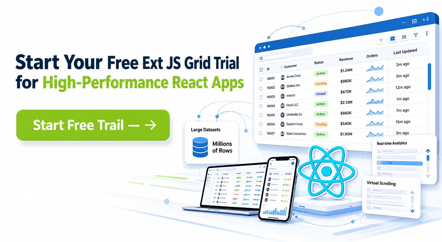
Ext JS Grid with ReExt
The Ext JS grid, used in React through ReExt, is built for enterprise-grade performance and ships as part of a framework with 140+ pre-built components. It is engineered to handle large datasets through virtualization and buffered rendering, and it provides comprehensive features, including advanced filtering, grouping, locking, and export, out of the box rather than through add-ons.
The right choice depends on the specific requirements. Simpler applications are well served by lightweight options such as React Table. Enterprise teams managing large datasets and complex interactions tend to favor a grid built for that scale, with a comprehensive feature set included by default.
Ext JS Grid with ReExt: Enterprise-Grade Performance
ReExt is a bridge library that lets enterprise teams use Ext JS components inside React applications. It provides access to all 140+ Ext JS components, including the data grid, while teams continue to work with familiar React development patterns. We built ReExt so React teams can adopt enterprise-grade components without leaving the React ecosystem.
The advantage is that performance-critical work the team would otherwise do by hand is handled by the framework. A grid displaying tens of thousands of records would require extensive optimization in many React libraries. With ReExt, that performance comes from the proven architecture of the Ext JS grid, which uses buffered rendering and DOM recycling to stay responsive at scale.
Horizontal buffering is a notable capability. Traditional virtual scrolling optimizes only vertical rendering, which leaves wide datasets with many columns as a performance bottleneck. The Ext JS grid buffers both axes, rendering only the visible rows and columns, which keeps scrolling smooth even for grids with dozens of columns. ReExt provides full access to this and the grid’s other features, including locking, advanced filtering, and export.
Performance Optimization for Large Datasets
Modern enterprise applications routinely handle datasets that exceed what traditional React table patterns can render efficiently. A few techniques form the foundation of high-performance data grids.
Virtual scrolling
Virtual scrolling is the foundation of high-performance data grids. Instead of rendering every row in the DOM, it creates only the rows currently visible plus a small buffer, which reduces initial render time from seconds to milliseconds. As the user scrolls, rows are recycled rather than continuously created and destroyed.
Column virtualization and horizontal buffering
Basic virtual scrolling is not always sufficient. Wide datasets with many columns create a horizontal performance bottleneck that vertical-only virtualization does not address. Column virtualization, also called horizontal buffering, renders only the visible columns, keeping the DOM small and scrolling smooth regardless of how many columns the dataset contains. The Ext JS grid applies buffering on both axes.
Server-side processing
For very large datasets, server-side processing keeps the browser from loading everything at once. Remote sorting, remote filtering, and paged data loading mean the server does the heavy work and the grid requests only the data it needs. This pattern is essential once datasets reach the hundreds of thousands of records.
Memory management
Memory management becomes critical at enterprise scale because enterprise users keep applications open for long sessions. A grid that does not clean up unused DOM elements and data records will gradually slow down. Frameworks with disciplined, automatic memory management avoid the memory leaks that can affect long-running data-heavy applications.
Also Read: 10 Essential JavaScript Libraries Every Developer Should Know in 2026
Accessibility and ARIA Compliance
Enterprise software development must meet accessibility standards such as WCAG 2.2. Data grids present particular accessibility challenges because of their complex, interactive nature and high information density.
ARIA attributes are the foundation of screen reader compatibility. A data grid needs proper roles, labels, and live regions so assistive technology can convey its structure and announce changes such as sorting, filtering, and selection updates. Keyboard navigation is equally important: users must be able to move between cells, activate sorting, open filters, and change selections using the keyboard alone, with proper focus management throughout.
Visual accessibility matters too. Color contrast must meet WCAG ratios, and status indicators should convey meaning through more than color alone. The Ext JS grid includes ARIA support, keyboard navigation, and focus management built into the component, which means enterprise teams meet accessibility requirements without retrofitting compliance onto each grid individually. For teams in regulated industries, this built-in compliance reduces both development time and risk.
Responsive Design for Mobile and Tablet
Mobile and tablet devices account for a growing share of enterprise application usage, even for data-intensive workflows. A responsive data grid must adapt gracefully from a wide desktop monitor to a small phone screen while keeping its core functionality intact.
Progressive disclosure is the key technique for handling information density. A desktop grid can display many columns at once, while a phone screen accommodates only a few. Effective responsive design prioritizes the most essential columns on small screens and provides access to the remaining detail through interaction, such as expanding a row.
Touch interaction also differs from mouse-based interaction. Mobile users expect larger touch targets and touch-friendly selection. Performance considerations multiply on mobile, where processing power and network bandwidth are more limited, which makes virtualization and progressive loading even more important. A grid with a built-in responsive system adapts across these breakpoints while keeping consistent functionality and performance.
Choosing the Right React Data Grid
The React data grid landscape offers several solid options, but the right choice depends on the application’s requirements. Lightweight libraries work well for simple data display, while applications with large datasets, complex interactions, and strict accessibility requirements need a grid built for that scale.
Performance at scale is what separates an enterprise grid from a consumer one. Virtual scrolling, column virtualization, server-side processing, and disciplined memory management are what allow a grid to stay responsive with very large datasets. Built-in accessibility and responsive design also reduce development overhead significantly, because compliance and mobile support come as core functionality rather than custom work.
For data-intensive React applications, the Ext JS grid used through ReExt provides this performance and feature depth as part of a complete framework. Teams can evaluate Ext JS and ReExt through a free trial and assess the data grid against their own datasets and requirements.
Frequently Asked Questions
What is a React data grid?
A React data grid is a component that displays tabular data in a React application, with built-in capabilities for sorting, filtering, editing, grouping, and navigating large datasets. It is designed to handle far more data, and far more interaction, than a basic HTML table can manage efficiently.
What is the difference between virtual scrolling and pagination?
Virtual scrolling renders only the rows currently visible in the viewport, plus a small buffer, while maintaining the experience of a complete, continuous dataset. Pagination divides data into discrete pages that the user navigates between. Virtual scrolling generally provides a smoother experience for large datasets because it removes page-load interruptions.
Which React data grid is best for enterprise applications?
For data-intensive enterprise applications, a grid built for scale with a comprehensive feature set is the strongest choice. The Ext JS grid, used in React through ReExt, is designed for large datasets and includes advanced features such as locking, filtering, grouping, and export by default. Lighter libraries suit simpler applications. The best choice depends on the dataset size and interaction complexity of the specific application.
Can I use Ext JS components in a React application?
Yes. ReExt provides a bridge between React and all 140+ Ext JS components, including the data grid, charts, and forms. React teams can integrate Ext JS components into their applications while continuing to use React development patterns, which allows enterprise-grade components to be added without abandoning the React ecosystem.
How do I handle very large datasets in a React data grid?
Combine several techniques: virtual scrolling to render only visible rows, column virtualization for wide datasets, and server-side processing so sorting, filtering, and paging happen on the server rather than in the browser. The Ext JS grid applies these optimizations as part of its architecture, which keeps it responsive with very large datasets.
How does the Ext JS grid compare to ag-Grid?
Both are capable enterprise data grids. The Ext JS grid is part of a complete framework with 140+ components and applies buffering on both the vertical and horizontal axes, which helps with wide datasets that have many columns. ag-Grid is a dedicated grid library with strong customization. The right choice depends on whether the team wants a standalone grid or a complete framework, and candidates should be benchmarked against the application’s actual data.
What accessibility features should an enterprise data grid have?
An enterprise data grid should provide ARIA labels and roles, full keyboard navigation, screen reader compatibility, focus management, and sufficient color contrast. It should also announce dynamic changes such as sorting, filtering, and selection updates. The Ext JS grid includes these accessibility features built in, which helps applications meet WCAG 2.2 requirements.
How do I make a React data grid responsive for mobile?
Use progressive disclosure to show only the most essential columns on small screens, with the remaining detail available through interaction such as expanding a row. Provide larger, touch-friendly targets, and rely on virtualization and progressive loading to keep performance acceptable on devices with limited processing power and bandwidth.
Does ReExt support all Ext JS grid features?
ReExt provides access to the full set of Ext JS components and grid capabilities, including column virtualization, accessibility features, lockable columns, advanced filtering, and export. React teams using ReExt can use the Ext JS grid’s enterprise features without feature limitations imposed by the bridge itself.
How do I handle real-time data updates in a React data grid?
For real-time data, connect the grid to a live data source through WebSocket connections or Server-Sent Events, and update the grid’s underlying data store as new data arrives. A well-designed grid updates only the affected rows rather than re-rendering the entire grid, and buffered data handling allows it to apply frequent updates efficiently at scale.
UI Components
Data Visualization
Enterprise Application Development
Frontend Development
Web Application Development
Web Development
Performance Optimization
React Development
JavaScript Frameworks
Enterprise Software


Latest Content

5 JavaScript Libraries Enterprise Teams Should Avoid Building From Scratch
Enterprise teams routinely invest substantial developer time building JavaScript libraries that already exist as mature,…
July 14, 2026

How to Evaluate UI Component Libraries: 10 Criteria That Actually Matter
Choosing a UI component library shapes development velocity and application quality for years. This guide…
July 14, 2026

JS Days Is Back: A Free Virtual Conference for JavaScript Developers
Sencha is bringing back JS Days, a free, two-day online conference for JavaScript developers. Dates:…
July 2, 2026


