






Creating Responsive Layouts with Flexbox and CSS Grid: The Complete Guide
May 26, 2026
2933 Views
Get a summary of this article:
Modern web applications must work across a wide range of screen sizes. From large desktop monitors to tablets and mobile devices, users expect layouts that adapt smoothly without breaking, overlapping, or becoming difficult to use. That is why responsive design is a core part of frontend development, and two of the most important CSS tools for building responsive interfaces are Flexbox and CSS Grid.
Both Flexbox and Grid help developers create layouts that are more powerful and maintainable than older float-based or heavily manual techniques. But they are not identical. Flexbox is designed primarily for one-dimensional layout control, while CSS Grid is built for two-dimensional layout management. Understanding when to use each one—and how they can complement each other—makes responsive layout work much easier.
For teams building Enterprise software development, layout complexity often goes beyond simple landing pages or marketing sites. Business applications may include dashboards, toolbars, forms, navigation areas, side panels, grids, dialogs, tabbed interfaces, and nested views that all need to remain usable across devices. This is where framework support becomes especially valuable.
Ext JS approaches responsive UI design through a rich layout system that abstracts much of the manual layout work developers would otherwise do with raw CSS. Its layout managers use ideas similar to Flexbox and Grid—managing sizing, alignment, regions, containers, and responsive behavior—while helping developers structure large application interfaces in a more consistent and scalable way.
In this guide, we will explore Flexbox and CSS Grid in depth, compare their strengths, review practical responsive layout strategies, and explain how Ext JS layout managers simplify responsive design for complex user interfaces.

Why Responsive Layouts Matter
A responsive layout adapts to the available screen size, orientation, and device conditions.
This matters because users expect interfaces to:
- resize smoothly
- remain readable on smaller screens
- keep navigation accessible
- avoid horizontal scrolling
- preserve visual hierarchy
- support touch-friendly interaction
A layout that works only on one screen size creates friction and reduces usability.
What Is Flexbox?
Flexbox, short for Flexible Box Layout, is a CSS layout model designed for arranging items in a single direction: either a row or a column.
It is especially useful when you want to align, distribute, or size items within a container without relying on manual spacing hacks.
Basic Example
    .container {
    display: flex;
    justify-content: space-between;
    align-items: center;
    }
This creates a flex container where child items are aligned along the main axis and cross axis.
Core Flexbox Concepts
To use Flexbox effectively, it helps to understand a few core ideas.
Main Axis and Cross Axis
Flexbox works on two axes:
- main axis: the primary direction of layout
- cross axis: the perpendicular direction
If flex-direction: row, the main axis is horizontal.
If flex-direction: column, the main axis is vertical.
Common Flexbox Properties
For the container:
- display: flex
- flex-direction
- justify-content
- align-items
- align-content
- flex-wrap
- gap
For the child items:
- flex
- flex-grow
- flex-shrink
- flex-basis
- align-self
- order
Why Flexbox Is Great
Flexbox is ideal for:
- navigation bars
- button groups
- form rows
- card alignment
- centering content
- distributing space between items
- vertical stacking with consistent spacing
Flexbox Example
    <div class="toolbar">
      <button>Save</button>
      <button>Cancel</button>
      <button>Help</button>
    </div>
    .toolbar {
      display: flex;
      gap: 1rem;
    }
This is simple, readable, and responsive-friendly.
What Is CSS Grid?
CSS Grid is a two-dimensional layout system that allows developers to control rows and columns at the same time.
While Flexbox is best for arranging items in a line, Grid is best when the layout itself has a more structured matrix or page-like arrangement.
Basic Example
    .container {
    display: grid;
    grid-template-columns: 1fr 2fr 1fr;
    gap: 1rem;
    }
This defines a three-column grid with proportional widths.
Core Grid Concepts
Grid Container and Grid Items
A parent becomes a grid container with:
display: grid;
Its children automatically become grid items.
Common Grid Properties
For the container:
- display: grid
- grid-template-columns
- grid-template-rows
- gap
- grid-auto-flow
- grid-auto-columns
- grid-auto-rows
For the items:
- grid-column
- grid-row
- grid-area
- justify-self
- align-self
Why Grid Is Great
CSS Grid is ideal for:
- full-page layouts
- dashboards
- card grids
- form sections
- sidebars with content regions
- multi-column responsive sections
- interfaces that need row and column control
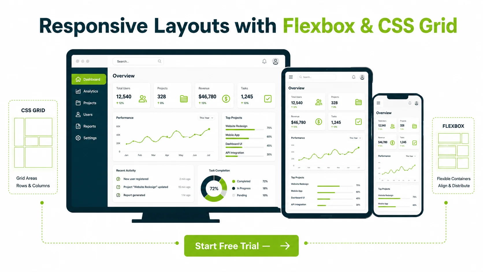

Flexbox vs CSS Grid
A common question is: which one should you use?
The answer is: it depends on the layout problem.
Use Flexbox When:
- you are laying out items in one direction
- alignment is the main challenge
- content size affects layout naturally
- you need simple responsive rows or columns
Use Grid When:
- you need control over both rows and columns
- the layout is more structural
- items must fit into defined regions
- you are building dashboards or page-level arrangements
Important Point
Flexbox and Grid are not competitors. They are complementary tools.
Many real interfaces use both:
- Grid for the page structure
- Flexbox inside individual sections
Also Read: Top JavaScript Frameworks for Mobile App Development in 2026
Responsive Design with Flexbox
Flexbox naturally supports responsive behavior because items can shrink, grow, wrap, and realign based on available space.
Example: Wrapping Cards
    .cards {
      display: flex;
      flex-wrap: wrap;
      gap: 1rem;
    }

    .card {
      flex: 1 1 250px;
    }
This lets cards wrap into new rows as screen width decreases.
Example: Stacking on Small Screens
    .form-row {
      display: flex;
      gap: 1rem;
    }

    @media (max-width: 768px) {
      .form-row {
        flex-direction: column;
      }
    }
This changes a horizontal layout into a vertical one for smaller screens.
Responsive Design with CSS Grid
Grid also shines in responsive design, especially when using fluid column definitions.
Example: Auto-Fitting Columns
    .dashboard {
      display: grid;
      grid-template-columns: repeat(auto-fit, minmax(250px, 1fr));
      gap: 1rem;
    }
This automatically creates as many columns as will fit, while preserving a minimum size.
This pattern is extremely useful for:
- product cards
- dashboard widgets
- feature blocks
- responsive panels
Common Layout Patterns
1. Header, Sidebar, Content Layout
Grid is often excellent for this.
    .app-layout {
      display: grid;
      grid-template-columns: 250px 1fr;
      grid-template-rows: auto 1fr;
      gap: 1rem;
    }
2. Navigation Bar
Flexbox is usually the better fit.
    .navbar {
      display: flex;
      justify-content: space-between;
      align-items: center;
    }
3. Responsive Card Grid
Grid is often simpler and more scalable here.
4. Form Field Alignment
Flexbox is useful for inline controls, while Grid can help with larger structured forms.
Best Practices for Responsive Layout Design
1. Design for Content, Not Just Device Widths
Responsive design should adapt to the content’s needs, not only to a list of common screen sizes.
2. Avoid Overcomplicating Layouts
Choose the simplest layout model that solves the problem cleanly.
3. Use Flexible Units
Prefer:
- percentages
- fr
- rem
- minmax()
- auto-fit
- auto-fill
instead of rigid pixel-heavy layouts where possible.
4. Combine Grid and Flexbox Thoughtfully
Use each where it makes sense rather than forcing one tool into every scenario.
5. Test Nested Layout Behavior
Complex interfaces often break not at the top level, but inside nested panels and containers.
Common Mistakes to Avoid
Some frequent layout mistakes include:
- using Flexbox for deeply two-dimensional layouts
- using Grid when simple one-direction alignment would be easier
- hardcoding widths excessively
- forgetting wrapping behavior
- ignoring small-screen spacing
- building layouts that depend too heavily on viewport assumptions
In larger applications, these issues become more noticeable as interface complexity increases.
Ext JS and Responsive Layout Management
This is where the Ext JS angle becomes especially relevant.
In raw CSS development, developers often manually combine Flexbox, Grid, media queries, spacing rules, and nested container logic to build complex interfaces.
Ext JS provides a component-based layout system that helps manage this complexity more systematically.
Instead of directly writing every layout rule by hand, developers work with layout managers that control how components are sized, positioned, aligned, and resized within containers.
This is particularly useful in enterprise applications, where interfaces may contain:
- toolbars
- side panels
- data grids
- forms
- tab panels
- nested containers
- dialogs
- dashboards
- collapsible regions
How Ext JS Layout Managers Relate to Flexbox and Grid Concepts
While Ext JS layout managers are not simply wrappers around native CSS Flexbox or Grid in every case, they use many of the same layout ideas:
- directional arrangement of items
- proportional sizing
- alignment and stretching
- row and column style organization
- region-based page structure
- responsive adaptation of nested containers
This means developers familiar with Flexbox and Grid concepts often find it easier to understand Ext JS layout behavior.
Key Ext JS Layout Strengths for Responsive UIs
1. Structured Container-Based Layout
Ext JS encourages developers to think in terms of nested containers and managed layouts rather than isolated CSS rules. This creates more predictable behavior in large interfaces.
2. Simplified Complex UI Composition
A dashboard or admin interface often requires many coordinated layout regions. Ext JS layout managers help organize these pieces without forcing developers to handcraft all sizing logic manually.
3. Better Handling of Enterprise UI Patterns
Enterprise apps often need:
- collapsible sidebars
- resizable panels
- nested forms
- responsive toolbars
- dynamic regions
- data-heavy screens
Ext JS is designed for exactly these scenarios.
4. Integrated Responsiveness
Responsive behavior in Ext JS can be managed through its UI component and layout system, reducing the need to manually orchestrate every responsive change at the CSS level.
5. More Maintainable Large-Scale Layouts
When applications grow, layout consistency becomes harder to preserve with scattered CSS alone. Ext JS helps centralize layout behavior within the application’s component structure.
Examples of Ext JS Layout Thinking
In practical terms, Ext JS layout managers help with scenarios such as:
- creating a two-region admin shell with navigation and content
- building forms with aligned input groups
- managing dashboards with panels that resize and rearrange
- controlling nested containers inside tabbed interfaces
- keeping complex UIs consistent across screen sizes
These are tasks that would otherwise require careful manual use of Flexbox, Grid, and responsive CSS rules.
Flexbox, Grid, and Ext JS Together
Understanding Flexbox and Grid still matters even when using Ext JS.
Why?
Because these concepts improve your understanding of:
- alignment behavior
- proportional sizing
- container logic
- layout direction
- spacing strategy
- responsive composition
Even when Ext JS abstracts much of the implementation, the underlying layout thinking remains similar.
Developers who understand core CSS layout models usually make better decisions when configuring Ext JS layout managers.
Conclusion
Flexbox and CSS Grid are two of the most important tools for creating responsive layouts in web application development. Flexbox is excellent for one-dimensional alignment and spacing, while Grid is ideal for two-dimensional page and section structures. Used together, they provide a powerful foundation for responsive design.
For teams building more complex applications, layout concerns quickly grow beyond simple CSS snippets. Dashboards, forms, panels, toolbars, side navigation, and nested views all introduce challenges that require more structured layout management.
That is where Ext JS provides significant value. Its layout managers apply many of the same concepts behind Flexbox and Grid—such as directional flow, proportional sizing, alignment, and responsive organization—while simplifying the process of building large, maintainable enterprise interfaces. For complex UIs, this can dramatically reduce layout complexity and improve consistency.
The better you understand layout fundamentals, the easier it becomes to build responsive applications—whether you are working directly in CSS or through a framework like Ext JS.
Build responsive enterprise UIs faster with the free trial of Sencha Ext JS 8.0.
FAQs
What is the difference between Flexbox and CSS Grid?
Flexbox is mainly for one-dimensional layouts, such as rows or columns, while CSS Grid is designed for two-dimensional layouts involving both rows and columns.
When should I use Flexbox instead of Grid?
Use Flexbox when alignment and spacing in a single direction are your main concerns, such as with navigation bars, toolbars, or stacked sections.
When should I use CSS Grid instead of Flexbox?
Use Grid when you need structured control over rows and columns, such as for dashboards, card layouts, or page-level arrangements.
Can Flexbox and Grid be used together?
Yes. Many responsive interfaces use Grid for the overall layout and Flexbox inside sections for alignment and spacing.
Why are responsive layouts important?
Responsive layouts help applications remain usable, readable, and visually organized across different screen sizes and device types.
How does Ext JS help with responsive design?
Ext JS provides layout managers that organize component sizing, alignment, and placement, helping developers build responsive and maintainable interfaces more efficiently.
Do I still need to understand Flexbox and Grid if I use Ext JS?
Yes. Understanding these concepts helps you make better layout decisions and better understand how Ext JS layout managers behave.



Latest Content


What JS Days 2026 Keynote Revealed About the Next Era of Development
The JavaScript ecosystem has spent the last decade optimizing for speed. Frameworks have become more…
September 23, 2026
Async/await with Ext JS
Probably one of the most appreciated features of the latest versions of JavaScript is Promises,…
September 3, 2026

Sencha IDE Plugins - JetBrains 6.0.18 Is Here
JetBrains 2026.2 just shipped. So did we. Sencha’s JetBrains plugin is an Integrated Development Environment…
September 2, 2026