


 Ask Sencha AI
How to Choose the Right React Component UI Library for Your Project
June 25, 2025
5068 Views

React is perhaps the most widely used web app-building framework right now. Many developers also pair it with Tailwind CSS for fast styling. It’s quick, versatile & supported by a huge community. But for creating real-world applications, this alone isn’t enough. That’s where the React UI component library & Tailwind CSS builds.
React UI component library saves time. They provide pre made UI components so that you don’t have to design everything from a beginner. They also ensure that your design looks uniform throughout the app and ease development. But they don’t all have the same. Some are simple & others are full of cutting-edge key features for handling complex data. Making the right decision can significantly impact the way your project functions, looks and progresses.
If you’re building something heavy or need high-performance Radix UI components, a library like ReExt can be a good choice. It blends performance with power, giving you more control, a better appearance & faster outcomes.
In this post, we’ll discuss what to consider when selecting a UI Framework for a React component, compare some of the best choices & discuss where ReExt fits in. Whether you’re creating a dashboard, an enterprise application, or a client application, this article will guide you toward selecting the appropriate tools for the task.
What Are React Aria UI Libraries?
React UI component library is a set of pre-designed complex components that allow developers to design user interfaces more quickly. They are like toolkits. Instead of coding from scratch each button, each form, or each table, you import pre-built pieces that already appear and function nicely.
These customizable components are time-savers. They also keep your application design constant, which is crucial if you’re developing big projects or in a team. Most also follow best practices like accessibility standards & WAI ARIA guidelines, so you have clean, effective code without coding from starting.
It’s usually simple for programmers to use a library. It speeds up development, reduces errors & aids in focusing on key features and functionality, which are what really matter.
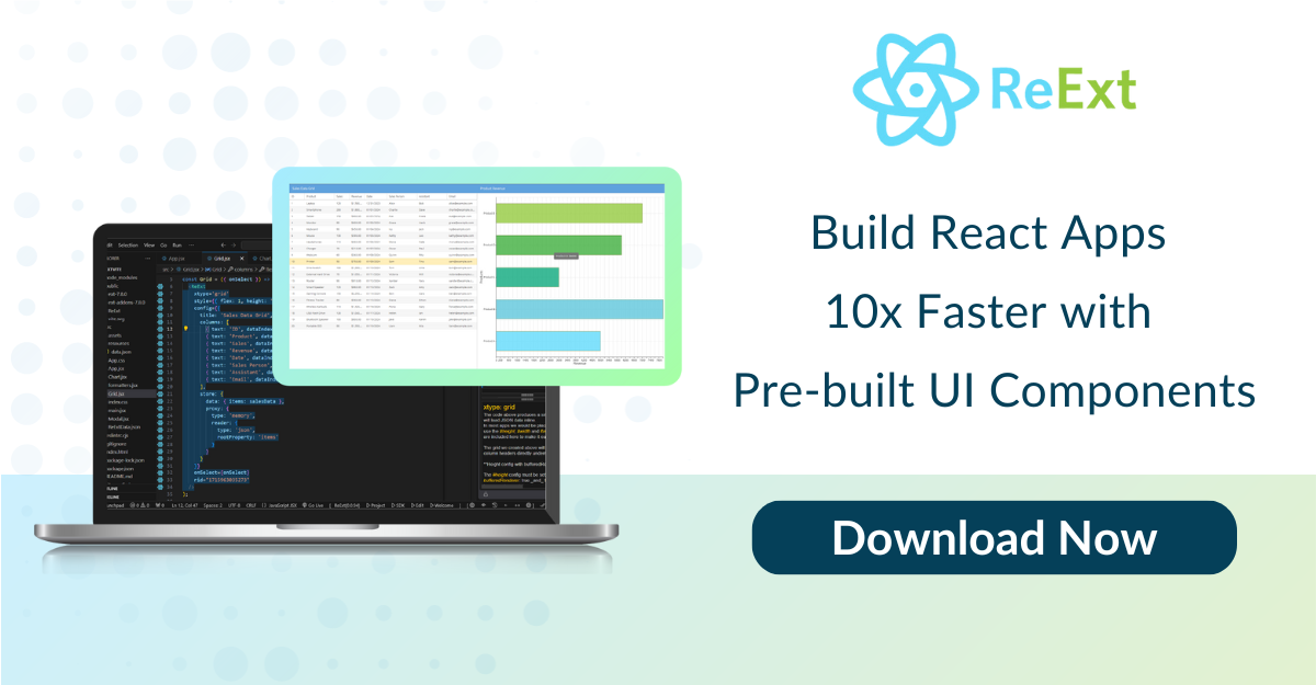
One strong choice is the ReExt component. It combines the extensive key features of Ext JS with flexibility. With it, you have access to a massive collection of advanced React UI components, such as data grids, charts & calendars – all customizable.
It’s ideal for developers who want to have a fast but also desire their app to handle lots of data visualization and look sleek UI. It also handles smooth animations so the app feels modern and responsive.
Why Choosing the Right Headless UI Component Library Matters?
The one you choose can affect how smooth your development process is & how efficiently your software will perform. Choosing the right Custom enterprise software development will save you time, money & a lot of rework later on if you’re doing it solo or with a team. Let’s break it down.
Impact on Developer Productivity
Instead of creating yourself, you use those that are already made and ready to plug into your program. This means spending more time developing distinctions and less time writing similar code.
However, the library may slow you down if it is difficult to use. Quality provides good documentation, adaptable Radix UI components & simple integration. These small things add a big difference to daily tasks.
With ReExt, productivity increases even more. It provides you with more than 140 accessible components ready to use and works very well. This means less setup, less debugging & more building blocks.
Design Consistency and Scalability
It gets harder to keep designs consistent as the team grows or applications scale to support different use cases. Different developers will style things a bit differently. Eventually, that creates a messy-looking and inconsistent app. With a utility-first framework such as Tailwind CSS helps maintain style rules. An effective React component library has a single design system that perfectly fits various applications. Most libraries also work smoothly with Tailwind CSS to enforce design rules.
Scalability is important as well. When your app becomes larger, the library needs to be able to keep up with more complex layouts and data visualization. ReExt component helps this, too – it’s designed to scale up, with strong layouts and dynamic key features that stay maintained and organized.
Performance Considerations and Maintenance
Some react headless UI libraries are beautiful but slow and heavy. Others won’t get along with big data or real-time updates. Using a well-optimized library prevents these problems. Performance does matter, particularly for applications that have high amounts of data or user interaction.
Maintenance is a big one, too. React radix UI Libraries require updates. They must stay compatible with the new version. Regular updates, fixes for bugs & new key features are all part of a well-kept library.
Key Criteria to Evaluate Before Choosing
Step back a step before you choose. Don’t only follow what other people are using or what is popular. Each project has unique objectives, dimensions, and technical needs. The right React UI library should match those needs and make your development process smoother – not harder. Let’s look at the key features to consider:
Project Scope and Requirements
Begin by figuring out what your project actually requires. Is it a small utility with a couple of screens? Or a huge web application with dashboards, charts & React data grid?
Certain headless UI libraries are light and ideal for small applications. Other frameworks, such as ReExt, are meant for data-intensive, enterprise-level applications. Choose one that matches your project size & complexity.
Design System Compatibility & Dark Mode Support
Your library must be consistent with your brand’s design system – or at least have enough flexibility to fit in. Ensure that it allows custom themes, supports accessibility & adheres to UI/UX best practices. Theming is easier if your library works with Shadcn UI or similar frameworks. The goal is to maintain consistency, whether in color schemes, fonts, or component behavior. Many also offer built-in support for dark mode, which helps maintain consistency across themes.
UI Component Variety and Quality
More key features mean more power. But it’s not merely a matter of numbers. Look for the best UI component library for React aria that provides well-crafted, responsive, and tested elements, from simple buttons to complex grids and charts – quality counts. Bonus if the components are compatible with Tailwind CSS. Libraries that pair well with Shadcn UI offer flexible styling options.
For instance, ReExt provides you with more than 140 accessible components, such as pivot grids, tree lists, calendars & more – all designed to deal with real-world scenarios. These components are flexible and responsive, with support for dark mode styling out of the box. You can also import them individually when needed.
Ease of Use and Developer Experience
It should simplify a developer’s life. Check how easy it is to install, import, set up, and style with Tailwind CSS. Most top libraries offer theming systems that allow easy dark mode toggling with minimal setup. Good documentation, useful examples, and an even learning curve make a big difference. Libraries that support tools like Shadcn UI are easier to set up and customize.
Performance and Bundle Size
Certain libraries put a huge amount of extra weight onto your modern web application, and it becomes slow to launch or laggy to use. Libraries that pair well with Tailwind CSS often stay lighter. Always confirm the bundle size and how it contributes to performance. Libraries like and Shadcn UI & ReExt support lazy loading. Also, they handle large datasets well without slowing down your app. This optimizes performance while still allowing features like theming and dark mode to be implemented easily.
Community Support and Maintenance
Headless UI libraries aren’t set-and-forget. They need updates, especially when they themselves change. Select a React native UI components with a robust user base, good documentation, and active maintenance. When problems appear, or new features must be added, you will not be stuck. Community support also means more tutorials, answers, and examples when you’re stuck.
Selecting the proper library from the beginning can avoid future time and trouble. It’s not just features – it’s about fit. Consider long-term & select a tool that provides accessibility support for your growth, flexibility, and success.
Top React UI Components Libraries in 2025
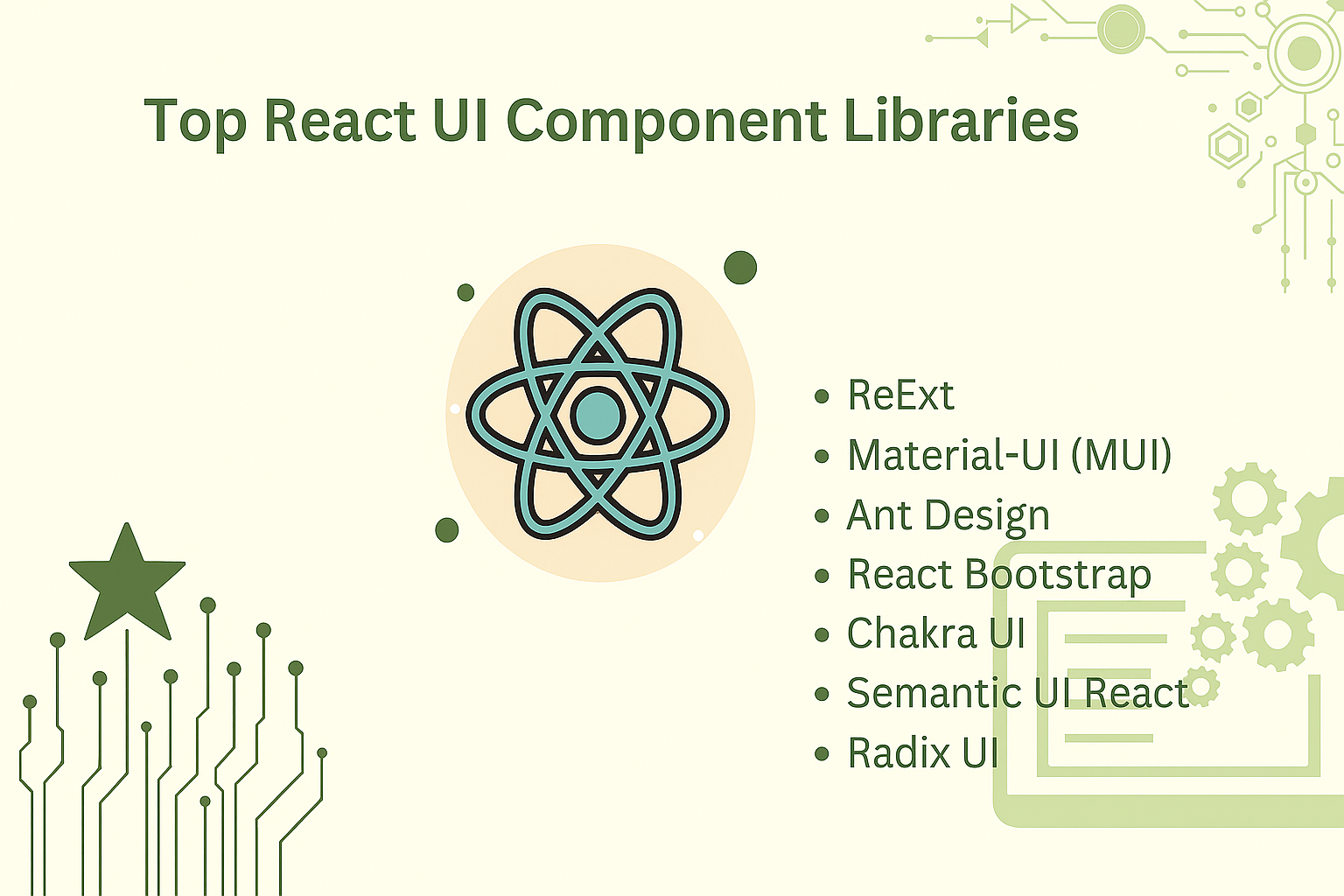
ReExt
It is designed for developers creating high-speed, scalable modern web applications with cross platform compatibility in mind. You can import ReExt components individually to keep your project lean.
It brings the strength of Ext JS within the React UI library. It also comes with server side rendering support, so it is ideal for SEO-focused or performance-critical applications. With over 140 pre-integrated components like React-grid-layout, charts, trees & calendars, this is ideal for data-intensive dashboards with high data or enterprise applications.
It supports React Hooks and integrates smoothly with Shadcn UI components. You can import components from Shadcn UI & ReExt to quickly build clean, customizable layouts.
Curious how ReExt works ? Watch this quick demo and see how easy it is to build fast, scalable React apps.
Material-UI (MUI)
MUI is based on Google’s Material Design. Though not built on Tailwind CSS, MUI can be customized to align with it. It’s modern and widely used. You get tons of UI components out of the box, with theming options that help match your brand. MUI is perfect for apps that need a polished design and a familiar layout. It works well for both startups and large-scale products.
Ant Design
This is known for its maintained layout and enterprise feel. It’s designed with large business apps in mind. The components level are detailed and consistent, making it easy to design full-featured admin panels or internal tools. It’s a great pick for teams focused on structured, professional UIs.
React Bootstrap
This one brings the simplicity of Bootstrap into React frameworks. It’s good if your team already knows Bootstrap or wants a fast way to build UI components without learning something new. It removes the need for jQuery and fits well in traditional-looking apps. Easy to use, reliable, and great for basic UI needs. It’s not built with Tailwind CSS, but you can layer in utility classes if needed.
Chakra UI
Chakra puts developer experience first. It’s simple, flexible & built with accessibility in mind. Chakra also works alongside Tailwind CSS if needed for layout tweaks. You can create layouts quickly using its pre styled components. This React UI component also comes with a solid theming system, including built-in dark mode support. Ideal for teams who want to maintain code and a good developer flow.
Semantic Radix UI React Components
Semantic UI React component uses class-based naming that feels close to plain HTML. This improves understanding for beginners. It’s useful when designing user interfaces that are both clear and functional. The components are straightforward and readable, with less focus on deep customization. Developers can apply Tailwind CSS easily on top of them.
Key Feature Comparison Table for Modern Web Applications
It’s useful to compare features side by side when deciding on libraries. Every library has something unique to offer – some emphasize simplicity, some enterprise-level key features & others developer convenience and performance. Below are some of the leading libraries compared:
| Feature | Material-UI (MUI) | Ant Design | React Bootstrap | Chakra UI | ReExt |
|---|---|---|---|---|---|
| Components | Covers most basic UI needs with a large range of components | Wide set of components, good for complex enterprise UIs | Offers core Bootstrap React components | Modern and modular components, easy to compose | Full suite of enterprise-grade components (grids, charts, etc.) |
| Customization | CSS-in-JS with deep theming system support | Flexible theming, allows advanced customization | Basic customization with Bootstrap classes | Custom styling with props and theme tokens | Theming via Ext JS + React, highly customizable |
| Design System | Follows Google’s Material Design | Based on Ant Design System for consistency | Built on Bootstrap’s clean and familiar design | Follows modern design best practices | Unified design system optimized for complex apps |
| Accessibility | Good ARIA support and keyboard navigation bars | Decent accessibility tools included | Basic ARIA roles | Strong focus on accessible components | Extensive ARIA, keyboard navigation, and internationalization built-in. |
| Developer Experience | Well-documented, widely adopted | Great community, strong docs | Easy to use for Bootstrap users | Simple, intuitive API with hooks support | Smooth React + Ext JS integration, solid docs, strong APIs |
| Performance | Responsive, works well on mobile | Optimized for high-load data apps | Lightweight, may lack advanced features | Fast, minimal DOM updates | Built for large-scale apps; handles complex data efficiently with lazy loading and fast rendering |
| Bundling & Tree Shaking | Tree shaking supported | Excellent tree shaking | Works, but can lead to bigger bundles | Built-in support | Efficient tree shaking and modular loading |
| Theming | Built-in theme options, customizable | Rich theming capabilities | Limited theme options | Dark mode and theme switching | Inherits strong theming engine from Ext JS, flexible styling with easy dark mode integration |
All these inclusive application development software are prioritized differently. If you want full control over the look and feel, Chakra UI or MUI would be excellent. Those who prefer to work with what they know will find React Bootstrap easy to learn.
If you’re making an enterprise app or a feature-complete dashboard, ReExt is exceptional, with strong data react UI components and scalability. The correct choice component actually relies on your team’s objectives and the complexity of your build application.
Final Checklist Before You Decide
Before you commit to React apps development for your task, take a minute to go through some basic but important questions. This quick checklist can save you from problems and help you choose a library that best suits your team and objectives.
Does the library meet both technical and design needs?
Look at your project requirements. Will the library support the kind of UI components you need – like data tables, charts, or calendars that are simple to import and use? Can you adjust your design aesthetics without writing infinite custom code? With Tailwind CSS alongside the library, design effort is minimized. The optimal library should assist with both form and function.
Is it used in production apps and actively maintained?
Check for the last update, GitHub activity, or release logs. An actively updated library implies an exceptional accessibility support community, fewer bugs & constant updates. It’s also nice to know if actual companies or products use it in production.
Can you and your teammates adopt it and grow with it?
Each team is unique. Ensure the library aligns with skill level and workflow. Is the learning curve smooth? Will it scale with your project? If it also supports custom UI components, responsive design, and theming – with support from a robust community – that’s a scalability win.
Selecting custom software development services isn’t simply a matter of appearances or popularity – it’s about making development, speeding it, & easier maintenance. When you pick one that meets your needs today or tomorrow, your entire project will be beneficial.
Conclusion
Choosing the right web application framework is a top priority. It shapes the look, feel & functionality of your app. We looked at leading libraries such as MUI, Ant Design, Chakra UI, React Bootstrap component, and Semantic UI component. All offer strengths – ranging from speedy setup to excellent design systems.
We also discussed why performance, team fit & accessibility support are important. These are things that will help you select a tool that functions today but also tomorrow.
ReExt is a great customization option for teams building blocks, data-heavy apps. It combines React’s versatility with Ext JS’s extensive set of component level. That translates to quicker builds, improved performance, and greater control. If you need power and speed in one package, ReExt is worth serious thought.
Ready to develop faster, smarter & more powerful React applications? Try ReExt – the best UI component solution that combines the power of Ext JS with the versatility of React. Start your free trial here.
FAQs
Does using a React UI framework need expertise in Tailwind CSS?
Not always. Most headless UI component come with built-in styles. But knowing the basics helps if you want to customize things.
Do React UI libraries affect application performance?
Yes, they can. Certain libraries are heavier than others. Pick one that fits the size of the task, and that’s optimized.
What is the lightest React UI library?
Libraries like Chakra UI and Semantic UI React are known to be lightweight. They are easy customization to use & quick to load.
Is ReExt a good choice for enterprise React apps?
Yes. ReExt UI component works well for large apps with complex data needs. It offers powerful components, fast performance, and strong community support.
Buy now to unlock advanced UI tools and components for your next big React project.


Latest Content

Building Enterprise Ext JS Applications Instantly with Indi Engine AI
Pavel Perminov, the solo founder and developer of Indi Engine AI, for an insightful session…
September 30, 2025
How to Implement Natural Language Grid Search in Ext JS Using ChatGPT
Data-rich applications often present users with powerful but complex data grids. While traditional filtering and…
September 30, 2025

How Ext JS UI Components Reduce Development Costs and Boost Productivity
Modern web users expect pixel-perfect interfaces and enterprise-grade performance—delivered yesterday. Yet most teams still spend…
September 25, 2025


