



 Ask Sencha AI
MVP Developer Series 1.1 – Responsive layout in Ext JS
August 24, 2026
1139 Views
Get a summary of this article:
Ext JS provides several tools for building a responsive layout. A video was recently published on Sencha‘s official YouTube channel, titled Building Responsive, Data-Driven Enterprise Applications with JavaScript, where Wemerson Januario explains the various options offered by ExtJS.
Introduction
Having used bootstrap in the past, I’ve always found the 12-column system convenient. Essentially, the page is divided into twelve columns, and components are placed into them one after another. Once the twelfth column is exceeded, the component wraps onto a new row. You can also specify how many columns each component should span, which makes it possible to build complex layouts with very little effort.
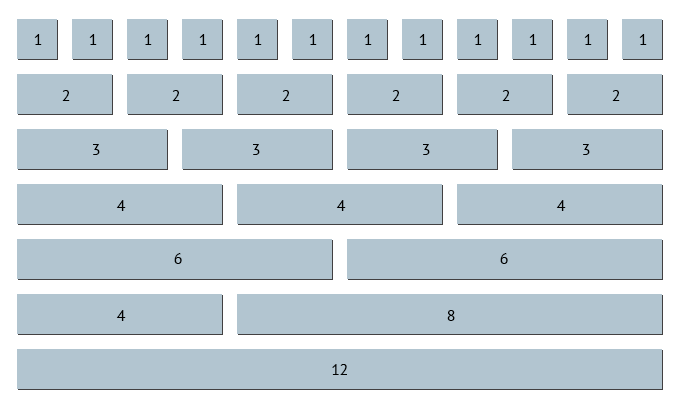
What makes this approach even more interesting is that the number of columns a component spans can depend on the browser window size, and therefore on the device resolution. For example, a text field might span three columns on a wide device, allowing four fields to sit side by side on a single row, and span all 12 columns on small devices, so just one field per row.
This is implemented by defining a series of breakpoints based on screen size:
- Extra large (xl): more than 1200 pixels
- Large (lg): more than 992 pixels
- Medium (md): more than 768 pixels
- Small (sm): more than 576 pixels
- Extra small (xs): less than 576 pixels
Implementation in ExtJS
ExtJS doesn’t provide anything like this out of the box, but building something similar isn’t complicated at all. In my (N)Ext package you can find an example in GridLayout. Using this package you can write code like the following:
    {
        xtype: 'container',
        layout: {
            type: 'next-grid'
        },
        defaults: {
            xtype: 'textfield',
            labelAlign: 'top'
        },
        items: [
            {
                label: 'First name',
                placeholder: 'e.g. Mario',
                colspan: { lg: 6, md: 12, sm: 12 }
            }, {
                label: 'Last name',
                placeholder: 'e.g. Rossi',
                colspan: { lg: 3, md: 6, sm: 12 }
            }, {
                label: 'City',
                placeholder: 'e.g. Milano',
                colspan: { lg: 3, md: 6, sm: 12 }
            }
        ]
    }

As you can see, the new next-grid layout adds a colspan config to the container’s items. This property can be either a plain number or an object. If it’s a plain number, the components will use a fixed number of columns; otherwise, the number of columns will depend on the screen resolution.
In this example, depending on the viewport width, the layout produces two, three, or four rows: on a large screen (lg) all three fields fit in a single row (6 + 3 + 3 = 12 columns), on a medium screen (md) the first field takes a full row and the other two share the second row, and on a small screen (sm) every field stacks on its own row. The Notes field always spans the full width regardless of the screen size.
Spacing between items
One common need when building grid-based layouts is controlling the spacing between items. You might be tempted to add margins to each component, but this can easily break the wrapping logic: horizontal margins increase the total width of the items, causing them to exceed the available space and wrap onto a new row earlier than expected. The result is a layout that looks correct at some resolutions but breaks at others.
The correct approach is to use the CSS gap property, which adds spacing between items without affecting their size or the column calculations. The next-grid layout supports this through a gap config:
    {
        xtype: 'container',
        layout: {
            type: 'next-grid',
            gap: 10 // 10px gap between rows and columns
        },
        items: [...]
    }
If you need different horizontal and vertical spacing, you can pass an object instead:
    {
        xtype: 'container',
        layout: {
            type: 'next-grid',
            gap: { row: 10, column: 20 }
        },
        items: [...]
    }
Under the hood, the layout applies CSS gap (or the equivalent row-gap and column-gap) to the container element. This keeps the spacing consistent regardless of how the columns rearrange at different breakpoints, without interfering with the wrapping behavior.
Conclusion
The 12-column system is a simple but powerful pattern for building responsive layouts without writing ad-hoc CSS for every breakpoint. ExtJS doesn’t offer it out of the box, but as shown above, a custom layout is all it takes to implement it. The result is a declarative, reusable way to define how components are arranged as the screen size changes, in line with what anyone familiar with frameworks like Bootstrap would already expect.


Latest Content

React Component Library for Data-Heavy Apps: Why 1 Vendor Beats 5
Data-heavy React apps rarely start with five UI vendors. They get there one reasonable decision…
October 21, 2026

How to Standardize on One UI Component Library Across Your React Apps
In most large organizations, every React app has its own UI stack. One team uses…
October 21, 2026

UI Component Library vs Component Framework: What Enterprise React Teams Need
Ask a React team what they use for UI, and you’ll usually hear the name…
October 21, 2026