


 Ask Sencha AI
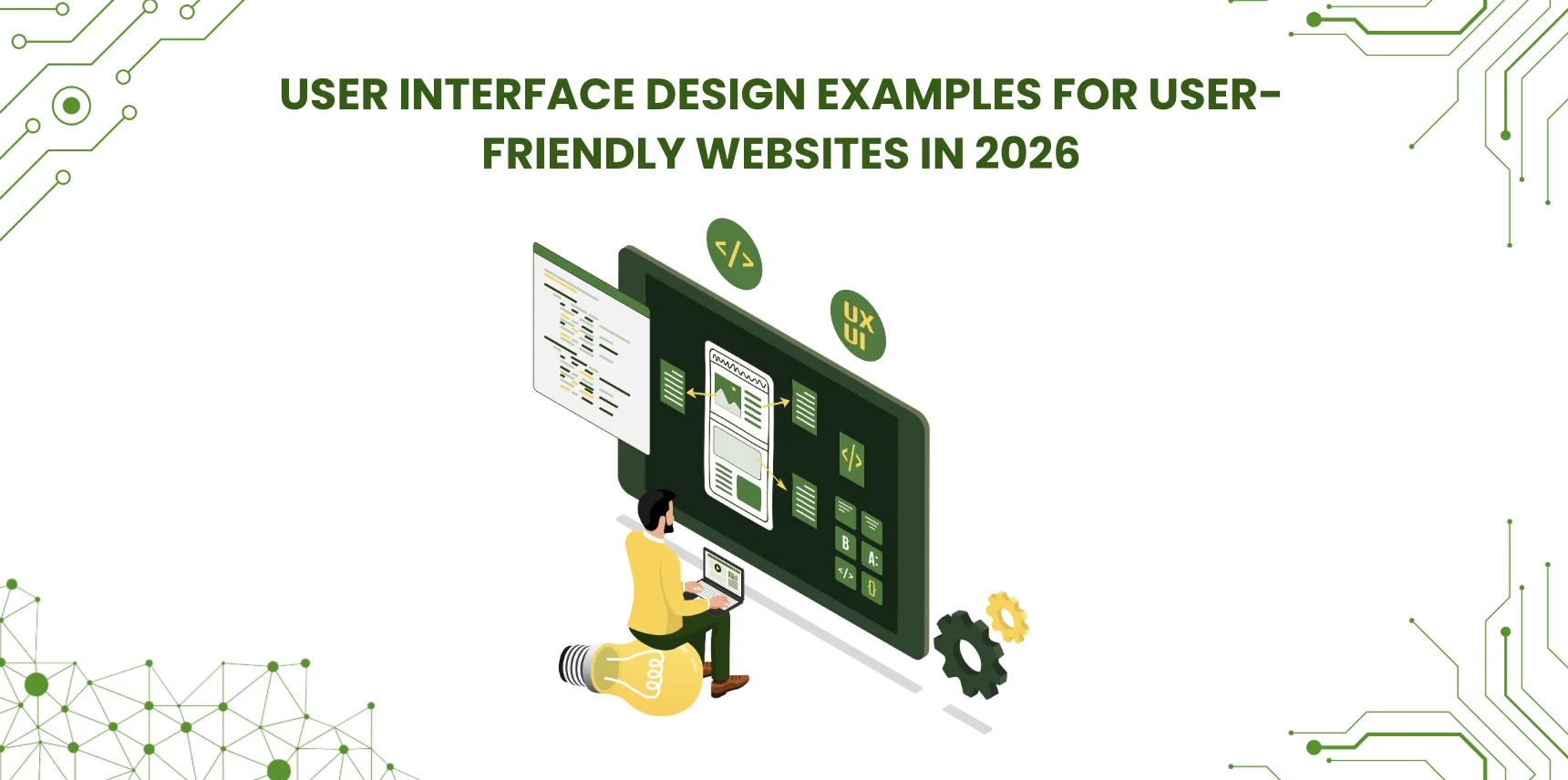
User Interface Design Examples for User-Friendly Websites in 2026
December 16, 2022
47835 Views
Get a summary of this article:
Good user interface design has a direct effect on how users perceive, trust, and engage with a website or application. The best UI examples in 2026 share common qualities: clarity, consistency, responsiveness, accessibility, and thoughtful feedback. This guide reviews 16 well-known UI design examples, explains what each does well, and summarizes the principles behind effective interface design that any team can apply.
Key Takeaways
- Strong UI design balances visual appeal with usability, accessibility, and performance.
- Card layouts, modular grids, and waterfall feeds work well for content-heavy interfaces.
- Effective onboarding uses guided flows and progressive disclosure rather than long instruction manuals.
- Micro-interactions and animation should communicate state, not decorate.
- Accessibility under WCAG 2.2 is now a baseline expectation, not an enhancement.
- Component libraries and UI frameworks help teams ship consistent interfaces faster.
Introduction
User interface design is far more than visual style. A clear, responsive interface builds trust, keeps visitors engaged longer, and reduces the friction that leads users to abandon a product. Strong UI design also helps the team behind the product: it reduces mistakes, speeds up development, and creates systems that scale as the business grows.
This guide reviews 16 well-known UI design examples and explains what each does well. The mix includes consumer products, enterprise frameworks, productivity tools, and content platforms, because good UI components work across categories. After the examples, the article summarizes the best practices that show up consistently in successful designs.
16 User Interface Design Examples Worth Studying
Each of the following products has earned its reputation by handling some aspect of UI design particularly well. Reviewing them is a fast way to build intuition for what works and why.
1. Sencha Ext JS: Enterprise component framework
Ext JS is an enterprise UI framework built for data-intensive web applications. It provides 140+ ready-to-use components, including grids, charts, forms, calendars, and trees, which makes it possible to build complex interfaces quickly while keeping the visual style and interaction patterns consistent across the application. Its high-performance data grid handles large datasets through virtualization and buffered rendering, and MVC and MVVM support make application code easier to organize and extend over time. Supporting tools such as Sencha Themer, Inspector, Architect, and Sencha Test cover theming, debugging, design, and testing within one platform.
2. Dribbble: Card-based layout
Dribbble’s interface is built around clean cards. Each card combines an image, a title, and metadata in a compact, scannable block. The card pattern works well for content-rich sites because it supports browsing without overwhelming the eye, and it scales naturally across screen sizes. The same approach now appears in dashboards, feeds, and online stores across the web, and Dribbble remains a clear example of card design done well.
3. Mailchimp: Task-focused onboarding
Mailchimp’s interface focuses on getting users to the value quickly. A clean, mostly text-based design pairs with step-by-step guidance that helps new users complete tasks without confusion. The small in-product prompts and tooltips reduce the learning curve for what could otherwise be a complex set of marketing tools, and the overall feel is approachable rather than intimidating. It is a strong example of how onboarding shapes long-term retention.
4. Dropbox: Adaptive color system
Dropbox uses a flexible color system that varies across pages and product sections rather than a single rigid palette. The result is a brand that feels fresh and current without losing recognizability, and it shows how a thoughtful design system can balance consistency with variety. For teams building large products, this approach proves that flexible themes can stay coherent across many surfaces.
5. Pinterest: Waterfall layout
Pinterest popularized the waterfall layout, where content blocks of varying sizes flow into the available space without obvious gaps. The pattern feels natural for browsing because the eye follows the content rather than fighting a rigid grid. Hover states and clear visual hierarchy reinforce which items are interactive. The waterfall approach has become a standard pattern for galleries, content-rich sites, and visual marketplaces.
Also Read: Add Elements to Array Start in JavaScript – 2026 Guide
6. Hello Monday: Effective use of white space
Hello Monday’s site demonstrates how generous white space can guide attention and create a sense of quality. Space between elements reduces clutter and lets each piece of content stand out, which improves readability and gives the design a calm, intentional rhythm. White space is best treated as a deliberate design choice rather than as wasted area.
7. Current: Audience-appropriate color and typography
Current is a financial product aimed at teenagers, and its UI reflects its audience. Bold colors, playful typography, and bright layouts make a category that usually feels formal feel approachable instead. The example shows how matching visual style to the target audience can transform how a product is perceived, and how color and typography are powerful tools for setting tone.
8. Rally: Motion as a navigation tool
Rally’s website uses motion and transitions as a navigation aid rather than as decoration. Smooth transitions help users understand where they are and where they came from, arrow-based navigation guides attention through the content, and the overall feel is dynamic without being distracting. The example shows that motion design, when grounded in a clear purpose, improves usability rather than just adding polish.
9. Cognito Forms: Personality through animation
Cognito Forms uses custom illustrations and subtle animations to give an otherwise utilitarian product personality. The animations bring friendliness to interactions that could otherwise feel sterile, and they make workflows memorable in a category dominated by plain form builders. The design illustrates how character and warmth can differentiate a product from functionally similar competitors.
10. Spotify: Gradients for visual depth
Spotify uses gradients extensively to create depth and visual interest, particularly on playlists and album pages. Gradients give surfaces a sense of dimension, draw the eye toward focal points, and adapt easily across screen sizes. The approach is lightweight, performant, and consistent with modern visual trends, which is part of why Spotify’s interface has aged well across many redesigns.
11. Toggl: Progressive disclosure in onboarding
Toggl introduces new users through guided flows that combine pop-ups, tooltips, and contextual reminders. The guidance appears when it is most useful and can be skipped by users who do not need it, which is the heart of progressive disclosure: show information when it is needed, not all at once. The pattern reduces friction without removing the help that newer users actually want.
12. Headspace: Inclusive design
Headspace builds accessibility into the product rather than treating it as an afterthought. The app supports adjustable text size, voice control, and navigation patterns that work for users with different abilities, and these choices align with WCAG accessibility standards. The example demonstrates that accessibility is part of making good experiences for everyone, not a separate checklist to satisfy after the main design is finished.
13. Figma: Learning by doing
Figma teaches new users through in-app tooltips and hints that appear during real work rather than through long manuals or training videos. Users learn the interface while accomplishing something useful, which is far more effective than reading documentation in the abstract. The approach also reduces support load, because users build skills through normal product use.
14. Typeform: Template-driven creation
Typeform’s template gallery lets users start with ready-made forms instead of building from a blank canvas. Templates give beginners a working starting point that reinforces good design habits, and they give experienced users a faster way to reach a finished result. The model works because the templates themselves are well-designed, which means the default outcome is already polished.
15. Asana: Celebratory micro-interactions
Asana adds small, occasional animations when users complete tasks, such as the well-known unicorn that flies across the screen. These celebratory micro-interactions add personality to a productivity tool without slowing the user down, and they create small moments of delight that reinforce positive behavior. Used sparingly, this kind of detail can transform how users feel about a tool they use every day.
16. Buffer: Unobtrusive upgrade prompts
Buffer handles paid plan promotion through quiet, contextual reminders rather than intrusive pop-ups or modal interruptions. Banner-style cues appear in the dashboard where they are relevant but do not block the user’s actual work. The approach respects the user’s time and attention, which keeps the relationship with the product positive even as the product is being upsold.
Best Practices for Creating Excellent UI Design
The examples above share common patterns, and those patterns translate into best practices that work across product categories. The most important ones come up consistently in any serious discussion of UI quality.
Keep the interface simple and clear
Simplicity is not about removing features. It is about presenting them in a way that users can understand at a glance. A clear interface communicates purpose, prioritizes the most important actions, and uses visual hierarchy so users know where to look first. Every element on the screen should justify its presence, and elements that do not earn their space should be cut.
Maintain consistency across the platform
Consistency builds trust and reduces cognitive load. The same typography, colors, spacing, and interaction patterns should appear across every screen, so users learn the system once and apply that knowledge everywhere. Design systems and component libraries make consistency easier to maintain as the product grows, because patterns propagate automatically rather than being copied by hand from screen to screen.
Prioritize accessibility and inclusivity
An accessible interface serves more users and meets the legal requirements that apply in most jurisdictions. Practical features include adjustable text size, sufficient color contrast, alternative text for images, keyboard navigation that covers every interactive element, and screen reader support through proper ARIA roles and labels. WCAG 2.2 provides the current standard, and designing for it from the start is dramatically less expensive than retrofitting later.
Provide feedback and guidance
Users need to know their actions matter. Visual feedback, animations, and clear messages confirm that an action has been received and that the system is responding. Buttons should change state when clicked, forms should show clear validation results, and longer operations should display progress rather than appearing frozen. Guided tooltips during onboarding reduce confusion without overwhelming the interface with help text everywhere.
Design for responsiveness and flexibility
Modern users access applications across many device types, and the interface should adapt without losing functionality. Responsive layouts, flexible grids, and well-chosen breakpoints produce a smooth experience on mobile, tablet, and desktop. For data-heavy interfaces, progressive disclosure on smaller screens, including hiding or stacking less essential columns and revealing details through interaction, often works better than trying to fit everything onto a phone.
Test and improve continuously
Good UI is never finished. Real users reveal problems that designers and developers cannot see on their own, because the team is too close to the work. Usability testing observes how participants attempt realistic tasks. A/B testing compares variations against measurable outcomes. Both methods work best when they happen early and often, not only at the end of a project when changes have become expensive.
Conclusion
Behind every strong UI is a set of clear design principles: simplicity, consistency, accessibility, responsiveness, and continuous improvement. The 16 examples in this guide demonstrate these principles in practice, across product categories from consumer apps to enterprise frameworks. The patterns they use are not secrets; they are well-understood techniques that any team can apply.
For enterprise teams building data-intensive applications, a comprehensive UI framework saves significant time. Ext JS provides 140+ pre-built UI components that handle complex requirements out of the box, which lets teams focus on the parts of the application that actually differentiate it rather than reinventing the same grids, charts, and forms. Teams ready to evaluate Ext JS for an enterprise application can start a free trial and assess it against their own requirements.
Frequently Asked Questions
What makes a user interface user-friendly?
A user-friendly interface is easy to understand at a glance, consistent across pages, fast to interact with, and accessible on every device. It reduces the friction that gets between a user and the task they are trying to complete, and it communicates clearly through visual hierarchy and feedback rather than relying on extensive instructions.
Why do UI design examples matter for improving conversions?
Strong examples show proven patterns that reduce drop-offs: clear navigation, readable layouts, strong visual hierarchy, and helpful feedback. Small UI improvements in these areas often produce measurable gains in sign-ups, purchases, and engagement, because they remove obstacles between users and the actions the product is designed to support.
What are the best UI layout patterns for content-heavy websites?
Card layouts, modular grids, and waterfall-style feeds work well for content-heavy sites because they support scanning and visual hierarchy. These patterns help users find content quickly without feeling overwhelmed, and they scale across device sizes more gracefully than dense traditional layouts.
How does design consistency improve usability?
Consistency trains users. When buttons, forms, spacing, and interaction patterns behave predictably across an application, users make fewer mistakes and move faster, particularly in dashboards and SaaS products with many screens. Consistency also makes future design changes cheaper, because patterns are defined in one place rather than reinvented everywhere.
Which UI design choices improve onboarding for new users?
Guided tours, tooltips, progressive disclosure, templates, and step-by-step flows all reduce learning time. The best onboarding teaches users while they complete real tasks rather than presenting long instructional content up front. Optional but easily accessible help respects users who want to learn at their own pace.
What role do animations and micro-interactions play in UI design?
Micro-interactions provide feedback, including success, loading, and hover states, and they help users understand what is happening as they interact with the interface. When used lightly, animation improves clarity. When overused, it slows the user down and feels gratuitous, so the discipline matters as much as the technique.
How can accessibility improve UI and business results?
Accessible UI supports more users, including those with visual, cognitive, and motor needs. It also improves trust and often boosts search engine performance and overall engagement. Keyboard navigation, sufficient color contrast, and readable typography are the foundation, and they produce a better experience for every user, not only those who specifically need accommodations.
What is the difference between a UI framework and a UI component library?
A UI framework typically provides structure and conventions for building the entire application, including routing, state management, and an overall architecture. A UI component library provides reusable UI building blocks such as buttons, modals, and forms, but leaves architectural choices to the developer. Many teams use both together: a framework for structure and additional component libraries for specialized needs.
How do UI component libraries help developers ship faster?
They reduce repetitive UI coding, keep design consistent across the application, and speed up feature delivery. Teams also spend less time on edge cases and cross-browser bugs, because the library has already solved those problems. For enterprise applications, a comprehensive library can reduce months of work compared to building equivalent components from scratch.
What are the most common UI mistakes that hurt user experience?
Common issues include cluttered layouts, weak visual hierarchy, inconsistent button styles, poor color contrast, slow page loads, confusing forms, and missing feedback after user actions. The pattern across these mistakes is that they each break the user’s trust in the interface, and rebuilding that trust takes far more effort than getting these basics right in the first place.
 2
2
 21
21
Latest Content

What Is DORA? A Complete Guide to the EU's Digital Operational Resilience Act (2026)
Last Updated: June 2026 The Digital Operational Resilience Act (DORA) is one of the most…
June 17, 2026

Top 8 Best Practices for Enterprise Software Development in 2026
Enterprise software development in 2026 demands a different approach than consumer application development. Enterprise teams…
June 3, 2026

JavaScript Framework vs Library: Key Differences Explained for 2026
JavaScript frameworks and libraries serve different purposes in enterprise development. Frameworks such as Ext JS…
June 3, 2026


