Understanding About Types Of Grid Or Layout Designs
Get a summary of this article:
Understanding the different types of JavaScript Grid designs is critical for developers. Without it, you cannot organize and position the elements. As a result, you cannot create an effective website or app design. That’s why you need to have a clear understanding of the grid before using the React grid system. In this post, you will find the different types of grid designs and examples. Also, you will know about the best tips and rules for the grid system. Let’s dive in.
What Is A Grid System In Design?
A React Data Grid is a structure of columns and lines. It allows you to determine the best position for placing the design components on the page. As a result, you can efficiently design websites or apps. The grid consists of three main elements, including columns, gutters, and margins.
Why Are Types Of Grid Systems Important?
You might not like to work within the constraints of types of grid systems. As a designer, you want to push the boundaries of design. You want to utilize your creativity in the best possible way. But the grid layout design constraints hold you back.
However, creativity isn’t a blank canvas. What will happen if you face a creative block while working on a blank page? It will be very frustrating.
You cannot utilize your creativity without following a design system. Without following a grid system, you cannot create an effective design. Also, you can’t utilize your creativity in the best way.
In this case, creative constraints come into play. They do not restrict your creativity. Instead, they give you a starting point for creating a meaningful design. Hence, you get the freedom to explore possible solutions.
Also, grid systems provide you with the structure for layout and visual organization. Therefore, the designers get a framework to follow. It ensures that the design behaves as intended on all types of devices.
On top of that, the grid system provides a plan for placing elements at the right places. Hence, designers can easily collaborate on designs.
6 Examples Of Types Of Grid Systems
Each type of grid serves different purposes. Here are 6 examples of grid systems:
Baseline
The horizontal lines in a baseline grid are closely spaced. It helps you determine the right place for inserting text. The designers use baseline grids in combination with column grids. It guarantees that each column’s text lines align consistently across a spread. A piece of ruled paper is a simple example of a baseline grid. You have already used it at school.
Column
The column grid is the most common type of grid. It splits a page into several vertical fields. Here, you align the objects. A simple example can be the newspapers. They extensively use column grids.
Modular
A modular grid takes a column grid and adds rows to it. The intersecting rows and columns create modules. You can use them to govern layout decisions. Therefore, it’s a type of extension of the column grid. A common example of a modular grid is corporate reports.
Manuscript
The manuscript grid is a one-column grid. It helps you determine the right place of putting text on a page. An example of the manuscript grid is classic books. They have layouts of facing pages mirroring one another.
Pixel
Pixel grid refers to the microscopic grid. For example, an image consists of millions of pixels. You can see them while zooming in on Photoshop. Sometimes, designers need to get in close to edit images pixel-by-pixel.
Hierarchical
Most often, hierarchical grids are utilized in web design. They enable you to organize elements in order of importance. By utilizing hierarchical grid layouts, your websites can avoid a box-like feel. It helps your site deliver a modern look.
Read: Complete Guide Of Grids
5 Tips For Using All Types Of Grid In UX/UI Design
While using the grid systems, you need to follow the best tips. It will help you create impactful designs. Here are 5 of the best tips for using the grid:
1. Do I Need To Know How To Effectively Position Grids For All Types?
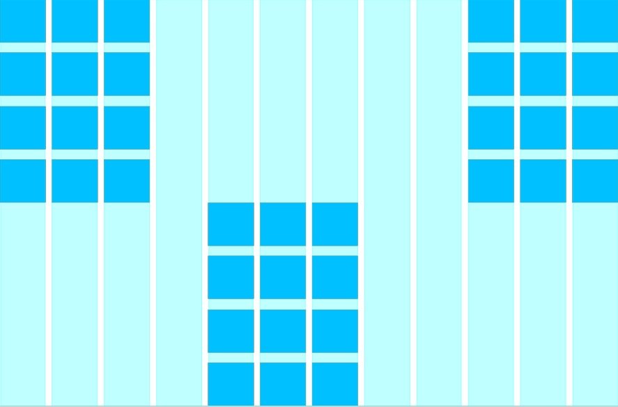
Positioning the grid effectively can have a big impact on your design. They can make your site cleaner, more persuasive, and more user-friendly. How can I position the grid within the page? How can I set up margins? These are some of the things that you must ask yourself before working on the grid.
2. Don’t Just Design With Types of Grid Layouts
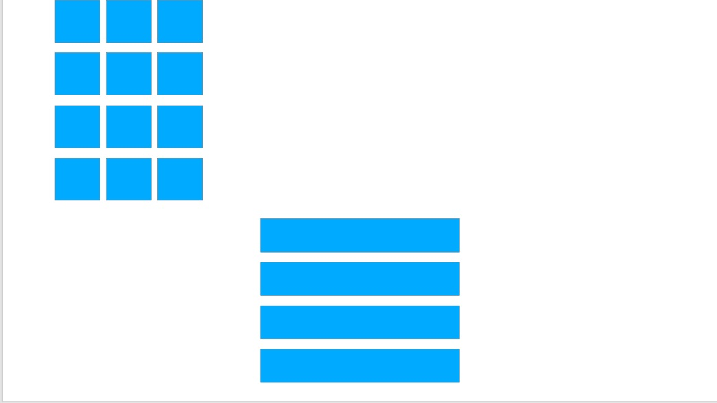
You might want to start with a usual grid to create a web or app design. You are accustomed to using a specific number of columns or a gutter width.
It makes sense for many designs. The project constraints are quite similar to an existing project. Hence, you feel comfortable working with the usual grid.
However, you should always spend time figuring out the grid that your project really needs. It will help you to find additional grid elements to make your design better. As a result, you will never get locked into the wrong type of grid.
That’s why you shouldn’t just design with the grid. Instead, you should focus on effectively designing the grid system.
3. Always Begin And End Elements In A Grid Field
The gutters are empty spaces between columns. You need to use them to separate design elements. Text and graphics can span multiple columns. However, they shouldn’t begin and end in the gutter. The design elements must always begin and end in the grid field.
4. Is Baseline Alignment Important?
Designers often overlook baseline alignment in digital design, which is different from graphic design. However, it can make a big difference. It can help you create balanced designs. Hence, you will never have to worry about something feeling off. While designing sites, make sure to stick to a consistent baseline. It will help you create well-organized web pages.
5. Consider Using An 8pt Grid For UX/UI Design
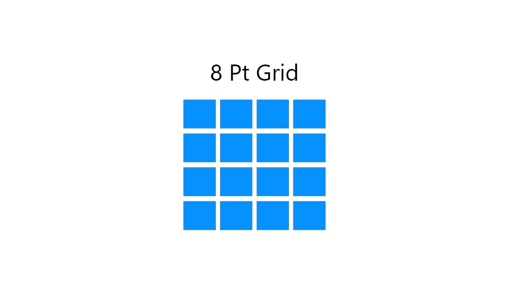
Your design needs to look crisp across different screen sizes and resolutions. Earlier, it was difficult to achieve. But in the modern days, you can easily make the transitions clean and systematic by using an 8pt grid. It helps your design perfectly scale on Retina screens. That’s why you should definitely consider using it for your design.
Read: 5 Best Tools For HTML5 Grid Tables
Rules For The Grid System
To create an effective grid system, you need to follow certain rules. They are essential for graphic designers.
1. Know Your Grid Anatomy
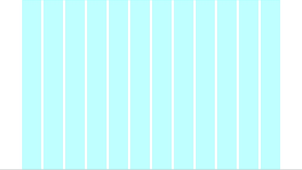
The very first thing you need to know is grid anatomy. A grid layout consists of various components.
1. Columns
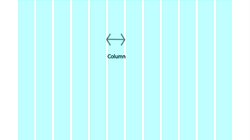
Columns are the building blocks of grids. They are the vertical sections on the layout. You can specify your preferred widths of the columns. But generally, designers use 12 columns on desktop applications. However, for tablets and mobile devices, the standard number of columns is 8 and 4. Most grids have 60-80px column widths. Your grid gets more adaptable the more columns you have. Hence, it is an important factor for effective grid layout design.
2. Rows
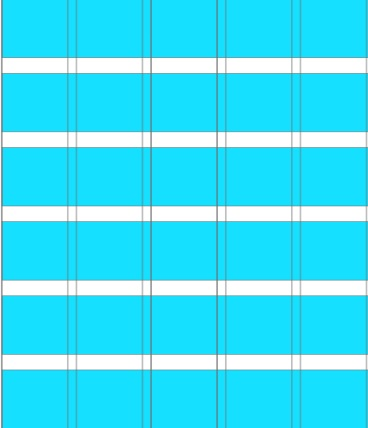
Rows are the horizontal sections of a grid. They fit fully from the left to right margin. They are often omitted from web design. However, it’s not considered to be best practice.
3. Modules
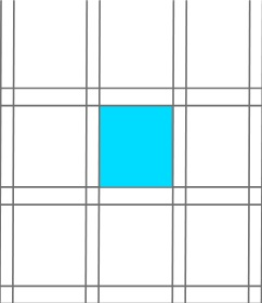
Modules are the units of space created from the intersection of rows and columns. They are also known as content modules. They are rectangular patterns in the grid. Modules contain all the necessary design elements, like text, images, and buttons. That’s why they are regarded as the building blocks of the web page.
4. Gutters
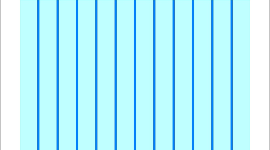
The gutters are an important aspect of the grid. In simple terms, they are the space between columns and rows. Their role is to create a negative space to separate each of these units. The size of the gutters depends on screen size. Smaller gutters look better on mobile screens. However, the standard size of a common gutter is 20px. Gutters should always be equal between columns or rows. It will help you maintain a visual balance.
5. Margins
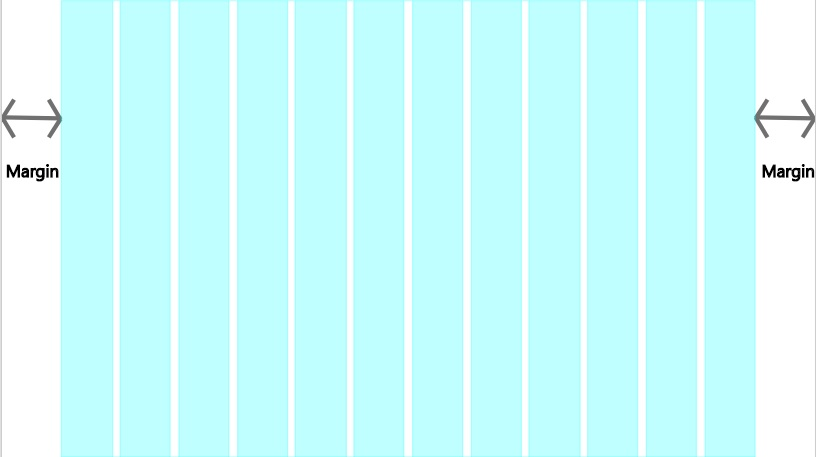
If you have used HTML and CSS before, you must have heard the word margin. You use it as a property to create space around a design element or container.
In UX/UI design, margins are the empty spaces between the edges of the format and the content. You can consider them outside gutters. The margin size varies with different devices.
2. Choose The Right Types Of Grid Layouts
To design the best grid system, you need to choose the right layout. There are many types of grid. You need to have a clear idea about them to choose the best layout for your project. Let’s find them out.
Block Grid
The block grid is a common grid type. Designers use it for extensive or continuous blocks of text. A great example of this type of block is blog pages. Another instance can be cover images or hero images.
One of the most common use cases for block grid layout is single post pages. You must have seen it while going through numerous blog posts.
Column Grid
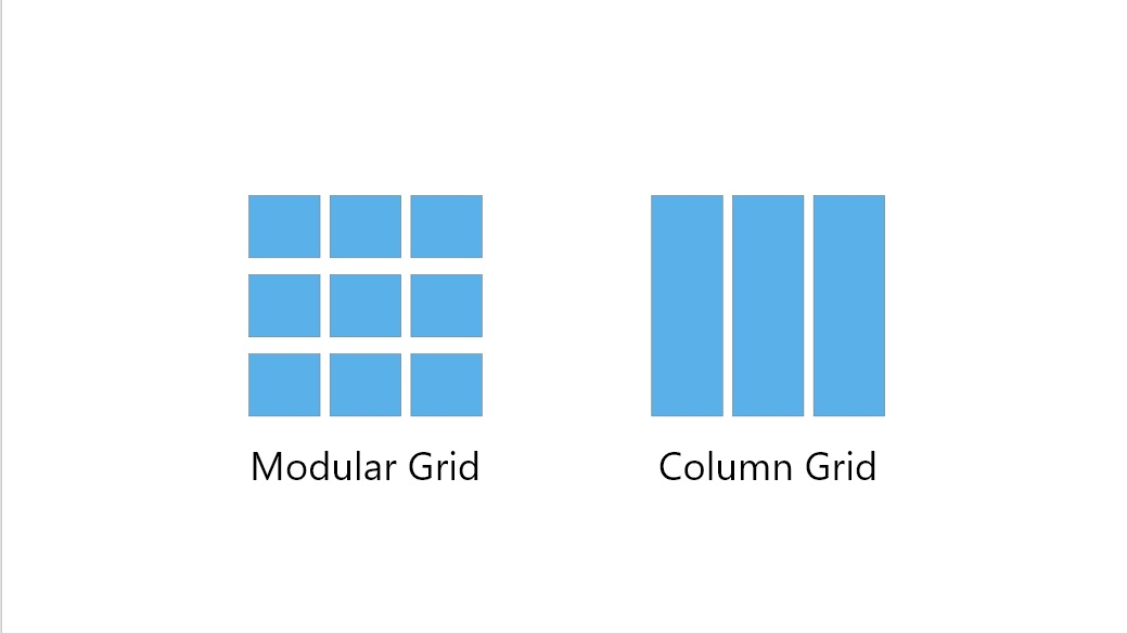
Column grids help efficiently organize multiple elements. They consist of several columns. There is no restriction on the number. Column grids can have as little as two columns. The number might increase depending on the project requirement. For example, the designers often use six, nine, or twelve columns. But it’s really up to you to decide the suitable number of columns for your project.
Modular Grid
Modular grids are like a checkerboard. They can display many things for easy access. Similar to a column grid, it has columns. Also, it has rows.
You should use modular grids when there are more elements to organize, and a column grid isn’t enough. Modular grids have equally-sized modules. Hence, you can use the spatial zones in different ways. Common use cases for modular grids include the mobile phone home screen and e-commerce websites. Another great instance can be newspapers. They use column and modular grids to organize the stories. It makes them easy to read.
Hierarchical Grid
Hierarchical grids are also known as freestyle grids. They have their elements spontaneously placed among columns and rows. As a result, their widths and heights vary throughout the grid.
You can set up a hierarchical grid freestyle. Also, you can create it with a modular grid. It takes years of practice to set up a balanced grid. That’s why designers use website templates to save precious time.
An example of a hierarchical grid can be a designer’s portfolio site. By utilizing a freestyle grid, it can effectively display images of all heights. Hence, you don’t have to crop the images to achieve a uniform height.
3. Follow Responsive Design
The responsive grid is also known as the fluid grid. They enable websites to have dynamically changing elements. As the browser or screen shrinks, responsive grids will systematically align and arrange your content. The tiles and grid content will scale accordingly. As a result, the information hierarchy will logically show up. There will be no breaks in the content structure.
4. Make Room For White Space
White space plays an important role in web design details, including hierarchy, and scalability. They make your site content readable and well-organized.
Also, white space is a major part of layout grids. The width and height of white space between columns and rows define the grid layout design.
5. Respect the Golden Ratio
Golden Ratio is a concept that enhances the sizing, balance, and layout of the grid design. It is a special number that approximately equals 1.6180. The ratio itself comes from the Fibonacci sequence. It is also known as the golden rectangle, where the length is 1.6180 times the width.
Therefore, if the width is 200px, the length would be 336px. The theory applies to the width and length of all design elements, including images, objects, or shapes placed next to each other. The Golden Ratio helps you create an organic, balanced, and aesthetically pleasing design for the viewer. It enables you to evaluate the right way for dividing the available horizontal space on the page.
6. Obey the Rule of Thirds
The Rule of Thirds is a web design method. The approach involves breaking the design into different sections using columns and rows. It enables you to create visually balanced grid layouts and image placement.
The technique is straightforward. You place your design space on a simple grid overlay. It is divided equally into thirds, both horizontally and vertically. This makes a grid of nine equal-shaped boxes. By utilizing it, you can make your design more aesthetically appealing.
Types Of Grid: Why Grids Are So Important?
Grids offer many benefits. It helps you effectively align and balance your designs. As a result, they will become aesthetically pleasing to the viewers. Grids are more than just some lines on a page. They structure, guide, and shape your design. Hence, you can achieve your desired end result. You can deliver meaningful designs. That’s why grids are very important.
GRUI by Sencha offer a high-performance type of grid for React applications. It provides several key features, including quick integration and easy customization.
FAQs
What are grid and layout designs in web development?
Grid and layout designs are structural systems that organize content on a page. They use rows, columns, or flexible containers to maintain balance, consistency, and responsiveness across devices.
Why are grid layouts important in UI/UX design?
Grids improve readability, visual hierarchy, and alignment. They help users navigate content intuitively while giving developers a consistent structure to build interfaces.
What types of grid systems are commonly used?
The most popular types include:
- Fixed grid (static width, uniform columns)
- Fluid grid (percentage-based, scales with screen size)
- Responsive grid (adapts at breakpoints for devices)
- Modular grid (blocks for complex interfaces)
- Hierarchical/Asymmetric grids (creative, non-linear layouts)
How does Ext JS support different grid and layout designs?
Ext JS includes powerful layout managers (like hbox, vbox, border, card, and fit) and a high-performance Grid component. Developers can combine these to create flexible, responsive, and data-driven applications.
Can Ext JS grids handle large datasets efficiently?
Yes. Ext JS grids are optimized for enterprise use cases. Features like infinite scrolling, virtual DOM rendering, and buffered data stores make handling thousands of records smooth and responsive.
What is the difference between Ext JS Grid and standard CSS grid?
- CSS Grid focuses on layout positioning for UI elements.
- Ext JS Grid is a data grid component that not only structures content but also adds features like sorting, filtering, inline editing, and data binding for complex apps.
Which industries benefit most from Ext JS grid layouts?
Finance, healthcare, government, logistics, and any sector requiring large-scale, data-intensive web applications benefit from Ext JS grids and layouts.
Unlock the power of Ext JS grids—try them in your next project.

In the modern web development landscape, the ability to leverage existing solutions is a superpower.…

This guide covers the technical steps for upgrading Ext JS 7.x applications to 8.0. Upgrading…
This guide covers the technical steps for upgrading Ext JS 6.x applications to 8.0. Upgrading…


